The World's BestAI Photographer.
Achieve big-brand campaign results without the budget. Our Agentic Engine acts as your creative director—analyzing your product and directing the shoot.No prompts required. No studio needed.
Trusted by world-class teams


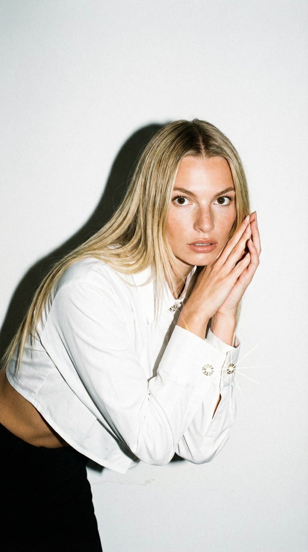
The "Ugly" Input
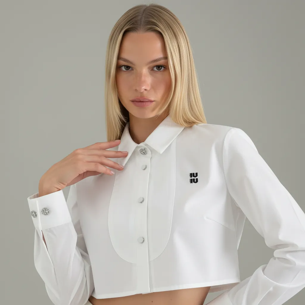
to Perfect Campaign.
Slide to see the transformation. CherryShot takes imperfect, raw photos and rebuilds them into world-class assets.
See CherryShot in Action
Watch how our Agentic AI analyzes a simple photo and rebuilds the entire scene in seconds.
Try the Engine
See how different creative directions transform the same input.
(Note: This is a limited demo. The full app includes custom prompting, batch processing, and 4K export.)
1. Active Inputs
Model
Product
2. Creative Direction
Ready to Render
Select a creative direction from the left and click Generate to create a studio-quality shot.
The Engine
From Photo to Campaign.
Drop files here
Supports Multi-Angle
Upload Input
Upload a raw smartphone photo or multiple angles. We extract depth and texture data automatically.
Select Mode
Choose between clean studio shots or full lifestyle campaigns with AI models.

Deploy
Instant render. No editing required. Ready for Shopify, Instagram, and Billboards.
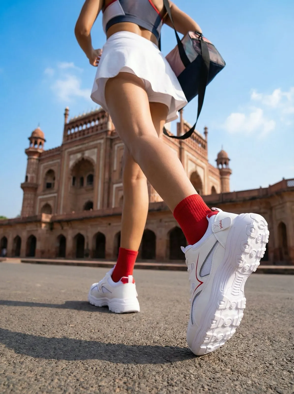
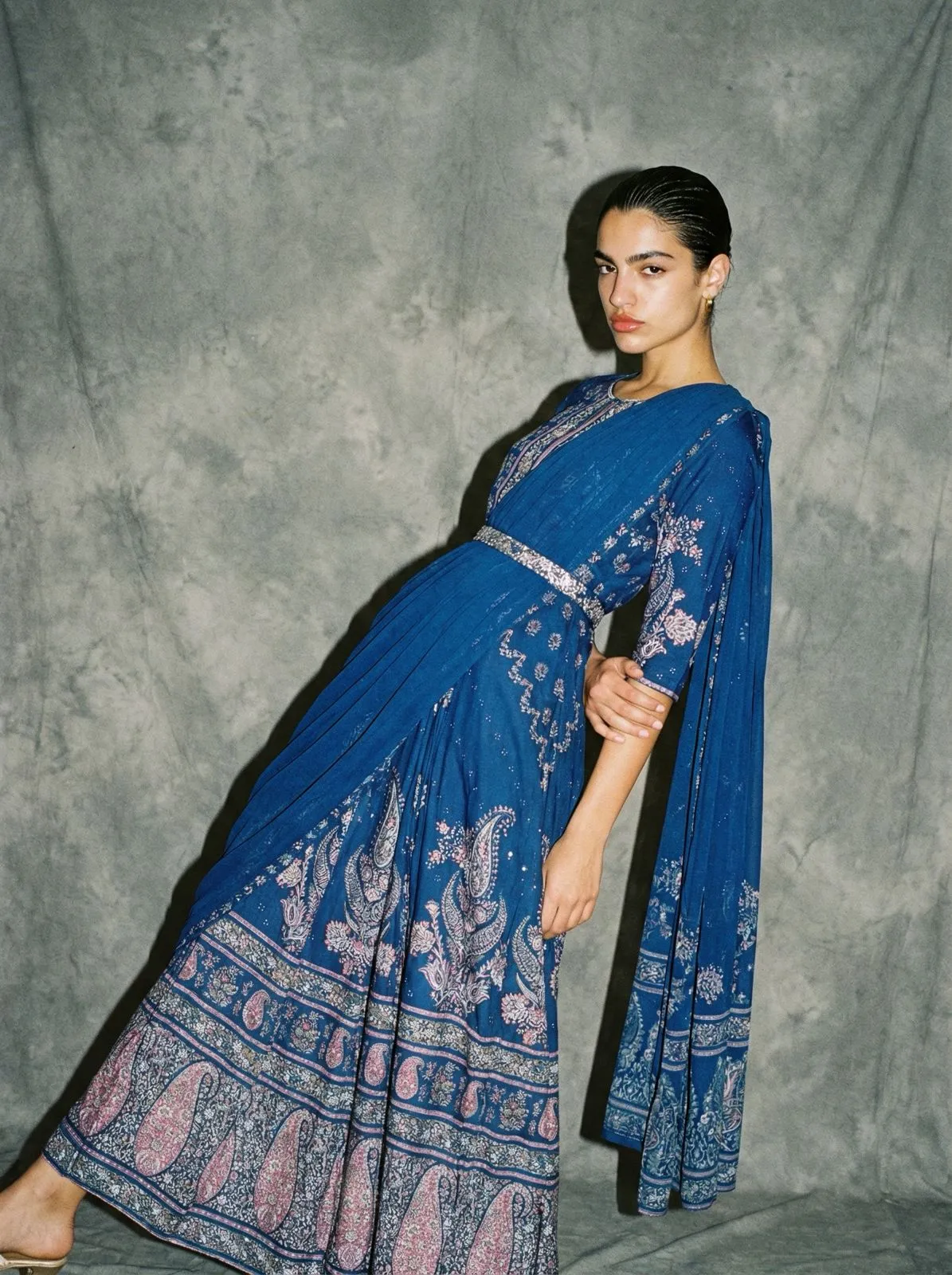
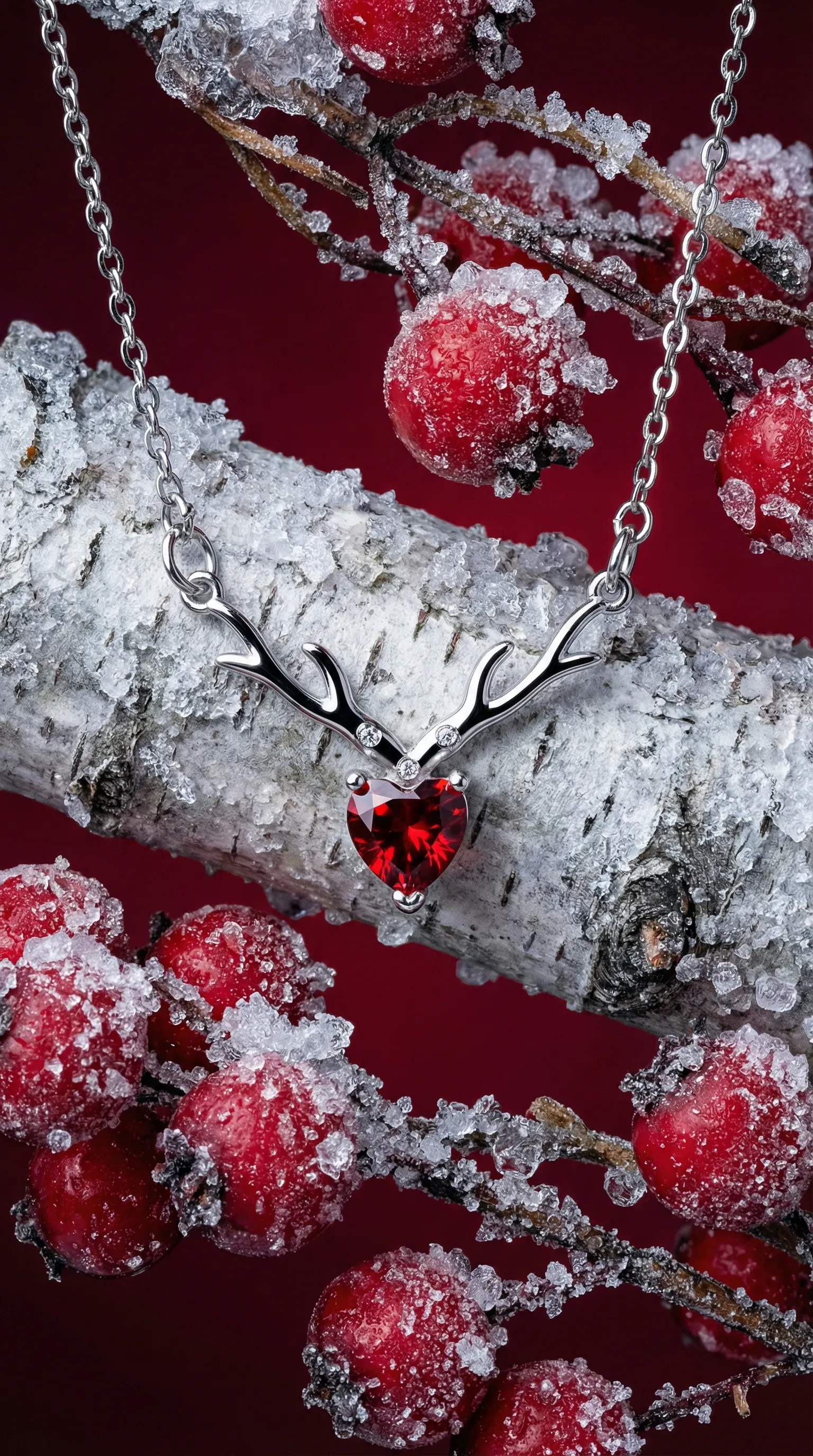
Made with CherryShot
No photographers. No sets. No post-production.
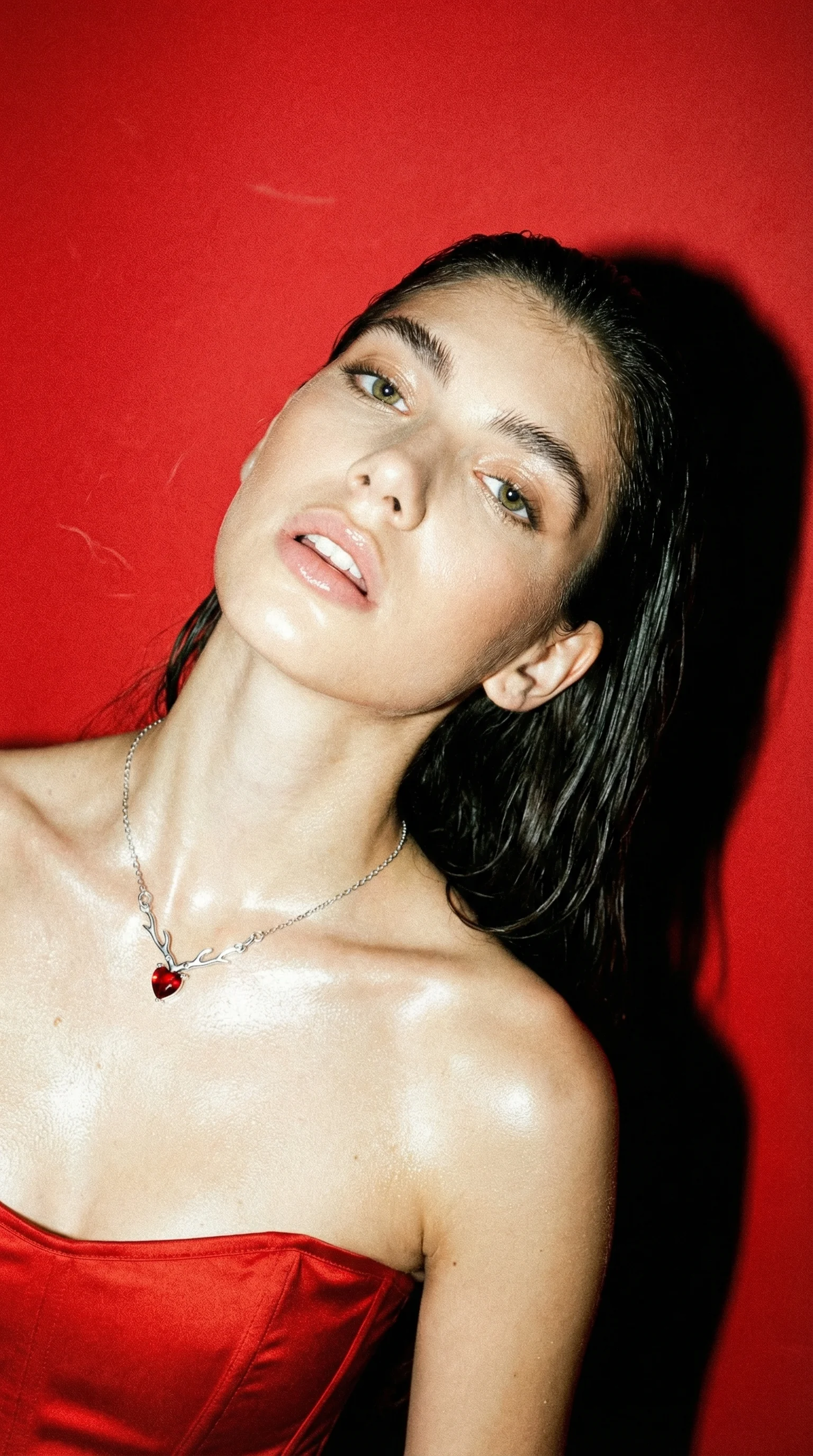
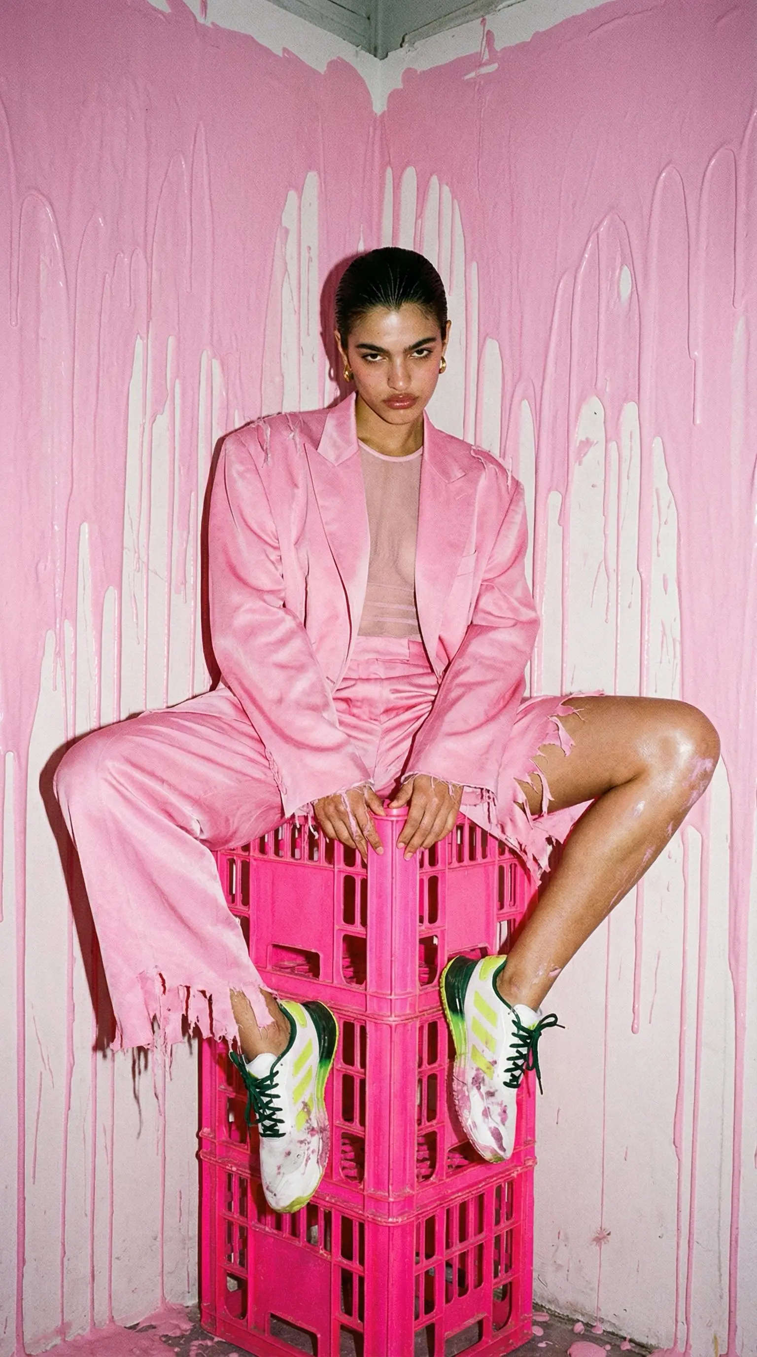
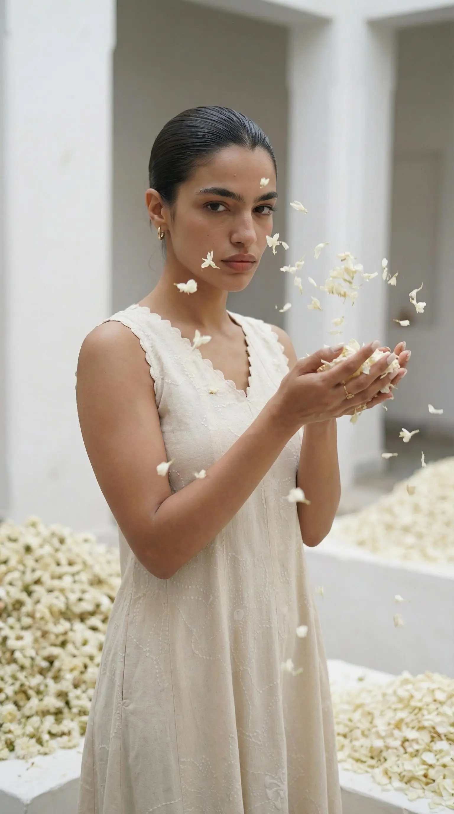
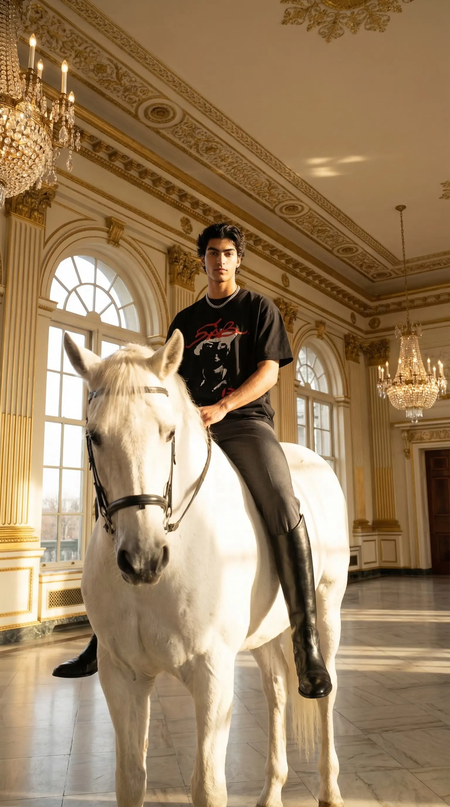
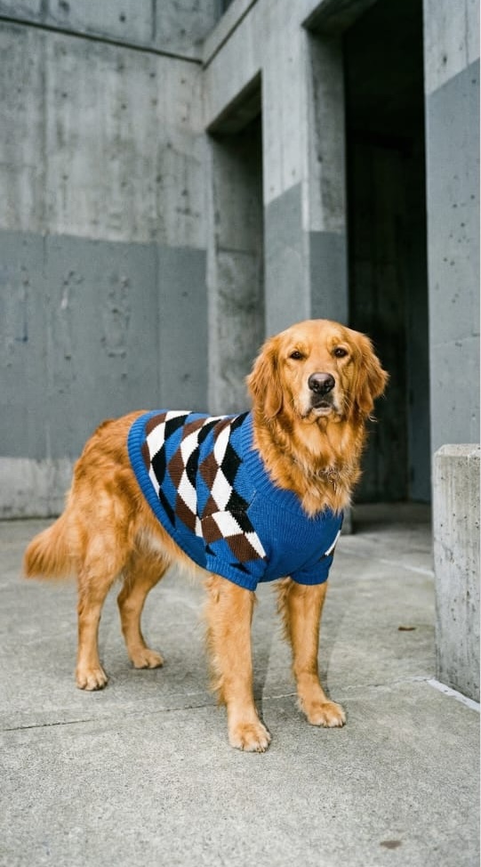
Every image below was generated 100% by AI.
Loud_luxury.webp)
Loud Luxury
Black Dress
luxury_mode.webp)
Luxury
Handbag
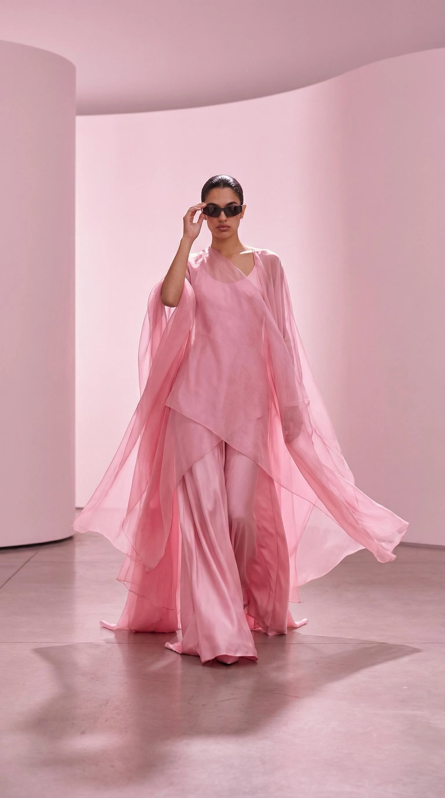
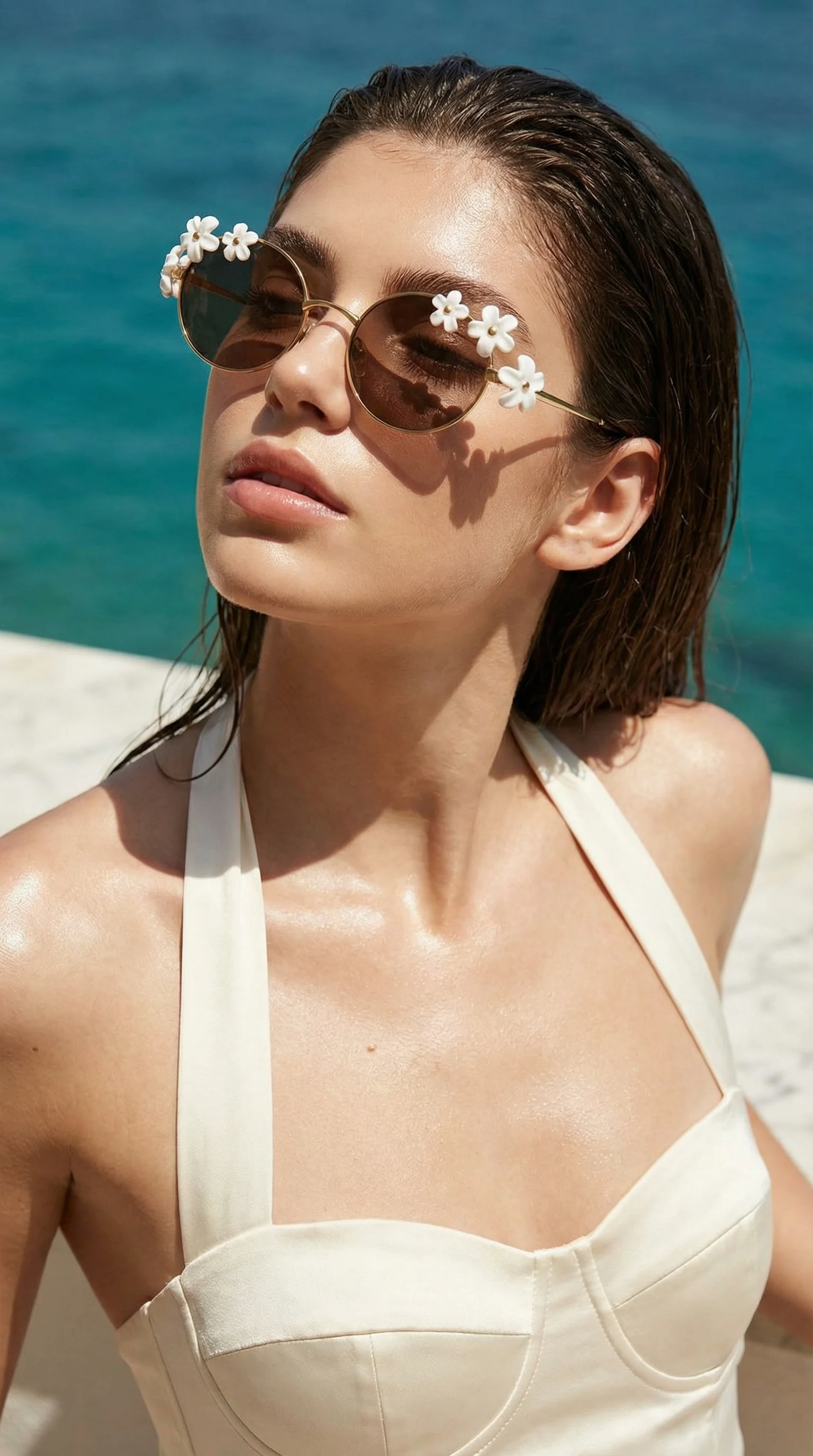
avant_garde.webp)
Avant Garde
Sunglasses
Influencer_mode.webp)
Influencer
Jacket
magazine_mode.webp)
Magazine
Pendant
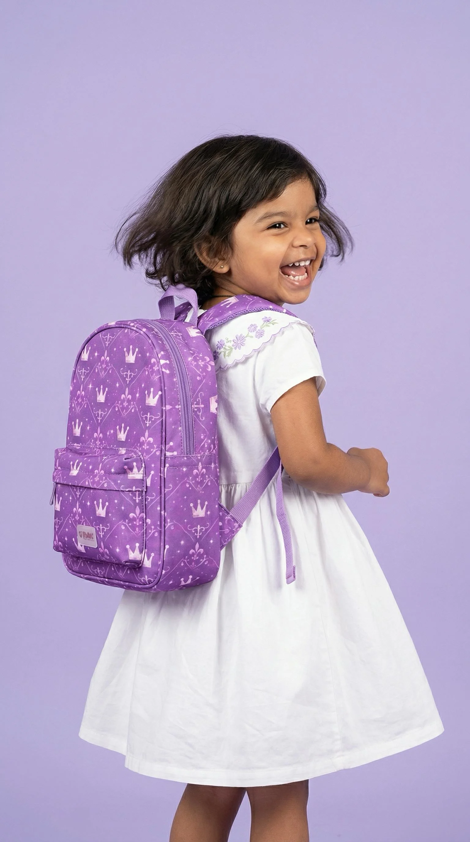
_Element_mode.webp)
Element
Pendant
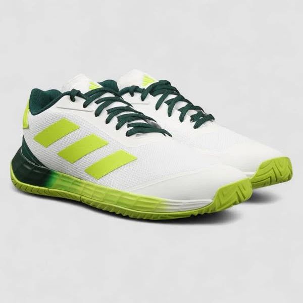
element_mode.webp)
Element
Shoes
Reference_mode.webp)
Reference
Ethnic Dress
referance_mode.webp)
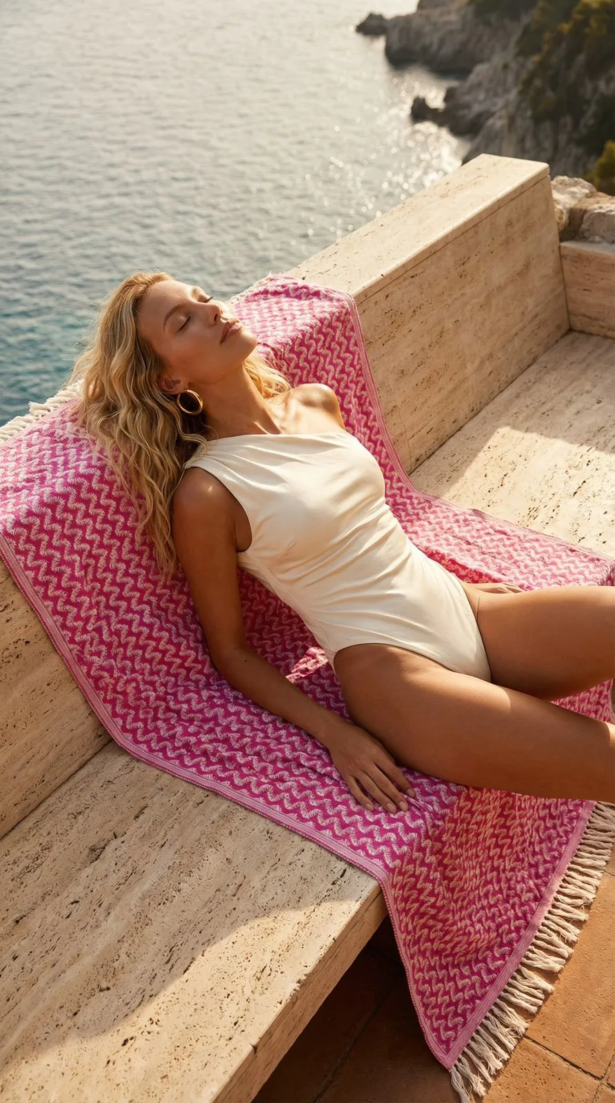
Reference
Towel
The CherryShot Mission
Democratizing
Luxury.
Big brand results. Startup budget.
We are the end of the $100k photo shoot.
Agentic AI Technology
Unlike standard generative tools that require complex prompt engineering, CherryShot uses Agentic AI. Our system is trained on thousands of campaigns from top fashion studios. It analyzes your product's material, shape, and context, then acts as a creative director to make the decisions for you.
Unmatched Efficiency
Traditional photoshoots involve location scouting, model booking, lighting crews, and weeks of post-production. CherryShot delivers superior output instantly. Whether you are a solo founder or an enterprise catalog manager, you now have the power of a world-class studio in your browser.
Simple, Transparent Pricing
Choose the plan that fits your production needs. No hidden fees. Cancel anytime.
Starter
Perfect for testing the waters.
- 50 Total Shots
- 25 Pro Mode AI shots
- 50 AI photo shots
- HD image quality
- All preset models
- Commercial license
Pro
For growing e-commerce brands.
- 250 Total Shots
- 125 Pro Mode AI shots
- 250 AI photo shots
- HD image quality
- All preset models
- Commercial license
Business
Maximum scale for agencies.
- 600 Total Shots
- 300 Pro Mode AI shots
- 600 AI photo shots
- HD image quality
- All preset models
- Commercial license
- Priority Support
- Early access to new features
Custom Solution
Tailored for high-volume retailers and agencies. Get direct access to our infrastructure and creative team.
Frequently Asked Questions
Everything you need to know about replacing your photo studio with AI.
Earn revenue with
CherryShot.
Join the fastest growing AI creative platform. We offer a competitive 20% recurring commission for every customer you refer, for the lifetime of their subscription.
20%
Recurring Commission
30 Days
Cookie Window