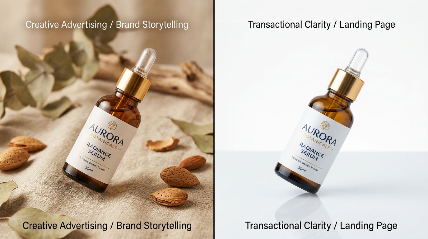
Ad Creative to Landing Page Visual Match
When a shopper clicks an ad and lands on your product page, they expect to see the exact vibe they just clicked. If your ad shows a moody, high-fashion shot but the landing page only displays bright, sterile white-background images, the brain immediately registers a mismatch. Trust drops. The visual handoff fails. That single moment of hesitation is where most paid traffic conversion dies. You paid full price for the click, but you lost the sale entirely because the visual context broke.
Definition
Ad to landing page visual match is the practice of maintaining identical aesthetic elements across an advertisement and its destination URL. This includes consistency in lighting, color grading, and background environment. This continuity prevents shopper confusion by instantly confirming they have reached the correct product after clicking.
Brands spend thousands of dollars testing ad hooks but completely ignore the visual continuity of the landing page. They treat the ad as an exciting marketing experiment and the product page as a boring catalog requirement. That rigid separation between acquisition and destination is bankrupting your ad account right now.
I see founders fighting with their media buyers every single week over this exact dynamic. The agency says the click-through rate is amazing and the website simply does not convert. The founder says the traffic is low-intent garbage. Neither of them is looking at the actual user experience of clicking the ad and waiting for the page to load. They are totally blind to the visual whiplash the customer feels.
Ad creative to landing page visual match ecommerce is not just a nice marketing theory. It is a fundamental law of user psychology. When the images match, the user feels safe. When they do not, the user bounces.
The Psychology of the Visual Handoff
You have to understand what happens in a buyer's mind during a scroll session on Instagram or TikTok. They are in a state of rapid consumption. Their attention is fragmented. When they finally stop scrolling and decide to click your ad, they are making a micro-commitment to a very specific aesthetic promise.
Why the brain rejects a visual mismatch
If you run a lifestyle ad showing your leather bag on a café table in Paris, you are selling a specific emotion. The user clicks because they want a piece of that emotion. If your landing page completely abandons that feeling and just shows a flat lay of a bag on a gray background, you have broken the spell. The user feels like they were tricked. The emotional momentum stalls out.
(Worth noting: you will always need standard white-background shots for basic clarity on your product pages. You just cannot make them the first and only thing a buyer sees after clicking a highly stylized social ad.)
The brain looks for patterns to confirm safety. When a user clicks a link, the loading screen is a moment of vulnerability. If the destination perfectly matches the origin, the brain says "we are in the right place" and transitions into a shopping mindset. If the destination looks like a completely different brand, the brain says "something is wrong" and triggers the instinct to hit the back button.
When the visual aesthetic of the ad carries through to the landing page, the user never questions if they are in the right place.
Where Ecommerce Brands Break the Chain
Most brands understand message match. If the ad says "50% off", the landing page better say "50% off". But they completely miss the boat on visual continuity paid ads. The text aligns, but the imagery fights itself.
This happens because of how modern ecommerce teams are structured. The growth team handles the ads. The merchandising team handles the product pages. They operate in silos, using completely different asset libraries. If you want to know why you are losing buyers, analyzing the visual gap on your product page will expose the exact moment your funnel breaks down.
Treating ads and product pages as separate projects
Think about how traditional photo shoots work. You book a studio. You spend a fortune on models, lighting, and sets. You shoot the standard catalog imagery first because you need it for the website. Then, in the last two hours of the day, the photographer rushes to shoot "creative" angles for the ad team.
Three weeks later, the ads launch. The creative angles perform brilliantly. The media buyer scales the budget. But the landing page still only features the boring catalog shots. The user clicks the exciting ad, lands on the boring page, and leaves. You cannot just book another shoot to redo the catalog images in the new winning style because the invoice would be astronomical.
| Workflow Approach | Ad Experience | Landing Page Result |
|---|---|---|
| Standard Siloed Teams | High-fashion lifestyle ad runs on social media. | Presents a disconnected flat lay on a gray background, causing bounces. |
| Basic Message Match | Ad copy promotes a 50% discount. | Landing page confirms the 50% discount but ignores image style. |
| Complete Visual Match | Minimalist aesthetic ad scales efficiently. | Product hero gallery updates to feature identical minimalist energy, securing the sale. |
This is exactly why you need to solve landing page issues killing ad conversions at the source. The problem is not the layout of your add-to-cart button. The problem is the massive visual disconnect between the ad creative and the product page landing.
The cost of ignoring visual continuity in paid ads
Generating fifty variations of an ad image to perfectly match fifty different landing pages takes massive storage and organization overhead. It is not a zero-effort strategy. Maintaining this level of ad to landing page visual consistency is an operational headache, but the math dictates you do it anyway.
When you ignore image match, your cost per acquisition skyrockets. You end up cycling through ad creatives desperately trying to find a winner, never realizing that the ads are fine. The landing page matches ad creative rule is being violated, and that is what is driving your bounce rate.
How to Fix Your Ad to Landing Page Visual Consistency
Fixing this issue does not require a redesign of your entire website. It requires a fundamental shift in how you produce and deploy imagery across your entire funnel.
Aligning the product page ad match
You need to audit your top performing ad concepts right now. Group them by visual style. Are they minimalist? Are they loud luxury? Are they user-generated influencer content? Once you know the winning aesthetic, you must update the hero image gallery on the destination product page to mirror that exact style.
If the user clicked an Avant Garde ad, the first image they see on the product page must be Avant Garde. If they clicked a clean Minimalist ad, the destination page must reflect that clean Minimalist energy. You are building a visual bridge from the click to the conversion.
Scaling the asset creation
Historically, achieving perfect visual continuity was a privilege reserved for massive brands with unlimited production budgets. If you found a winning ad angle, you simply could not afford to re-shoot the entire product catalog to match it.
AI product photography changes that reality. If you want to deploy ecommerce ad creative at scale while maintaining perfect landing page alignment, you no longer need to coordinate schedules with a freelance photographer. You can adapt on the fly.
This is exactly why we built CherryShot AI. You can upload a standard product image, select a visual mode that matches your winning ad campaign, and generate perfectly aligned product page imagery in minutes. If your media buyer scales a "Loud Luxury" ad campaign on a Tuesday, you can update your product page gallery to match that exact aesthetic by Tuesday afternoon. Pricing starts at $10 for 50 images, which makes the traditional studio math look entirely ridiculous.
The brands winning in paid media today are not the ones with the best targeting. They are the ones who understand that the click is only a promise. The visual handoff delivers on that promise. When you respect the user enough to maintain visual consistency from the ad to the checkout cart, your conversion rate takes care of itself.
Key Takeaways
- The visual handoff between an ad and a landing page is the most fragile moment in your conversion funnel.
- Users bounce when the visual aesthetic of the destination fails to match the promise of the ad they clicked.
- Siloed teams treating ads and product pages as separate projects inevitably destroy visual continuity.
- AI tools allow you to dynamically match product page imagery to winning ad styles without booking expensive studio reshoots.
Frequently Asked Questions
What is ad creative to landing page visual match?
Ad to landing page visual match is the practice of ensuring the lighting, color palette, and overall aesthetic of your advertisement perfectly mirrors the destination website. Maintaining this continuity prevents cognitive dissonance when a potential buyer transitions from social media browsing to active shopping. If your ad features a dark and moody vibe, the first image on your product page must display that exact same dark and moody atmosphere.
Why does visual consistency between ads and landing pages increase conversion?
Visual consistency increases conversion by immediately confirming the user has landed in the correct place after clicking a promotional link. A sudden shift in imagery causes the brain to subconsciously register a threat, which instantly breaks the emotional momentum of the purchase. Displaying the same aesthetic elements from the ad on your landing page keeps the buyer feeling secure and focused on adding the item to their cart.
How do I make my product page visually match my ad creative?
You must audit your top performing social advertisements to identify their dominant core visual modes. Group these winning ad concepts by aesthetic style, then produce new product hero images that perfectly reflect those specific environments. Once generated, immediately update the destination URL for your vibrant lifestyle campaigns to feature those matching vibrant lifestyle product shots prominently above the page fold.
What happens to conversion when ad creative and product page visuals do not match?
Paid traffic conversion plummets rapidly when users experience a jarring disconnect between an advertisement and the resulting landing page. Shoppers will bounce within the first three seconds because they assume they clicked the wrong link or encountered a broken redirect. You will end up paying maximum price for the initial click while completely destroying your opportunity to capture the final sale.
Stop accepting a massive drop-off between your ad clicks and your add-to-cart metrics. If you are tired of losing buyers during the visual handoff, it is time to upgrade your asset production. Head to CherryShot AI to start generating campaign-ready product photos that perfectly match your winning ads in minutes.
Audit your product page images before scaling ad spend
Review your top three converting social media ads and compare them directly against their destination URLs. If the aesthetic styles clash, update your landing page hero images to reflect the winning ad context. Generate perfectly matched product photography for your next campaign without booking a traditional studio shoot.
Try CherryShot AI