Color Correction for Product Photography: How to Ensure Your Product Colors Are Accurate Across Every Device
If your product photos look perfect on your monitor but your return reports constantly cite "inaccurate color," your core problem is not the camera. Color correction for product photography is the required bridge between what the camera sensor captures and what the customer sees on their phone screen. To achieve accurate colors product photography workflows must include locking your white balance, using a physical color checker on set, and strictly exporting files in the sRGB color profile.
Definition
Color correction is the technical process of adjusting a digital image so that the captured hues exactly match the physical product. It neutralizes unwanted tints created by studio lighting and ensures the final file displays consistently across different consumer screens. This practice protects brands from excessive return rates caused by inaccurate visual expectations.
Obsessing over elaborate set design without a rigid color calibration workflow is the fastest way to artificially inflate your return rate. You can spend thousands of dollars styling a beautiful lifestyle scene, but if a navy sweater renders as black on an iPhone, the customer will send it back. Poor imagery is the leading driver of preventable returns. Breaking down how bad product photos inflate your return rate reveals exactly where that silent cost hides in your margin.
I have personally approved invoices for catalog shoots where a beige trench coat looked olive green upon delivery. The photographer blamed my monitor. My monitor blamed the lighting. The warehouse team had to hold the inventory for an extra week while we attempted to fix the files in post production. Relying on an editor to visually eyeball the correct hue based on memory is a failing strategy for any brand launching more than a handful of SKUs a year.
(Worth noting: an exact color match is scientifically impossible across every consumer screen since you cannot control brightness settings or night modes on individual devices, but shifting your baseline from wildly inaccurate to functionally close enough saves thousands of dollars in reverse logistics.)
Why screen variation destroys accurate color ecommerce
The internet is a hostile environment for color accuracy. When you approve an image on a heavily calibrated studio monitor, you are looking at an idealized version of your product. Your customer is not using that monitor. They are shopping on an older laptop with a dim screen, or a brand new smartphone with a vivid color profile that intentionally over saturates reds and greens to make everyday photos pop.
Apple devices utilize True Tone technology to constantly shift the color temperature of the screen based on the ambient light in the room. Android devices routinely ship with display enhancements enabled by default. If your starting image leans slightly yellow, a device operating with a warm filter will compound that error until a pristine white sneaker looks heavily stained.
You cannot force a customer to calibrate their hardware. You can only control your input. Establishing a catalog wide visual standard for product photos builds brand trust because it minimizes unexpected surprises during unboxing. If the customer can trust your presentation of a familiar shade like charcoal gray, they are far more likely to take a chance on an unconventional seasonal colorway.
Three mandatory steps to product photography color calibration
Getting color right is not a post production task. It is an on set requirement. Trying to fix a fundamentally flawed capture in Lightroom requires an enormous amount of time and usually degrades the overall quality of the image pixels.
Locking your white balance product photography
Never shoot product catalog images using automatic white balance. When a camera is set to auto, it evaluates the scene in front of the lens and guesses what white should look like. If you place a bright orange sweater on a white table, the camera will compensate by adding blue to the image. When you swap the orange sweater for a blue one, the camera will push the white balance toward yellow. The background color of your photos will shift violently from shot to shot.
Instead, manually set your camera kelvin temperature to match your lights. Most standard studio strobes fire at roughly 5500K. Dialing that exact number into your camera ensures that every single frame captures color exactly as the lights emit it. Understanding the foundation of a proper studio lighting setup for ecommerce sellers is half the battle for color consistency.
| Camera Setting | How It Evaluates Color | Impact on Product Catalog |
|---|---|---|
| Auto White Balance (AWB) | Guesses neutral white based on the changing scene | Background colors shift wildly as different products are placed on set |
| Manual Kelvin (e.g., 5500K) | Locks the color temperature to a fixed mathematical value | Maintains an identical visual baseline across every single catalog item |
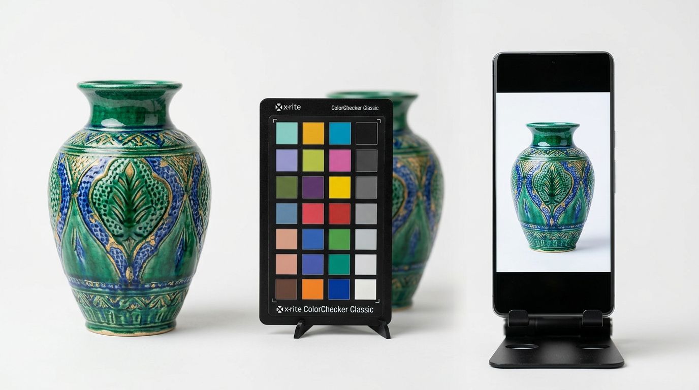
Using a color checker product photography
The most effective tool on any product photography set is a physical color checker. Brands like Datacolor and Calibrite produce small plastic cards containing mathematically precise squares of color, ranging from pure black to pure white, alongside primary colors and specific skin tones.
Place the color checker next to your product in the very first frame of a new lighting setup. Take a photo. Then remove the card and shoot your catalog. Later, when you load the files into your editing software, you simply click the gray square on that reference photo with your eyedropper tool. The software instantly neutralizes any color cast in the room. You can then sync that correction across every subsequent photo in the batch.
Exporting to the sRGB color profile
Professional cameras capture an enormous spectrum of color, usually represented in the Adobe RGB or ProPhoto RGB color spaces. These spaces are fantastic for printing billboards. They are terrible for ecommerce websites.
Web browsers strip out complex color data to load pages faster. If you upload an image in the Adobe RGB format to Shopify, the browser will attempt to translate it on the fly and often fails, resulting in an image that looks completely washed out and dull. Every final image destined for a web store or a social media feed must be explicitly exported in the sRGB color profile. sRGB product photography is the universal language of consumer display screens.
Hardware calibration for your editing team
A perfectly captured image is useless if the person editing it is working on an uncalibrated monitor. Over time, all monitors experience color drift. The backlight ages, and the rendering of neutral gray gradually shifts toward magenta or green.
If your retoucher is working on a monitor that naturally skews green, they will subconsciously add magenta to every photo to make it look neutral to their eyes. When those images go live, everyone else will see photos that look noticeably pink. Using a hardware calibration tool every four weeks ensures that the editing monitor is telling the truth.
How AI fits into the color workflow
While AI image generation tools are incredible for producing lifestyle composites at scale, if you need an absolute pantone match for a highly specific technical textile, traditional photography under controlled studio lighting with a physical color checker is still the safest path. There is a genuine trade off between the infinite creative flexibility of generative pixels and the mechanical certainty of a camera sensor.
However, managing color correction for product photography at scale does not mean you have to rent a studio for every campaign. CherryShot AI is designed specifically to maintain the integrity of your core product. You can shoot a clean, color accurate photo of your product using a smartphone in neutral light, or rely on a standard white background catalog shot. When you upload that image into CherryShot AI and select a visual mode like Minimalist or Editorial, the AI builds the new environment around the product without altering the original pixels of the item itself.
This hybrid approach guarantees that the navy blue you approved on your phone remains the exact navy blue the customer sees on the final campaign image. It removes the risk of an overzealous filter ruining your product presentation while dramatically reducing your time to market.
Frequently Asked Questions
How do I color correct product photos for ecommerce?
Lock your camera white balance and photograph a physical color checker during the first frame of your shoot. This establishes a true neutral baseline that eliminates ambient color casts caused by studio strobes or mixed lighting. Use the eyedropper tool in your editing software to click the gray square on that reference frame, syncing the exact mathematical correction across every subsequent image in that specific batch.
Why do my product photos look different colors on different screens?
Hardware manufacturers apply unique display technologies, brightness defaults, and built-in filters to their consumer devices. A modern smartphone often saturates reds and greens to make everyday photos pop, whereas an older office monitor frequently suffers from a degrading backlight that casts a heavy blue tint. Exporting every final web image in the sRGB color profile minimizes these visual discrepancies by providing a standardized baseline that browsers understand.
What white balance should I use for product photography?
Set your camera to a manual kelvin temperature that exactly matches the output rating of your primary studio lighting. Professional strobe units typically operate at a constant 5500K to replicate natural daylight without the unpredictable shifting of actual sun exposure. Dialing this precise number into your camera settings prevents the sensor from randomly adding blue or yellow casts as you swap brightly colored items on set.
Does incorrect color in product photos increase returns?
Misrepresented hues trigger an immediate spike in customer return rates across all retail categories. Shoppers quickly lose trust when they unbox a garment and discover the navy blue sweater they purchased looks aggressively black under their home lighting. Identifying these visual errors before launch saves your profit margins by avoiding the expensive reverse logistics costs associated with processing constant item not as described refunds.
How do I ensure color accuracy in product photography?
Establish a rigid production workflow that includes blocking out ambient window light, capturing a physical reference card, and enforcing a strict export protocol. Natural sunlight shifts in temperature by the minute, introducing unpredictable visual variables that make batch editing nearly impossible for large catalogs. Calibrate your primary editing monitor with a hardware tool every four weeks to guarantee your retouchers are not overcompensating for degrading screen backlights.
Key Takeaways
- Inaccurate color representation is a primary driver of preventable return shipping costs.
- Always manually set your camera white balance to prevent color shifting between individual catalog shots.
- Using a physical color checker in your first frame simplifies the entire post production workflow.
- Web browsers compress color data, so exporting final images in the sRGB color profile is mandatory for ecommerce displays.
Mastering color correction for product photography requires discipline, but the result is a massive reduction in customer complaints and reverse logistics fees. If you already have color accurate base images and want to scale them into compelling lifestyle scenes without compromising your product tones, head over to CherryShot AI to generate your next campaign.
Check your catalog on a mobile device right now
Pull up your top-selling product page on an uncalibrated smartphone to see exactly what your customers are viewing. If the item looks significantly different than it does in your warehouse, you need to tighten your visual baseline. CherryShot AI helps maintain these exact product tones while instantly generating high-converting lifestyle scenes around them.
Try CherryShot AI