Color Accuracy in Product Photography: Stop Losing Sales
I once spent three weeks arguing with a freelance photographer over a batch of knitwear photos. The physical fabric was dusty rose. The digital photos looked like bubblegum. The photographer told me it was an issue with my monitor calibration. I told him our customers do not shop on calibrated reference monitors. They shop on iPhones, and on an iPhone screen, the sweater he photographed looked neon pink.
Definition
Color accuracy is the measurement of how closely the colors displayed on a digital screen match the physical object. In ecommerce, it ensures the digital representation of a product remains consistent with the item the customer receives.
Color accuracy in product photography is not an artistic choice. It is a margin protection strategy. When a customer orders a specific shade of olive green and receives a garment that looks forest green, they will send it back. You lose the sale, you pay for the return shipping, and you take a hit to your brand trust. True color product photography is the single most effective way to protect your profit margins from preventable returns.
Most brands treat color matching as an afterthought. They assume the camera captures what the eye sees. This is a fundamental misunderstanding of how digital sensors work. If you do not actively manage your color workflow from the moment the shutter clicks, your colors will shift. By the time those images hit your product page, they are silently eroding your conversion rates.
The Financial Drain of the Visual Gap
Founders obsess over customer acquisition cost. They spend thousands optimizing ad creative. Yet they routinely upload catalog images that misrepresent their core products. When a customer unpacks an item that does not match their visual expectation, the transaction breaks down.
We know that poor imagery is the leading driver of preventable returns. When you sell apparel, cosmetics, or home decor, color is the primary purchasing criteria. A customer buying a foundation liquid is entirely dependent on the digital swatch matching their skin tone. If the white balance in your ecommerce photos leans too warm, you just sold a yellow-toned foundation to a customer with cool undertones. That product is coming right back to your warehouse. Understanding how product photos affect your return rate will completely change how you allocate your production budget.
Every return initiated because the color was wrong is a failure of production. The logistics of processing a return often exceed the profit margin of the initial sale. You pay for the outbound shipping, the return label, the warehouse labor to inspect the item, and the potential markdown if the packaging is damaged. Fixing this at the source is much cheaper than processing the fallout.
Why Cameras Lie About Color
Your eyes are incredible at adjusting to different lighting scenarios. If you look at a white piece of paper under a warm tungsten bulb, your brain still tells you the paper is white. A camera sensor does not have a brain. It records the exact temperature of the light hitting the subject.
If you shoot in a room with mixed lighting, half natural sunlight pouring through a window and half fluorescent overhead bulbs, your camera gets confused. The sunlight is cool and blue. The overhead light is green. The resulting image will have muddy, inconsistent colors that cannot be fixed globally in post-production. The visual gap between expectation and reality starts with terrible lighting discipline.
Beyond lighting, digital camera sensors have native color profiles. Camera manufacturers engineer these profiles to make consumer photos look punchy and vibrant. They deliberately boost reds and blues to make sunsets and skin tones pop. For a lifestyle portrait, this looks great. For a precise color correction product image, it is a disaster. Your subtle coral lipstick suddenly reads as bright cherry red on screen.
The White Balance Baseline
Fixing color starts with establishing a neutral baseline. Automatic white balance is a gamble. As you move around the product or change angles, the camera constantly recalculates the color temperature. One shot looks blue, the next shot looks yellow. This makes maintaining color consistency across your entire catalog impossible.
The solution is manual product photo color calibration. Professional setups use an eighteen percent gray card or a dedicated white balance target. You place the card in the frame under your final lighting setup. You tell the camera to read that specific card as neutral gray. The camera then mathematically shifts all other colors into proper alignment. This single step eliminates eighty percent of color accuracy issues before you even open a laptop.
The Color Managed Workflow
Shooting with proper white balance is only the first phase. If you want true-to-life product colors, you need a fully color managed workflow. This means standardizing how color is read, displayed, and exported from the camera to the final web browser.
Worth noting, some fabrics like neon synthetics or heavily textured velvets will confuse even the best camera sensors due to how they scatter light. A true color match on these highly specific materials sometimes requires manual hex code painting in post-production regardless of your calibration efforts.
| Tool | Primary Function | Accuracy Level |
|---|---|---|
| Gray Card | Sets white balance baseline | Basic |
| Color Checker | Creates custom ICC profile | Scientific |
| Monitor Calibrator | Ensures screen display accuracy | Professional |
Color Checker Calibration
For brands where exact color is make-or-break, gray cards are not enough. You need an ICC profile for your specific product photography setup. Photographers build these profiles using a physical color checker passport. This tool looks like a small booklet containing rows of highly specific color squares.
You take a reference photo of the color checker alongside your product. In your editing software, a plugin analyzes how your camera sensor recorded those specific color squares compared to their known scientific values. The software then builds a custom color profile that forces your camera's raw data into perfect alignment. When you apply this profile, you watch the muddy reds snap into perfect crimson and the dull blues clarify into vibrant navy.
Monitor Calibration for Ecommerce
If your editing monitor is displaying colors incorrectly, every adjustment you make in Photoshop is a mistake. Most factory monitors are too bright and heavily saturated. If you edit on an uncalibrated screen, you might think an image looks dull and boost the saturation. When a customer views that file on a normal device, the colors will be blindingly radioactive.
Using a hardware monitor calibrator ensures your screen displays colors exactly as they exist in the digital file. This is non-negotiable for anyone handling product photo retouching. If you are paying freelancers to edit your files, ask them when they last calibrated their monitors. If they hesitate, find a new retoucher.
The Uncontrollable Variable: The Customer Screen
You have to accept one brutal truth about ecommerce photography. Even if you shoot with perfect color checker calibration, edit on a specialized reference monitor, and embed the exact color profile, you cannot control the final display.
Your customer is going to look at the photo on a smartphone with low battery mode enabled, screen brightness turned down to ten percent, and a blue-light filter automatically warming the display. Their specific screen hardware will shift the colors you worked so hard to perfect. You cannot fix the customer's hardware. You can only ensure that the source file you provide is mathematically accurate. Starting with accurate color product photography guarantees that the image looks as good as possible across the widest range of consumer devices.
The sRGB Export Rule
A common mistake happens during the final export. High-end cameras capture in wide color spaces like Adobe RGB or ProPhoto RGB. These spaces contain millions of colors that standard web browsers simply cannot display. If you upload an image saved in Adobe RGB to your Shopify store, the web browser will blindly compress the colors. The result is a washed-out, desaturated mess.
Every final ecommerce image must be converted to the sRGB color space before uploading. sRGB is the universal language of the internet. By intentionally compressing your colors into sRGB during export, you control how the image degrades, ensuring a punchy, accurate representation online.
How AI Solves the Color Consistency Problem
The traditional studio workflow demands immense technical discipline to keep colors true. Booking a studio, managing mixed lighting, balancing gray cards, and building ICC profiles takes time and expertise. This is why a standard commercial shoot runs thousands of dollars and takes weeks to deliver.
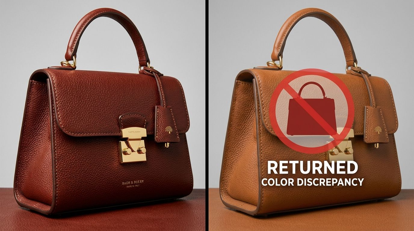
General purpose AI image tools have tried to speed this up, but they fail catastrophically at color accuracy. If you prompt a standard AI model to place your red handbag on a marble counter, the AI will often generate an entirely new red handbag. It hallucinates details. It shifts the red hex codes to match the lighting of the generated room. The result is a pretty picture of a bag you do not actually sell.
CherryShot AI was built differently. We know that altering the product color defeats the purpose of the photograph. When you upload your product image, CherryShot isolates your item and locks those exact pixels. You select your visual mode, and the system generates the campaign-ready environment around the product. The lighting, shadows, and reflections are built to match the scene, but the original product colors remain untouched.
You get the speed and scale of AI generation without sacrificing the color accuracy that protects your profit margins. When you can generate fifty campaign images in an afternoon without worrying about color shifts, you stop managing logistics and start driving revenue.
Audit your product page colors before your next campaign
Review your top-performing items to confirm they reflect the true product shade. If you identify inconsistencies, our platform can generate high-end, color-accurate visuals to replace those problematic images without a costly studio restaging.
Try CherryShot AIFrequently Asked Questions
Why do my product colors look different in photos?
Digital sensors interpret light differently than biological vision. Studio lighting often carries subtle color casts that sensors record across your entire frame. Additionally, automatic camera profiles boost saturation to make images appear vibrant, which frequently shifts delicate hues like pastels or earth tones away from their true color values.
How do I calibrate white balance for product photography?
Manual white balance settings replace the unreliable automated system built into your camera. Positioning an 18 percent gray card within your specific studio setup provides a neutral reference point for your shots. Using that test frame as a baseline allows you to set custom color parameters that ensure consistency across every item in your professional catalog.
What is a color checker and do I need one?
Color checkers provide a grid of scientifically formulated squares that serve as a high-precision calibration reference. Photographing this tool during your initial shoot setup allows software to build a custom color profile that aligns your sensor data. Apparel, cosmetics, and luxury decor brands require this tool because small variations in shade frequently dictate the final purchase decision.
How much do inaccurate product colors affect returns?
Color inaccuracies represent a primary cause of avoidable ecommerce returns. Industry data suggests that more than twenty percent of all online returns occur because the delivered product differs from the website imagery. Apparel retailers often find that the labor, shipping, and restocking costs associated with these specific returns eliminate the net profit margin on the initial transaction.
Does AI product photography accurately reproduce colors?
Common AI image generation models hallucinate details and frequently alter original product colors. Specialized ecommerce tools function differently by isolating your product image to preserve its exact original pixel data. These systems only modify the surrounding environment, lighting, and shadow details to create a realistic scene without changing the actual hex codes of your inventory.
Key Takeaways
- Color accuracy is a financial metric that directly impacts return rates and profit margins.
- Mixed lighting and automatic camera settings are the primary causes of digital color shifts.
- Always convert final ecommerce images to the sRGB color space to prevent desaturation on web browsers.
- CherryShot AI generates new environments around your product while strictly preserving original hex codes.
Stop paying for return shipping because a freelance photographer failed to set a custom white balance. CherryShot AI gives you campaign-ready imagery in minutes, keeping your product colors locked and your margins intact.