Lifestyle vs White Background Product Photography: Which Converts Better
Founders constantly ask me whether lifestyle vs white background product photography drives higher conversions. The answer depends entirely on where the user is currently sitting in your marketing funnel. White background images remove friction at the point of purchase. Lifestyle images create the desire that gets them to the product page in the first place. You need both to run a profitable brand. Choosing between them is a false dichotomy that will actively hurt your revenue.
Definition
White background product photography isolates an item on a pure white canvas to highlight physical details without distraction. Lifestyle product photography places that same item in a styled, real-world environment to demonstrate scale, context, and aesthetic appeal. eCommerce brands use both formats together to guide shoppers from initial product discovery to final checkout verification.
If you are looking at your quarterly marketing budget and trying to pick a lane, you are asking the wrong question entirely. A white background product photo tells the buyer exactly what physical object they are getting. A contextual lifestyle image proves to them why they want it in their home.
For years, brands had to choose because running a massive studio shoot with models and set design was a logistical nightmare. The invoice for a contextual lifestyle shoot is usually three times the cost of a flat lay on seamless paper. That financial constraint forced founders into making painful compromises. Now that AI product photography tools like CherryShot AI can generate campaign ready environments from a single flat lay, that compromise is officially dead.
The unique job of a white background photo
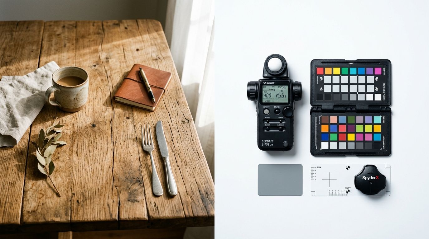
White background product photography is the baseline foundation of eCommerce trust. There is a specific reason Amazon enforces a pure RGB 255,255,255 background for every single main product image on their marketplace. It completely removes distractions. It eliminates lighting variables. It forces the eye directly onto the silhouette, texture, and physical details of the item.
Removing visual friction at checkout
When a shopper is ready to click the checkout button, their brain is desperately looking for reasons to back out of the transaction. They will zoom in to see the specific stitching on a leather bag. They will check the reflection on a watch bezel. They want absolute verification that the colorway matches the text description. A pure white background gives them that clinical, objective view.
(I will admit a real limitation here: pure white backgrounds are incredibly boring. Nobody shares a seamless paper product shot on Pinterest, and nobody stops scrolling on TikTok to look at a clinical shoe profile.)
But boredom is highly functional on a checkout page. You are not trying to entertain the buyer at the add to cart stage. You are trying to assure them. When you skip the studio white background ecommerce shots to rely purely on artistic environmental photos, you leave basic logistical questions unanswered. Unanswered questions lead directly to abandoned carts.
The psychological pull of lifestyle imagery
A clinical shot proves the physical product exists. A product environment photography setup proves the product actually belongs in the life of the buyer. This is where lifestyle product image conversion metrics start to separate the massive brands from the struggling ones.
Building scale and spatial reasoning
Think about a high end espresso machine. On a sterile white background, it is just a steel box with a portafilter attached. It looks exactly like an appliance. Put that same machine on a marble countertop with morning light filtering through a nearby window and a heavy ceramic mug resting on the drip tray. Suddenly, it is no longer an appliance. It is an aspirational Saturday morning ritual.
Online shoppers generally lack imagination. You have to do the spatial reasoning for them. If you sell a floor lamp, you absolutely must show it next to a sofa so the buyer understands its true height. If you sell a weekend duffel bag, you must show it slung over a shoulder. A white background gives them no reference points for size.
If you are relying solely on white background shots, your paid social campaigns will fail. Meta and TikTok algorithms actively punish clinical catalog shots because human users scroll past them instantly. To understand exactly how these visual assets dictate your ad performance, reviewing a deep dive on the specific visual hooks that build scroll stopping product images will show you why rich context is absolutely mandatory for modern paid acquisition.
How to structure your product page image carousel
How do you structure the actual image carousel to maximize conversions? The highest converting product pages do not throw images up randomly. They follow a very specific visual hierarchy that guides the brain from discovery to purchase.
The golden ratio of catalog imagery
Your primary image must be a white background shot. This is basically non negotiable for Google Shopping feeds and most marketplace syndications. It also sets a clean, scannable grid on your Shopify collection pages. When a user is browsing thirty different SKUs on a single screen, a unified white background keeps the visual noise low and allows them to compare shapes and colors easily.
The second image should be a secondary angle on that same white background. Show the back of the garment, the inside pocket of the bag, or the alternate profile of the furniture piece.
The third image is where you introduce lifestyle context. Show the product in active use. Show a hand holding it. Show it sitting on a messy desk. This bridges the gap between the clinical view and physical reality. Getting this transition right is critical. If you are unsure how to blend these styles, looking at a complete breakdown of how product photography background choices impact conversions will give you the exact blueprint for building your carousel.
The fourth and fifth images should be macro details. Give the buyer close ups of the fabric grain, the metal hardware, the ingredients label, or the premium unboxing experience.
Category specific rules for photography styles
The balance between white vs contextual photography changes drastically depending on what you actually sell. Some categories require absolute precision while others require heavy emotional framing.
Apparel and fashion
Clothing shot flat on a white background is notoriously difficult for a buyer to visualize on their own body. Ghost mannequin photography helps, but lifestyle imagery is highly necessary here. Buyers need to see how the fabric drapes, how the material catches natural light, and how the garment moves.
Furniture and home goods
Scale is the single biggest conversion killer in the home goods sector. A velvet sofa floating on a white background is virtually useless if the buyer cannot tell if it actually fits their living room dimensions. You must provide a room context shot.
Beauty and skincare
Texture is everything for cosmetics. Smear shots on white backgrounds work very well for showing the exact color pigment, but seeing the physical bottle next to water splashes or raw botanical ingredients builds the sensory expectation that justifies a premium price tag.
Consumer electronics
High fidelity white backgrounds win the electronics category every time. Buyers want to zoom in and see the specific USB ports, the matte finish on the casing, and the exact screen dimensions. Lifestyle images are secondary here.
The comparison matrix
| Feature | White Background | Lifestyle Photography |
|---|---|---|
| Primary Function | Removes visual friction, provides clinical verification. | Creates emotional desire, demonstrates physical scale. |
| Funnel Placement | Bottom of funnel, product page hero, checkout, Google Shopping. | Top of funnel, paid social ads, email banners, carousel middle. |
| Emotional Impact | Zero. Purely logical and objective. | High. Connects the product to an aspirational identity. |
| Traditional Cost | Low to moderate. Predictable studio day rates. | Very high. Requires locations, props, models, and styling. |
The death of the logistical trade off
Five years ago, I would have told a bootstrapped eCommerce brand to skip the lifestyle shoots entirely until they crossed their first million in revenue. The math simply did not work out in their favor. Booking a studio for white background shots is highly predictable. You rent a cyc wall, bring in a technical product photographer, and shoot eighty distinct SKUs in a single afternoon.
Lifestyle shoots are organized chaos. You are paying for location scouting, prop styling, model day rates, and wardrobe changes. A single cloud rolls over the sun, and your natural light aesthetic is ruined for an hour. You often end up paying two hundred dollars per finished image. That margin compression is exactly why so many direct to consumer brands just settle for boring catalog pages.
How AI product photography changes the math
This exact margin problem is what CherryShot AI was built to solve. We looked at the sheer waste of time and money happening on physical production sets and realized the technology was ready to bypass those limitations completely.
Now, you shoot your physical product exactly once. You take a clean, evenly lit photo of your item on a basic surface. You upload that single reference image into CherryShot AI. You select the Classic mode to generate your pure white background catalog shots for Amazon and Google Shopping. Then, you simply switch to the Lifestyle, Luxury, or Influencer mode to generate your contextual environments.
You get both styles generated from a single source image in minutes. You do not have to book two different specialized photographers. You do not have to argue with a retoucher and wait three weeks for them to send back the finals. If you want to dive deeper into the exact settings and modes required to execute this smoothly, our guide on planning and executing lifestyle product photography breaks down the entire workflow.
The debate over lifestyle vs white background product photography is officially over because you no longer have to choose. You generate exactly what the marketing channel demands, exactly when you need it.
Key Takeaways
- White background photos provide objective verification and reduce checkout friction.
- Lifestyle photos communicate physical scale and build emotional desire at the top of the funnel.
- The highest converting pages use white backgrounds for the hero image and lifestyle shots in the carousel.
- AI product photography allows brands to generate both clinical and contextual images from a single baseline photo.
Frequently Asked Questions
Does lifestyle photography convert better than white background?
Conversion dominance between the two styles shifts entirely based on marketing funnel placement. Lifestyle photography secures higher click-through rates in social media advertisements and email campaigns by capturing initial user attention and building aesthetic desire. Pure white background photos command higher completion rates on checkout pages because they strip away visual friction and verify exact physical product details before payment.
When should I use white background product photography?
Deploy white background images as your primary product page hero shot, collection grid thumbnail, and Google Shopping feed asset. This objective formatting intentionally removes environmental distractions so shoppers can accurately evaluate physical silhouettes, material textures, and precise colorways. Major platforms including Amazon enforce strict compliance policies requiring pure RGB 255,255,255 background codes for all primary catalog listings to maintain consistency.
When should I use lifestyle product photography?
Publish lifestyle product photography across top-of-funnel paid acquisition channels, organic social media feeds, website hero banners, and the middle positions of your product image carousel. Environmental context proves essential whenever buyers require spatial reasoning to grasp physical scale or visualize active daily use scenarios. Displaying a weekend duffel bag slung over a human shoulder answers basic sizing questions that a floating studio isolation shot entirely ignores.
Which product photography style is better for my category?
Optimal photography styles map directly to the primary buying triggers of your specific catalog category. Technical merchandise like consumer electronics or auto parts requires clinical white backgrounds to highlight complex hardware ports and specific material finishes. Categories driven by emotion and scale like apparel or living room furniture demand rich lifestyle scenes to confirm spatial fit and personal aesthetic alignment.
Can I use both lifestyle and white background for the same product?
High-performing eCommerce brands intentionally mix both essential photography styles to build a complete visual sales pitch. The most profitable product pages open with clean white background shots for absolute clarity before transitioning into contextual lifestyle environments. Introduce two or three styled room scenes to demonstrate physical scale before closing the carousel with tight macro detail shots of hardware or fabric textures.
The most profitable eCommerce brands do not pick sides in the lifestyle vs white background debate. They use white backgrounds to prove the product exists and lifestyle imagery to prove it matters. If you are tired of spending thousands of dollars trying to capture both styles manually, you can generate your entire catalog of campaign ready imagery starting today at cherryshot.ai.
Audit your product page images before your next campaign
Review your top-selling items to ensure they open with a clinical white background and transition into spatial lifestyle shots. If your catalog is missing crucial environmental context, you can generate new scenes directly from your existing baseline photos.
Try CherryShot AI