Volume Discount Visual Ecommerce: How to Photograph Multiple Units
You want your customers to buy the three-pack. It makes your unit economics work. It secures loyalty. It is the most profitable button on your product page. Yet when you present the volume discount visual ecommerce option, you likely rely on a poorly edited composite of three identical bottles lined up like soldiers on a pure white background. The offer is highly valuable. The presentation looks incredibly cheap.
Definition
Volume discount photography is the practice of capturing multiple units of a product to visually represent bulk purchase options on an ecommerce page. It requires strategic physical grouping and lighting to maintain premium brand perception while communicating a higher inventory quantity.
Volume discounts should elevate your average order value without dragging your brand aesthetic into the bargain bin. Showing volume in ecommerce requires styling for lifestyle wealth, not warehouse inventory. The visual gap between aspirational abundance and cheap bulk is remarkably narrow. Cross that line, and you train your customers to wait for a clearance sale instead of valuing your product.
I once approved an invoice from a retouching agency to duplicate a single hero bottle of a premium skincare serum into a six-pack bundle visual. When the file arrived, the shadows pointed in three different directions. The lighting highlights on the glass were mathematically identical on every bottle. The image looked so artificial and discount-oriented that we pulled it from the website after two days. We lost the volume sales for the entire quarter because we lacked the assets to sell the concept properly.
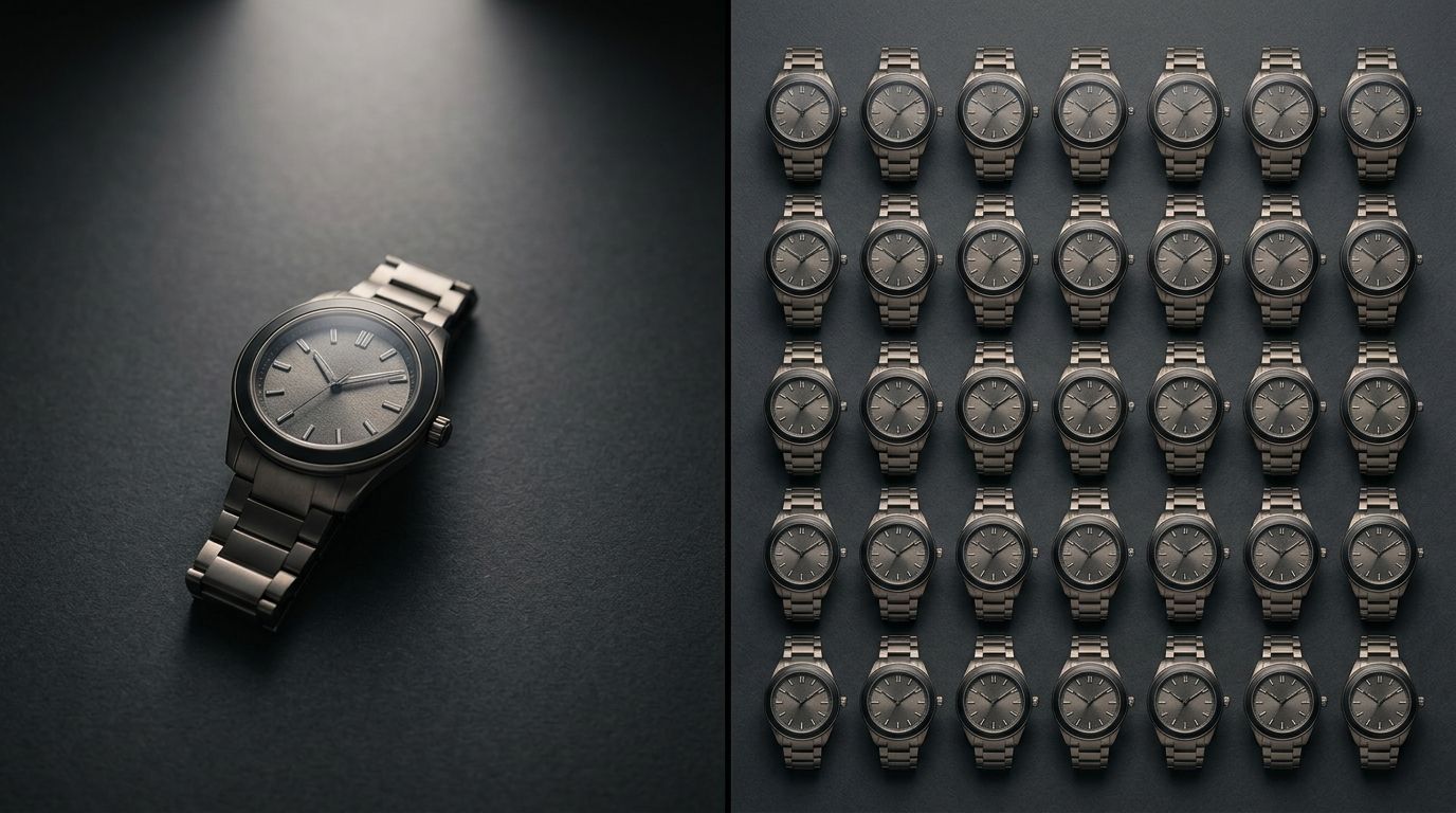
The visual trap of the warehouse look
Most ecommerce brands treat multi-unit product photography as a math problem rather than a styling challenge. The logic is simple but flawed. If the customer is buying three items, show them three items exactly as they appear in the single-unit hero shot. This approach creates a rigid, grid-like composition that strips all aspiration away from the purchase.
When you line up multiple identical items strictly facing forward, you evoke the visual language of a wholesale distributor. It triggers a budget-conscious mindset in the consumer. They stop evaluating the quality of the formula or the prestige of the brand. They start doing division in their heads to figure out the cost per ounce. You have entirely changed the psychological context of the sale from desire to arithmetic.
If you want to maintain your perceived market value, you have to frame the quantity purchase as a lifestyle upgrade. Fixing an ecommerce brand that looks cheap without a massive rebrand often starts right here. The goal is to make the customer feel like they are stocking their beautiful pantry with essentials they refuse to live without. They are not hoarding. They are preparing elegantly.
| Visual Element | Warehouse Bulk Strategy | Premium Abundance Strategy |
|---|---|---|
| Product Placement | Rigid, identical rows facing forward | Overlapping depth with staggered angles |
| Lighting Setup | High contrast with mathematical highlights | Soft, directional light wrapping the entire group |
| Background Staging | Stark white or pure transparent void | Contextual lifestyle environment with props |
| Consumer Perception | Budget compromise and mere utility | Aspirational wealth and lifestyle preparedness |
Why duplication always fails in volume purchase product images
Digital duplication is the enemy of premium volume photography. When an editor copies and pastes a product file, the relationship between the object and the light source becomes physically impossible. Human eyes are incredibly adept at spotting fake lighting environments. We might not know the technical term for a mismatched specular highlight, but our brain instantly flags the image as inauthentic.
This inauthenticity bleeds into the perception of the product itself. If the image is a cheap shortcut, the customer assumes the product is too. Your buy more save more ecommerce visual must exist in a shared physical space. The items must cast shadows on one another. They must reflect the same ambient environment. When you group physical items properly, they become a single cohesive subject rather than a scattered collection of individual parts.
Framing quantity buy photography ecommerce correctly
To communicate value without cheapening the brand, you must rethink the geometry of the shot. A single hero product usually stands tall and proud, dominating the center of the frame. Multiple units require a completely different compositional strategy to remain elegant.
The secret is overlapping placement. Do not leave awkward white space between the units. Group them closely. Let the front bottle slightly obscure the side of the back bottle. This grouping technique immediately signals unity and abundance. It softens the commercial edge of the transaction.
The geometry of the multi-unit product shot
(Worth noting: you do not have to hide the product labels to achieve this. You just have to stop treating the labels as the only important part of the composition. Shoppers already know what the product is. They are currently deciding how many to buy.)
Introduce varied angles. If you are selling a bundle of three jarred candles, leave the front candle unboxed with the lid resting gently beside it. Keep the second candle fully assembled behind it. Place the third candle partially visible in the background, out of focus. This approach tells a story of immediate use and future reserve. It is a highly effective way to use tactics to increase average order value through photography.
The lighting for a volume shot must also adapt. A single strong light source that works beautifully on one bottle might create harsh, distracting shadows when hitting three bottles clustered together. You need a broader, softer light source that wraps around the entire group, highlighting the texture and premium finish of the materials across the entire frame.
Contextualizing the buy more save more ecommerce visual
A pure white background is highly effective for a single SKU. It removes distraction. But when you are trying to sell a lifestyle of abundance, the white background works against you. It provides no context for the quantity.
This is where environmental staging becomes crucial. Three bottles of premium olive oil standing on an endless white void look like a restaurant supply order. Those same three bottles grouped on a rustic wooden kitchen counter, bathed in warm morning light next to a bowl of fresh tomatoes, look like the foundation of a magnificent dinner party. The context justifies the volume.
The stocked pantry photography approach
We call this the stocked pantry approach. The visual narrative should communicate that this product is so essential to the customer's daily routine that running out is unacceptable. The environment must reflect the desired state of the target consumer.
For cosmetics, this means rich textures, marble surfaces, and soft bathroom lighting. For supplements, it means clean, modern kitchen aesthetics. The key is integration. The products should look like they naturally live in these spaces. Creating this context is a massive part of understanding the specific visual elements of product photos that convert today.
Admittedly, there is a distinct trade-off here. Styling multiple identical products in a single environmental frame usually creates an uncomfortably deep depth of field, forcing photographers to compromise on background blur to keep all the labels readable. Getting this balance right in a traditional studio requires a highly skilled technical photographer and significant setup time.
Scaling volume purchase product images without the massive studio bill
This brings us to the operational bottleneck. Organizing a photoshoot specifically for your multi-unit bundles is exhausting and expensive. Most brands simply skip it because justifying a separate studio day just to shoot three bottles next to each other feels like a poor allocation of marketing budget.
The setup time for grouping multiple reflective items is notoriously long. The photographer has to manage complex reflections between the bottles. The retoucher has to spend hours cleaning up the overlapping shadows. The per-image cost skyrockets, which is ironic considering the entire goal of the image is to offer a volume discount.
Why AI changes the math of bundle visuals
This is exactly where general-purpose AI image tools fail and purpose-built platforms thrive. A general AI tool struggles to keep your specific product label accurate when generating multiple units. It tends to hallucinate text or alter the packaging dimensions.
CherryShot AI handles this entirely differently. You can upload your single hero product image and select a visual mode that specifically supports environmental abundance. Whether you choose the Lifestyle mode to create that beautiful bathroom vanity context or the Minimalist mode for a clean, overlapping studio look, CherryShot AI understands how to ground the product realistically. The lighting matches. The shadows behave properly. The labels remain crisp.
Instead of spending three weeks negotiating with a studio over the styling of a bundle shot, you generate the campaign-ready volume visual in minutes. The per-image cost drops to under $5. More importantly, you stop presenting your most profitable offers as cheap afterthoughts. You protect your brand equity while aggressively driving up your average order value.
Frequently Asked Questions
How do I photograph volume purchase options for ecommerce?
Style multi-unit product shots by grouping physical items together in a shared lighting environment to create natural depth. Avoiding simple copy-and-paste duplication ensures the products cast realistic shadows on one another, signaling a premium offering instead of cheap warehouse inventory. Overlap the edges of the bottles slightly and introduce contextual props to frame the purchase as an aspirational, stocked pantry upgrade.
Does multi-unit photography affect volume purchase conversion?
Multi-unit photography directly determines your volume purchase conversion rates by signaling the perceived quality of your bundled goods. An artificially duplicated image implies low brand value and trains buyers to view the higher-margin offer as a cheap clearance sale. Frame larger purchases as an investment in lifestyle continuity by physically staging the items together to create a premium, cohesive scene.
How do I make quantity purchases look aspirational in photos?
Make quantity purchases look aspirational by staging the products inside a high-end environmental context instead of a stark white void. Placing three bottles of premium shampoo in a sunlit shower niche emphasizes the luxury of never running out of a favorite essential. Use soft, directional lighting that wraps around the entire group to highlight the premium materials of the packaging across every single unit.
What is the difference between abundance and bulk photography?
Abundance photography relies on negative space and environmental context to make a large quantity of items look highly desirable. Bulk photography simply crams identical units into a rigid grid to prove the math of a discount, which signals utility and compromise. Shift away from a warehouse look by styling the physical spacing and applying unified lighting to evoke wealth and aesthetic satisfaction.
How do I show multiple units without looking like a warehouse?
Prevent a warehouse aesthetic by breaking the visual grid and staggering the physical placement of your items. Lining up identical units in perfect rows facing exactly forward creates commercial rigidity that triggers budget-conscious thinking in consumers. Allow one unit to lay flat or appear partially unboxed while surrounding the group with complementary lifestyle props to anchor them in reality.
Key Takeaways
- Never rely on digital duplication to create bundle imagery because fake lighting destroys brand trust.
- Overlap your products physically to create depth and signal an aspirational lifestyle rather than a warehouse.
- Use environmental contexts and lifestyle props to justify the quantity purchase visually.
- Eliminate the studio scheduling bottleneck by using AI to generate multi-unit lifestyle contexts from a single reference image.
Volume discount visual ecommerce does not require sacrificing your brand prestige. When you prioritize lighting, styling, and environmental context over rigid math, your multi-unit photography becomes a powerful tool for growth. You elevate the perceived value of the bundle. You give the customer a compelling visual reason to click the higher price point. If the logistical nightmare of setting up these shots is holding your catalog back, let CherryShot AI build those environments for you in minutes.
Audit your bundle listings before your next promotion
Review your highest-margin multi-pack listings to see if they rely on artificially duplicated product files. If your current visuals signal a warehouse clearance rather than premium abundance, you can generate overlapping lifestyle layouts from a single reference photo. Fix your volume visuals to stop leaving high-margin revenue on the table.
Try CherryShot AI