What is Wrong with My Product Photos?
If you are staring at your store analytics and asking yourself what is wrong with my product photos, you already know the answer. They look cheap. You can tweak your ad copy and optimize your checkout flow all month long. If your main product image looks like it was shot on a dirty smartphone in your kitchen, buyers will bounce.
Definition
Product photography refers to the commercial visual representation of merchandise. In an online store, these images serve as the primary proxy for the physical item, providing customers with necessary information about quality, scale, and intended use.
Most founders blame their pricing or their traffic quality when conversions stall. The truth is much simpler. Your imagery is failing to answer basic customer questions. A bad product photo creates friction, and friction kills sales. Buyers cannot pick up your item, feel the weight of it, or check the stitching. Your photos have to do all of that heavy lifting for them.
I have sat in countless marketing meetings where brands try to diagnose poor sales performance. The team looks at everything except the actual visuals. Worth noting, you do not need to be a professional photographer to spot these flaws, but you do need to stop looking at your products like a proud founder and start looking at them like a skeptical stranger.
The Baseline Technical Audit
Start your product photo quality check with the raw technical elements. You cannot hide bad lighting behind a Lightroom preset. Look closely at the shadows in your current images. If they are harsh, deep, and distracting, your lighting was either too close or completely un-diffused. Good product lighting wraps around the object smoothly.
Color accuracy is another massive trap. If you sell a navy blue sweater and it looks charcoal gray on a mobile screen, your return rate is going to punish you. When customers open a package and see a color they did not expect, they do not blame their screen. They blame your brand.
Finally, look at the edges of your product. Are they sharp? If you zoom in and the edges blur into the background, your depth of field was wrong during the shoot. This is a classic bad product photography mistake that makes a premium fifty-dollar item look like a cheap five-dollar drop-shipped knockoff.
Framing, Cropping, and the Grid View Disaster
Are your products breathing? A very common failure point is the crop. If your product touches the very edge of the frame, the image feels claustrophobic. If the product is too small, it feels insignificant. You need a consistent margin across your entire catalog.
This becomes painfully obvious on your collection pages. If your framing varies from shot to shot, your products will appear to bounce up and down in the grid view. This inconsistency destroys visual trust. If you really want to know what makes product photos convert, look closely at the negative space around the items. Top tier brands guard their negative space obsessively.
Context and Scale: The Real Reason They Bounce
| Feature | White Background | Lifestyle Shot |
|---|---|---|
| Primary Goal | Marketplace compliance | Emotional connection |
| User Benefit | Clear product view | Real-world scale |
| Conversion Impact | High (Baseline) | Very High (Trust) |
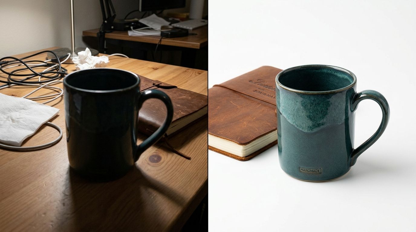
Shooting your product on a pure white background is mandatory for most marketplaces. It is also the absolute fastest way to strip away all sense of scale. If a buyer cannot tell if your ceramic bowl is meant for eating cereal or serving salads to a family of four, they will not buy it.
You need contextual lifestyle images to anchor the product in reality. Historically, this meant booking a location, hiring a stylist, gathering props, and hoping the weather held up for natural light. The logistics were a nightmare. The invoice arrived weeks after the campaign was supposed to launch.
Now, you can just upload your basic white background shot to CherryShot AI, select the Lifestyle or Minimalist mode, and generate dozens of contextual scenes in minutes. The per-image cost drops from roughly eighty dollars down to under five. The bottleneck shifts completely from production time to how quickly you can launch the listing.
I will admit a genuine trade-off here. If you need a highly complex hero image involving live models interacting with your product in very specific, dynamic ways, a freelance photographer is still your best bet. But for the heavy lifting of your catalog volume, running full studio shoots for simple contextual scenes simply does not make financial sense anymore.
The Detail Deficit: What Are You Hiding?
Most brands do not show enough angles. A customer cannot walk up to their monitor and turn your product upside down. Your photos must replicate that physical retail experience.
Check your listings right now. Do you have the straight-on hero shot? Good. Do you have a 45-degree isometric angle? Do you have a macro shot of the texture, the zipper, or the ingredient label? Do you have a shot showing the premium packaging? Missing angles leave room for doubt. These exact visual gaps are frequently the hidden causes of low add-to-cart rates for otherwise healthy brands.
Benchmarking Against Competitors
The best way to run a product listing image review is to face reality head-on. Open an incognito browser window. Search for your primary category keyword. Open the top three organic results and put them side-by-side with your product page.
Look at their lighting style. Are they using soft, diffused light while yours looks like a camera flash went off in a dark room? Are they using clean, aspirational aesthetics while your backgrounds look gray and muddy? Establishing strict brand guidelines and keeping product photos consistent across your entire grid is the fastest way to signal reliability to a new buyer.
If their photos look cohesive and yours look like a collection of random test shots taken on different days, you have successfully diagnosed your problem.
The Photography Self-Audit Framework
To make this actionable, here is a quick diagnostic breakdown you can use to score your own catalog right now. Do not grade yourself on a curve.
| Audit Category | Professional Standard | Common Warning Sign |
|---|---|---|
| Lighting | Soft shadows, even exposure, wrapped light | Harsh black shadows, blown-out bright spots |
| Color Accuracy | Matches physical item precisely under daylight | Washed out, or tinted yellow by room lighting |
| Backgrounds | Pure white (#FFFFFF) or deliberate lifestyle context | Muddy gray, visible seams, or wrinkled paper |
| Coverage | 5 to 8 angles covering all features and details | 1 or 2 front-facing shots only |
| Scale | Clear context showing the actual size of the item | Floating in empty space, size completely ambiguous |
| Consistency | Margins, lighting, and angles match entirely | Every single product is cropped differently |
Frequently Asked Questions
How do I know if my product photos are good enough?
Good product photos accurately represent the physical item while answering every visual question a potential buyer might have. Sharpness, correct color calibration, and consistent cropping serve as the primary indicators of quality. Conversion rates falling below the industry average for your specific category often signal that your imagery is failing. Compare your main hero image side-by-side with top competitors to see how your visual presentation holds up against the market leaders.
What makes a product photo look unprofessional?
Harsh, deep shadows and poor cropping are the most common signs of amateur photography. These issues often arise from using improper lighting setups like direct camera flashes or desk lamps. Muddy, off-white backgrounds frequently make a product look cheap and poorly produced. You must provide clear visual cues regarding scale and texture, as failing to show these details leaves customers guessing about the actual nature of the item they are viewing.
How many product photos do I actually need?
Five to eight photos per product listing is the ideal standard for most ecommerce stores. Every page needs a pure white background hero shot, a 45-degree angle, a back or side view, a close-up material detail, and a lifestyle shot. Providing fewer than three photos leads to buyer hesitation and lost sales. Conversely, excessive identical angles create scroll fatigue without providing the information necessary for a customer to feel confident in purchasing.
Should I retake all my product photos?
Prioritize auditing your ten best-selling products before planning a massive reshoot of the entire catalog. Measure the impact on your conversion rate after replacing the images for those specific high-traffic items. If sales improve, the data will provide a clear justification for updating the rest of your inventory. Modern AI tools help you create new backgrounds, adjust lighting, and generate lifestyle context from your existing assets without booking an expensive professional studio session.
How do I compare my product photos to competitors?
Display your product page and your competitor's page simultaneously on a desktop monitor for a direct visual audit. Squint at both pages to blur the details and focus on the overall impression. Assess whether their product appears brighter, larger, or better framed than your own. This harsh reality check identifies specific flaws in lighting consistency and image quality that are often invisible when you are only looking at your own store in isolation.
Key Takeaways
- Bad lighting and incorrect color matching will actively drive up your return rates.
- Inconsistent cropping on collection pages instantly lowers visual trust in your brand.
- Pure white backgrounds strip away scale, making lifestyle images a mandatory addition.
- You can bypass expensive reshoots by using AI to generate missing context and angles from existing shots.
Audit your product page images before your next campaign
Use the framework above to identify the specific visual leaks in your top-performing products. You can use CherryShot AI to generate professional-grade lifestyle backgrounds and consistency adjustments for your existing catalog today.
Try CherryShot AIYour product photos serve as your storefront window, your sales team, and your fitting room all at once. If you run this audit and find your current listings lacking, stop accepting the hidden cost of bad aesthetics. You can use CherryShot AI to fix your catalog, generate campaign-ready photos, and get your visual quality back on track before your next major launch.