Colour Accuracy in Product Photography: Why Getting It Wrong Is Your Biggest Return Rate Driver
If a customer buys a navy blue jacket and opens a box containing a royal blue jacket, they are sending it back. Colour accuracy in product photography is the single largest preventable driver of ecommerce returns. When your photos misrepresent the actual item, you are not just losing a sale. You are paying outward shipping, return shipping, restocking fees, and destroying customer trust in a single transaction.
Definition
Colour accuracy in product photography is the precise alignment between how an item looks on a digital screen and how it appears in physical reality under neutral lighting. It ensures that the digital data captured by the camera sensor faithfully matches the actual dyes, paints, or materials of the product being sold.
Every brand founder knows returns kill margin. Most misdiagnose the cause. A sudden 15% spike in returns on a new SKU is rarely a sizing problem. It is almost always a product photo color mismatch between your studio shots and physical reality. Fixing this requires stopping the drift that happens between the physical product, the camera sensor, the retoucher's monitor, and the customer's screen.
The margin cost of a missed shade
You launch a new collection. The hero images look incredible. The lighting is moody, the shadows are dramatic, and the engagement metrics are high. Two weeks later, the return requests flood your inbox. The common complaint is that the item does not look like the photo.
This scenario plays out constantly in fashion, home goods, and beauty. A customer expects a warm terracotta and receives a flat orange. They expect an olive green and get a vibrant forest green. The financial impact of this gap is staggering. You lose the initial acquisition cost. You absorb the fulfillment cost. You pay the return label cost. If the item goes out of season while sitting in a return processing center, you take a markdown hit.
Poor imagery is the leading driver of these preventable losses. Doing a deep dive into how poor imagery inflates your return rate reveals that a single inaccurate lighting setup can wipe out the profitability of an entire product line. Relying on "close enough" colour matching is a luxury no ecommerce brand can afford.
Why traditional shoots fail at product color accuracy ecommerce
Mixed lighting and white balance drift
A studio is a chaotic environment for light. You might have daylight balanced strobes mixed with a warm modeling lamp. You might have sunlight leaking through a window. Every light source has a different color temperature measured in Kelvin. Camera sensors try to average these out using white balance, but they often guess wrong.
This creates white balance product photography issues where a white shirt looks slightly blue or a grey sofa looks vaguely purple. A photographer shoots hundreds of frames. By the time the files hit the computer, the baseline colour has shifted away from the physical object. The person editing the photos is now working from a flawed starting point.
Heavy-handed retouching
Retouchers want images to look appealing. They bump up the contrast and push the saturation to make the product pop on a small screen. This makes the image look better as a standalone piece of art, but it completely destroys the true color ecommerce photos you actually need for your product page.
Finding methods to process images without relying on heavy post-production tricks is the only way to protect your product's actual appearance. Every time someone moves a slider in editing software, they are making a subjective guess about what the product should look like. That guess usually happens miles away from the physical item, practically guaranteeing a mismatch.
Fabric textures and specular highlights
Certain materials actively fight camera sensors. Velvet, silk, and satin absorb and reflect light in complex ways. A flash bouncing off a satin dress creates bright white highlights that wash out the underlying dye color.
Understanding the nuances of capturing garments under studio lighting is critical if you sell apparel. If the photographer does not control the reflections, the camera records a lighter, washed-out version of the garment. The customer orders based on the shadows and returns based on the highlights. This makes fashion color accuracy photography incredibly difficult to execute at volume.
Preserving product truth with AI
This is where the traditional studio model breaks down entirely. Getting perfect colour accuracy across fifty different lifestyle shots requires an agonizing amount of manual retouching. You end up paying someone to painstakingly adjust the hex codes on a dozen different images just to make the product look consistent.
| Workflow Approach | Traditional Studio Pipeline | AI Photography Pipeline |
|---|---|---|
| Colour Correction | Manual adjustments on dozens of individual files | One calibrated source file locked in at capture |
| Lighting Variables | Multiple conflicting setups that shift baseline hues | Consistent neutral baseline applied mathematically |
| Scaling Effort | Requires tedious hex code matching across all shots | Platform generates environments without altering core pixels |
AI product photography changes the production pipeline. Instead of shooting fifty setups and trying to fix the colour in all of them, you focus entirely on one perfect reference shot. You put your item under controlled, neutral lighting. You capture the exact, accurate color product photography you need on a simple flat lay or ghost mannequin.
You upload that single source of truth to CherryShot AI. You select a visual mode like Lifestyle or Minimalist. The platform generates the surrounding environment, the shadows, and the context without ever altering the pixels of your original product. The colour accuracy is locked in at the source. Your product looks exactly the same across a brutalist concrete background as it does on a sunny kitchen counter.
To be clear, AI cannot magically fix an uploaded reference photo that was shot in a dark basement on an old smartphone. You still have to provide a properly lit, colour-true source image for the AI to build around. Once you do, the logistics of scaling that image drop to zero.
(Worth noting: some fabrics like iridescent synthetics will always look slightly different under natural sunlight than they do indoors, no matter how perfectly you calibrate your studio lighting.)
Standardizing your visual pipeline
Product photography color calibration
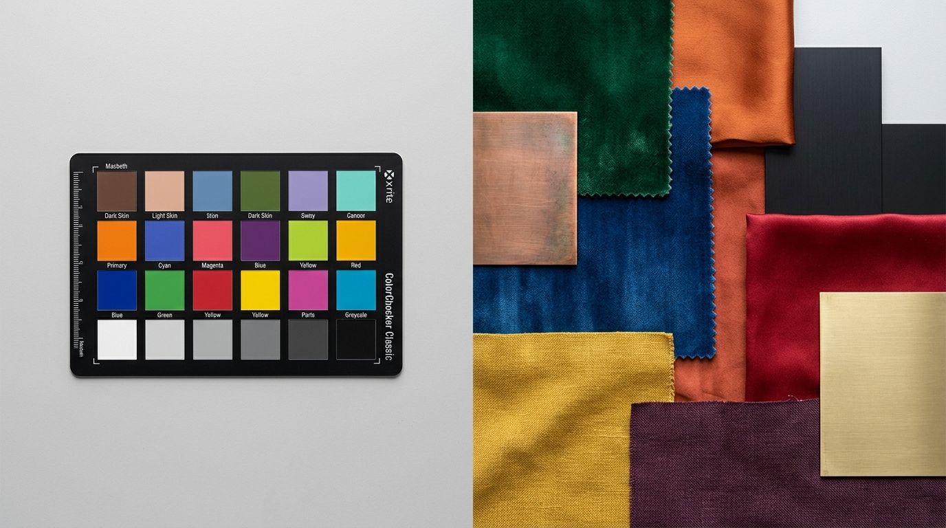
If you are capturing that initial reference shot, you need physical calibration tools. Placing a standard gray card in the first frame of a lighting setup gives your camera a mathematical baseline for neutral white. This eliminates the guesswork and secures your color calibration photography protocols.
The monitor used to review these images must also be calibrated. Editing on a standard laptop screen is a fast track to high return rates. Laptop screens are heavily saturated and biased toward cool blue tones to make videos look better. You need a dedicated, color-calibrated monitor designed specifically for photo editing to ensure what you see is what the customer actually gets.
Managing screen variance
You cannot control the brightness or the night-shift settings on a customer's phone. A product photo will look different on a five-year-old screen than it does on a brand new display. You can only control your own output.
Providing a baseline of absolute true colour ensures that any screen variance happens uniformly. If you start with inaccurate photos, the customer's screen variance will only magnify the error. Start from an objective truth. When the product arrives, it must match the expectation you built online.
Frequently Asked Questions
Why does my product look a different colour in photos?
Camera sensors process light mathematically rather than adaptively like the human eye, meaning they easily misinterpret reality. Mixing daylight with artificial bulbs forces the camera to average conflicting colour temperatures into a single, inaccurate white balance baseline. Place a physical grey card in your first test shot to give both the sensor and your editing software a fixed anchor for true neutral tones.
How do I make product photos show true colour?
Standardize your lighting environment to a single source to prevent mixed color temperatures from confusing the camera sensor. Eliminating ambient room light and firing only daylight-balanced 5500K strobes establishes an absolute baseline for consistency across your entire shoot. Always review and edit the resulting files on a hardware-calibrated monitor, as default laptop screens heavily exaggerate saturation and mask subtle hue shifts.
What causes colour inaccuracy in ecommerce photos?
The primary causes of visual misrepresentation are conflicting studio lighting sources and aggressive post-production adjustments. Editors frequently increase contrast and saturation to make images stand out on small phone screens, which completely destroys the factual representation of the physical item. Mandate strict visual guidelines that forbid subjective hue adjustments and require all editors to match files against physical product samples under neutral light.
How does colour inaccuracy in product photos cause returns?
Presenting a false hue breaks the foundational promise made at checkout by delivering a physical item that contradicts the visual evidence. Customers buy items to match specific aesthetics or existing wardrobes, so receiving a vibrant orange cushion instead of a muted terracotta triggers an immediate sense of betrayal. This mismatch generates an automatic return request that forces you to absorb the initial shipping fee, the return label price, and warehouse restocking labor.
What is the best lighting for colour-accurate product photography?
Isolated, daylight-balanced continuous panels or strobes provide the most reliable environment for capturing factual tones. Equipment rated between 5500K and 5600K accurately mimics neutral midday sun without injecting the heavy blue or orange tints found in standard office bulbs. Block out all windows and turn off overhead fixtures completely before striking your studio flashes to prevent ambient spill from polluting your sensor data.
Key Takeaways
- Colour inaccuracy is a leading driver of costly and entirely preventable ecommerce returns.
- Mixed studio lighting and heavy-handed retouching destroy product colour truth.
- Controlling the initial reference shot eliminates the need for mass manual color correction.
- CherryShot AI scales a single accurate product image across dozens of environments without altering core pixels.
Selling products online requires an unbroken chain of visual trust. The moment your imagery lies to a customer, you lose margin and you lose repeat business. Lock down your color accuracy on a single perfect frame. Then let CherryShot AI handle the scale.
Audit your product page images before your next campaign
Pull up your top-returned SKU and compare the physical item to your live hero image on three different monitors. If you spot a stark difference in saturation or hue, you are losing margin to preventable returns. Generate flawless lifestyle shots from a single, colour-calibrated reference photo without touching editing software.
Try CherryShot AI