Why Do My Competitors' Product Photos Look Better Than Mine?
You are staring at a competitor's product page and wondering why their items look like luxury goods while yours look like a garage sale. The reason why competitors product photos look better is rarely their camera. It is consistency, lighting control, and context. Most brands have a product photography competitive gap because they treat images as an afterthought rather than a core conversion lever. Closing this gap does not require a massive budget. It requires identifying the exact missing visual signals.
Definition
The product photography gap is the objective difference in visual quality between a brand’s current assets and those of their top-performing competitors. It is measured by inconsistencies in lighting, background styling, and contextual depth that directly influence consumer trust and conversion rates.
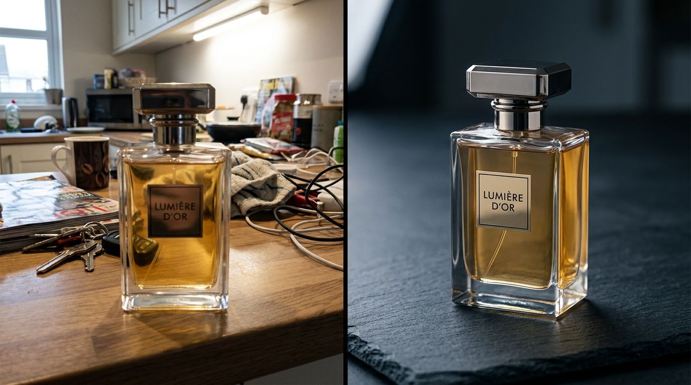
It happens to every founder. You refresh a competitor's site and feel an immediate sinking sensation. Their catalog looks cohesive. Their lifestyle shots look effortless. Your site looks like it is trying too hard. When trying to figure out how to match competitor product photos, the immediate instinct is to fire your freelance photographer and double your production budget. Do not do that yet.
I have personally sat through studio shoots that ran four hours over schedule. I have argued with art directors about whether a shadow angle was close enough to the brand guidelines. I have paid invoices that arrived two weeks after the campaign was supposed to launch. Throwing more money at a broken production process does not fix bad photos. Fixing the actual gaps in your visual presentation does.
Any brand still running a full studio shoot for standard catalog images is paying for logistics instead of quality. If you want professional looking product photos, you need to systematically break down what your competitors are doing right. There are five specific gaps you need to address.
Gap 1: The Lighting Consistency Problem
Lighting is the immediate giveaway of an amateur shoot. Look closely at your current product grid. Does the light hit the product from the left in one image and the right in the next? Are the shadows incredibly harsh in your lifestyle shots but completely absent on your pure white backgrounds? This inconsistency signals to the buyer that your brand lacks attention to detail.
Shadows tell the truth about your budget
Competitor product image quality stems from rigid lighting guidelines. Top tier brands do not let photographers guess on set. They document exactly how soft a shadow should be and exactly where the light source is positioned. This creates a psychological rhythm for the buyer. When every image on the page shares the exact same lighting environment, the catalog feels established and expensive.
You have two choices to fix this. You can hire a studio and enforce a ruthless style guide. Or you can bypass the physical studio entirely. With an AI tool, you dictate the environment digitally. Upload a product image, select a visual mode like Classic or Minimalist, and CherryShot AI handles the shadow falloff automatically. The lighting remains perfectly consistent across every single SKU because the computer does not get tired or bump the light stand by accident.
Gap 2: Context and Scale
Buyers need visual anchors. If you are selling a $200 ceramic vase, placing it on a stark white background makes it look identical to a $20 drop-shipped alternative. High-end brands use context to justify their price tag.
Selling the environment over the item
They place that vase on a travertine table or against a textured plaster wall. They surround it with objects that communicate scale and lifestyle. By doing this, they are not just selling the object. They are selling the aesthetic life of the person who owns that object.
| Feature | Amateur Approach | Professional Approach |
|---|---|---|
| Lighting | Inconsistent angles | Standardized shadow profile |
| Environment | Plain white background | Contextual lifestyle staging |
| Material | Flattened appearance | Tactile texture emphasis |
| Workflow | Slow studio reshoots | Rapid AI-driven iteration |
A direct look at the visual gap between standard catalog shots and campaign-ready imagery.
(Worth noting: sourcing physical props like travertine tables and renting architectural lifestyle locations is exactly what balloons traditional photography budgets to unsustainable levels.)
You do not actually need to rent a mid-century modern house in the hills to get these shots. You just need the visual cue. Choosing the Lifestyle or Magazine mode inside CherryShot AI instantly builds these high-end contextual environments around your product without requiring a single prop stylist.
Gap 3: Texture and Material Translation
Competitors win when they make digital images feel incredibly tactile. Zoom in on their product page. You can almost feel the weave of the fabric, the grain of the leather, or the matte finish of the metal. Poor photography flattens texture completely. It blasts the product with so much front light that all depth and material quality disappears.
Making digital images feel tactile
If you want to improve product photos vs competitors, you have to prioritize texture. Flat lighting makes expensive materials look like cheap plastic. Directional lighting creates the micro-shadows necessary to show off material quality. This specific attention to texture is often the root cause of the visual difference between brands operating in the exact same price tier.
When you conduct a competitor photography audit, look exclusively at how they light dark materials. If they are selling a black leather wallet, how do they keep it from looking like a black void? They use specular highlights. They bounce light specifically to catch the edge of the material. You must adopt this exact standard.
Gap 4: The Hero vs. Catalog Divide
This gap is where conversions actually drop. Imagine this scenario. Your Instagram ad features a beautiful, moody lifestyle shot. The customer is intrigued and clicks through. Then, the product page loads. They are greeted by a poorly lit, grainy catalog image that looks absolutely nothing like the ad they just clicked.
When the ad does not match the product page
This visual dissonance kills trust instantly. The customer assumes the ad was deceptive. Competitors maintain visual continuity from the very top of the funnel all the way down to the checkout button. The lighting vibe of the hero image matches the lighting vibe of the detailed catalog shots.
If you have noticed bounce rates spiking right after the click, fixing the visual gaps costing sales between your acquisition channels and your owned properties is mandatory. Your grid images cannot feel like they belong to a completely different company than your hero banners.
Gap 5: Production Speed and SKU Adaptation
The final gap is not about the final image on the screen. It is about how fast the brand gets that image onto the screen. If your competitor can launch a new collection with full campaign imagery in three days, and you need three weeks to book a photographer, ship physical samples, and wait for external retouching, you are always going to look a step behind.
The hidden cost of slow iteration
The ability to iterate visually is a massive competitive advantage. When you can generate imagery for a new colorway in twenty minutes instead of booking another shoot day, the bottleneck shifts from production to ideas. This is the ultimate equalizer for emerging brands.
General-purpose AI image tools struggle with keeping the product details exact. Dedicated tools built for commerce handle this effortlessly. If you need to visualize five different color variations of the same product, you use the Upload Ref mode in CherryShot AI to keep the exact angle and styling while swapping the product perfectly. At a pricing model that starts at $10 for 50 images, the financial argument for physical reshoots simply falls apart.
To be completely transparent, using an AI tool to generate your imagery means you sacrifice the unpredictable, happy accidents that sometimes happen on a live set. However, for 95% of an ecommerce catalog, you do not want happy accidents. You want predictable, scalable consistency.
Closing the photography gap requires an honest look at your current output. You have to admit where the shadows fall flat and where the context feels cheap. If you are serious about competing, run the AI photography cost comparison against your current studio spend. You will quickly realize that matching your competitor's visual quality is no longer a budget problem. It is just a workflow choice.
Key Takeaways
- Lighting consistency across your entire catalog is the primary signal of brand quality.
- Context and scale justify your pricing by showing the product in its intended lifestyle environment.
- Flat lighting destroys material texture and makes premium products look cheap.
- Production speed is a massive competitive advantage when launching new collections or variations.
Audit your current product page images before your next campaign
Review your top-selling products and compare the lighting consistency against your main competitors. You can immediately identify where visual gaps are harming your conversion rate. Once you spot the inconsistencies, use CherryShot AI to regenerate those specific assets and align your catalog with top-tier industry standards.
Try CherryShot AIFrequently Asked Questions
Why do my competitors' product photos look more professional?
Professional photography relies on consistent lighting, textural depth, and environmental context rather than expensive camera gear. Brands build trust by following strict style guides that eliminate distracting shadows, harsh highlights, or inconsistent background styles. A cohesive catalog communicates higher value to customers, making your brand look established and trustworthy. Small changes in your lighting setup can immediately shift how visitors perceive the quality of your entire inventory.
How do I close the product photography gap with competitors?
Start by auditing competitor imagery to identify specific missing visual signals like shadow softness and background choices. Comparing your current assets against these benchmarks helps you pinpoint exact weaknesses in your presentation. You can reconstruct these high-end elements using AI tools to transform basic shots into professional-grade catalog images. This approach bypasses traditional studio costs while ensuring your final visuals match the standards set by industry leaders.
What makes competitor product photography better?
Superior imagery translates physical product properties into digital assets that convey weight, scale, and material quality. Top brands capture this by balancing macro shots of texture with wider lifestyle images that provide emotional context. They focus on showing where the item belongs rather than just highlighting the product itself. Buyers rely on these visual cues to understand the true finish and quality of the items they intend to purchase.
How can small brands compete with larger brands' product photography?
Emerging brands compete by replacing slow, expensive production methods with agile digital technology. Instead of paying for location scouting and physical sets, you can apply professional lighting and environmental modes to existing product photos. This digital approach generates a premium aesthetic that typically requires a significant production budget. Consistent output across your catalog helps you maintain a high-end visual presence that keeps you competitive in crowded markets.
Can AI photography help match competitor image quality?
AI platforms allow you to control lighting, camera angles, and staging directly through digital inputs. This precision removes the variability common with freelance photographers, ensuring your brand imagery remains uniform. Uploading basic product shots permits you to upgrade the staging instantly to exceed the standards of well-funded competitors. You gain full creative control over your assets, resulting in a cohesive, polished look that converts browsers into paying customers.
Your visual presentation is the only physical interaction your customer has with your product before they buy. Stop letting poor logistics dictate your brand perception. Upload your raw images to CherryShot AI, choose a high-end visual mode, and close the gap on your competitors today.