Instagram Stories Size 2026: Dimensions & Safe Zones
Stop pinching and zooming your horizontal website banners to fit a vertical screen. The exact instagram stories size is 1080 pixels wide by 1920 pixels tall. This translates to an aspect ratio of 9:16. Every time you crop a square catalog shot to force it into this space, you destroy the image resolution, and you usually cut off the context that makes the product desirable in the first place.
Definition
Instagram Stories dimensions refer to the native pixel requirements for full-screen mobile content. Using 1080x1920 pixels ensures that your visual assets fit the vertical interface without scaling errors.
Ecommerce brands that treat the full screen story format as an afterthought end up paying a massive penalty. When a user taps through their feed, they expect native vertical content. If your image looks like a zoomed-in mistake with awkward black bars at the top and bottom, they will skip it in less than half a second. You are burning ad budget on impressions that never had a chance to convert.
Getting your instagram stories dimensions right is not just a graphic design best practice. It is a fundamental requirement for making your products look premium on the platform where your customers actually discover them.
The Exact Instagram Stories Size for 2026
The technical requirements have remained strictly enforced by Instagram for years. If you want your product shots to look crisp, you need to deliver exactly what the platform asks for.
Pixel Dimensions and Aspect Ratio
Your ig stories size pixels must be exactly 1080 by 1920. Anything smaller will be stretched by the app, resulting in a blurry mess. Anything significantly larger runs the risk of aggressive compression. When Instagram compresses a massive 4K file to fit its delivery network, it often introduces harsh artifacts and muddies your brand colors. Keep your exports locked to 1080 by 1920 pixels.
This 9:16 ratio is the standard vertical image dimensions format across almost all social platforms today. Building a reliable library of assets in this size serves your brand far beyond just Instagram.
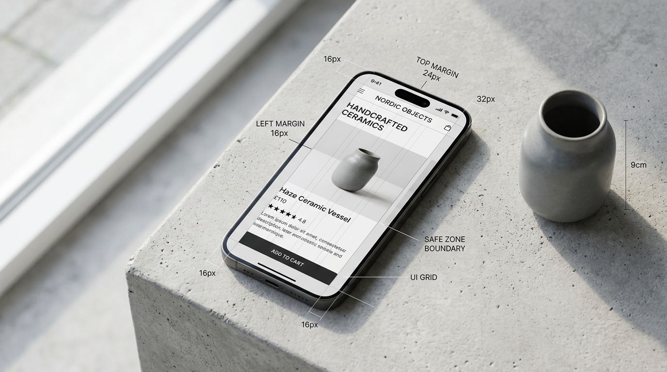
Navigating the Stories Safe Zone
Having the right dimensions is only the first half of the battle. The second half is understanding the stories safe zone. Instagram overlays its own user interface elements on top of your image. Your profile picture, brand handle, and the exit button sit at the top of the screen. The message reply box, reaction buttons, and the share icon sit at the bottom.
If you place key product features or your primary text hook in these areas, they will be completely unreadable. The standard rule is to leave the top 250 pixels and the bottom 250 pixels completely clear of text. Your product needs to sit squarely in the middle of the frame. When you set up an instagram story template size in your design software, draw solid red boxes over the top and bottom quarters to remind your team where not to put the product.
| Placement Area | Buffer Requirement | Primary Risk |
|---|---|---|
| Top 250 Pixels | Clear | Profile and exit UI |
| Center Area | Use | Product focus |
| Bottom 250 Pixels | Clear | Reply and action UI |
Why Cropping Square Photos Damages Your Brand
Most brands launch a product with a standard set of square catalog images and a few horizontal lifestyle banners. When the social media manager needs to post a Story, they grab one of those square images and pinch it until it fills the vertical screen.
This is a terrible strategy for selling physical goods. When you zoom in on a square photo to fill a 9:16 frame, you are throwing away over half of the image data. The texture of your fabric gets lost. The fine details on your packaging become illegible.
If you are just posting a quick behind the scenes video from your warehouse, a less than perfect crop does not matter. But for paid media campaigns and actual product launches, blurry assets destroy consumer trust.
Producing native vertical imagery requires a specific shot list. The genuine trade off here is that custom shooting for every single aspect ratio doubles your time in the studio. You end up paying a photographer to shoot the same product twice just to get a different crop. But if you want product photos that convert, you have to deliver assets that look like they belong on the platform.
Ecommerce Formats That Actually Convert in Stories
Knowing your instagram story photo size is just the technical baseline. What you actually put inside that 1080 by 1920 frame determines whether a user clicks through to your product page or swipes away.
The Feature Breakdown Format
This format uses the vertical space to map out the benefits of your product. Place a high quality product shot in the center of the safe zone. Use the empty space above and below to add crisp text callouts pointing to specific features. Because you have so much vertical room, you can explain why a product matters without making the screen look cluttered. This is highly effective for technical apparel, skincare ingredients, and consumer electronics.
Product Launch Countdowns
Instagram provides a native countdown sticker. The best way to use this is to design a vertical asset specifically around the sticker placement. Leave a prominent blank space in your design right where the sticker will go. Show the product partially hidden or cropped creatively to build anticipation. The background image should feel premium and native to the vertical format.
Before and After Sequences
Stories are tapped through sequentially. Use this behavior to your advantage. Post a native 9:16 image of the problem your customer faces. The next Story is a native 9:16 image of your product solving it. If you are dealing with underperforming ad creative, breaking your value proposition down into a tap through sequence almost always improves your baseline metrics.
Story Ad Dimensions Require Even More Discipline
Running paid ads in Stories introduces another layer of complexity. The technical story ad dimensions are exactly the same at 1080 by 1920 pixels. However, Instagram adds a "Sponsored" tag near the top and often includes a persistent call to action banner at the bottom.
This shrinks your safe zone even further. If your text overlaps with the "Swipe Up" or "Learn More" banner, the ad looks cheap and broken. Always test your story ads organically on a private account before putting budget behind them. You need to see exactly where the app interface lands on your specific image.
Producing Campaign-Ready Stories at Scale
The math on traditional photo shoots breaks down quickly when you need dedicated assets for every social channel. Paying a studio day rate to get horizontal banners, square catalog shots, and native 9:16 Stories for every single SKU simply does not scale for growing brands.
This is exactly why we built CherryShot AI. You upload a standard product image, select a visual mode like Lifestyle or Minimalist, and set your aspect ratio to 9:16. CherryShot AI generates campaign-ready, fully native vertical photos in minutes.
You no longer have to beg your photographer to go back and recrop the raw files. You no longer have to settle for blurry, zoomed-in square photos. When you use CherryShot AI, the bottleneck shifts from waiting on production logistics to actually launching your campaigns. It is the most effective method for scaling ad creative without inflating your monthly marketing overhead.
Generate your vertical assets before the next product drop
Stop relying on cropped square photos that kill your engagement. Turn your existing product library into high-converting 9:16 assets that fit the Instagram interface perfectly.
Try CherryShot AIKey Takeaways
- The exact Instagram Stories size is 1080 pixels wide by 1920 pixels tall.
- Cropping square images for Stories ruins resolution and kills conversion rates.
- Keep critical text out of the top and bottom 250 pixels to avoid UI overlap.
- Generate native vertical assets using AI instead of booking separate studio shoots.
Frequently Asked Questions
What are the dimensions for Instagram Stories?
Instagram Stories require an image size of 1080 pixels wide by 1920 pixels tall. This specific vertical format creates a 9:16 aspect ratio that fills the entire mobile screen. Adhering to these exact pixel dimensions ensures your visual assets appear sharp and professional without awkward black bars or unintended cropping across different device screen sizes.
What is the safe zone for Instagram Stories?
The safe zone encompasses the central portion of the vertical frame where your critical visual content stays visible. You must keep important text and product details at least 250 pixels away from both the top and the bottom edges. This margin prevents the platform interface elements like profile icons, reply boxes, and ad badges from obstructing your primary message.
Can I use horizontal product photos for Instagram Stories?
Horizontal photos create poor user experiences because they either leave significant empty space or force an ugly zoom. Cropping these images to fit vertical screens loses the core product context and degrades image resolution. Always prioritize native 9:16 captures to maintain high quality visuals that effectively highlight the product features your potential customers need to see.
What resolution should Stories images be?
Your Instagram Story exports must be exactly 1080 by 1920 pixels to ensure consistent display quality. Uploading higher resolution files often forces the platform to apply heavy compression, which makes the image look muddy or pixelated. Providing the file at the native resolution allows the app to display your product details cleanly without risking damage from aggressive internal algorithms.
How do I design product Stories that convert?
High-converting Stories occupy the full vertical screen while centering key products within the safe zone. Use bold text overlays to emphasize the core value proposition without creating visual clutter. Clear visual cues that point toward link stickers help guide the viewer toward the next step in your sales funnel with minimal friction.
Stop letting bad formatting ruin great products. Proper dimensions show your customers that you care about the details before they even make a purchase. If you are tired of fighting with awkward crops, head over to CherryShot AI and start generating native 9:16 assets that actually fit the screen.