How to Match Ad Creative to Product Page for Higher Paid Traffic Conversion
You run a Facebook ad that gets a phenomenal click-through rate. Your cost per click is the lowest it has been in six months. Your media buyer is thrilled. But when you look at your Shopify dashboard, the conversion rate is a miserable 0.4 percent. The traffic is there, but the revenue is not. To fix this, you must match ad creative to your product page perfectly. If your ad sells a gritty urban lifestyle but your product page looks like a sterile hospital waiting room, the buyer feels tricked and leaves immediately.
Definition
Visual message match is the practice of ensuring your landing page imagery directly reflects the lighting, setting, and overall aesthetic of the ad that generated the click. Maintaining this visual consistency prevents cognitive friction and immediately reassures the buyer that they are in the correct place.
The click only matters if the visual handoff delivers on the promise. When you master ad to product page optimization, you stop paying for traffic that bounces in three seconds.
Key Takeaways
- A disconnected visual aesthetic between your ad and landing page destroys paid traffic conversion rates.
- Message match applies to lighting, color grading, and product angles just as much as headline copy.
- You do not need to reshoot your entire catalog. Updating the top fold hero image is enough to bridge the gap.
- Replacing standard white backgrounds with contextual lifestyle imagery builds immediate trust after the click.
The Visual Handoff Is Where Paid Traffic Dies
Most ecommerce operators treat media buying and conversion rate optimization as two completely separate departments. The agency handles the ads. The internal team handles the website. This structure almost guarantees a broken conversion funnel. The agency tests wildly different ad angles to find cheap traffic. They use user-generated content, loud influencer graphics, and moody lifestyle shots. Meanwhile, the website team maintains a strict, minimalist template with basic studio catalog photography.
This creates a massive friction point the exact moment a customer clicks. The brain processes images in milliseconds. When a shopper taps an ad featuring a model using a skincare product in a sunlit bathroom, they expect the next page to feel like a sunlit bathroom. If they land on a plain white page with a tiny, shadowless bottle of serum, their immediate subconscious reaction is confusion.
The jarring transition from lifestyle to sterile studio
I have audited hundreds of ecommerce brands leaking money on paid social. The story is almost always the same. They spend ten thousand dollars a month driving traffic to product pages that look like Amazon listings. Amazon can get away with sterile white backgrounds because people go to Amazon with high purchasing intent. They are already there to buy. Social media traffic is entirely different.
Social traffic is interruption marketing. You interrupted someone watching a video of a dog to sell them a coffee maker. You have to maintain the momentum of that interruption. The visual gap between ad and product page is the number one reason interruption marketing fails to convert. If the ad was exciting and the product page is boring, the momentum dies instantly.
Your ad creative sets a visual promise. The lighting, the setting, the vibe. Your product page must fulfill that promise in the very first scroll. If it does not, you are paying for window shoppers who will never add to cart.
A seamless visual handoff maintains the emotional momentum generated by the ad creative.
Message Match Is More Than Just Copy
Marketers talk about message match constantly. Usually, they are talking about headlines. If the ad says "Save 20% on Winter Coats," the landing page better say "Save 20% on Winter Coats." That is basic advertising hygiene. But in ecommerce, visual message match is arguably more important than text.
Aligning the visual conversion funnel
Think about ad to product page optimization as a relay race. The ad is the first runner. The product page is the second runner. Passing the baton requires both runners to be moving at the same speed and in the same direction. When you align your image quality, color grading, and product angles, the baton pass is flawless.
Let us look at a specific example. Suppose you sell tactical outdoor gear. Your winning Facebook ad shows a backpack covered in mud resting on a rocky trail. The lighting is harsh. The colors are muted greens and browns. The user clicks because they identify with that rugged aesthetic.
If they land on a product page where the backpack is perfectly clean, brightly lit, and sitting on a pure white background, the rugged aesthetic is gone. The cognitive dissonance makes them hesitate. Hesitation is the enemy of conversion. To fix this, you need specific landing page visual fixes that incorporate those outdoor elements right into the hero image gallery.
| Handoff Element | Mismatched Strategy | Aligned Strategy |
|---|---|---|
| First Impression | Sterile white studio background | Contextual lifestyle hero image |
| Color Grading | Default camera settings | Mirrors the ad's specific mood |
| Product Presentation | Static shadowless isolation | Dynamic real-world scaling |
| Buyer Reaction | Instant cognitive friction | Immediate aesthetic validation |
(Worth noting: you do not need to build a custom landing page for every single ad variant. Group your ads by visual themes. Have one product page variant for your loud lifestyle ads and another for your clean, feature-focused ads. Route the traffic accordingly.)
How to Audit Your Ad to Product Page Consistency
You cannot fix a leaky funnel until you know exactly where the drop-off happens. Auditing your paid traffic landing page optimization requires looking at your assets the way a distracted consumer looks at them. You cannot look at them on a 27-inch retina monitor sitting in a quiet office. You have to look at them on a phone while walking down the street.
The five-second visual blink test
Take your smartphone. Open your Instagram app and find your own ad. Click the call to action button. Count to five. What do you see before you scroll?
Ask yourself these three strict questions. First, does the background color of the landing page completely clash with the dominant color of the ad? Second, does the product look substantially different in size or scale than it did in the video? Third, is the emotional trigger that caused the click present in the first image on the site?
If the answer to any of those questions is bad news, you have a consistency problem. Your ROAS improvement strategy should focus entirely on fixing that five-second window. Everything below the fold is irrelevant if they bounce before scrolling.
The obvious trade-off here is operational drag. You cannot realistically reshoot your entire product catalog every time your media buyer wants to test a new Facebook ad angle. Traditional photography costs too much and takes too long. By the time you get the new photos back from the studio, the ad fatigue has already set in and you need a different angle anyway.
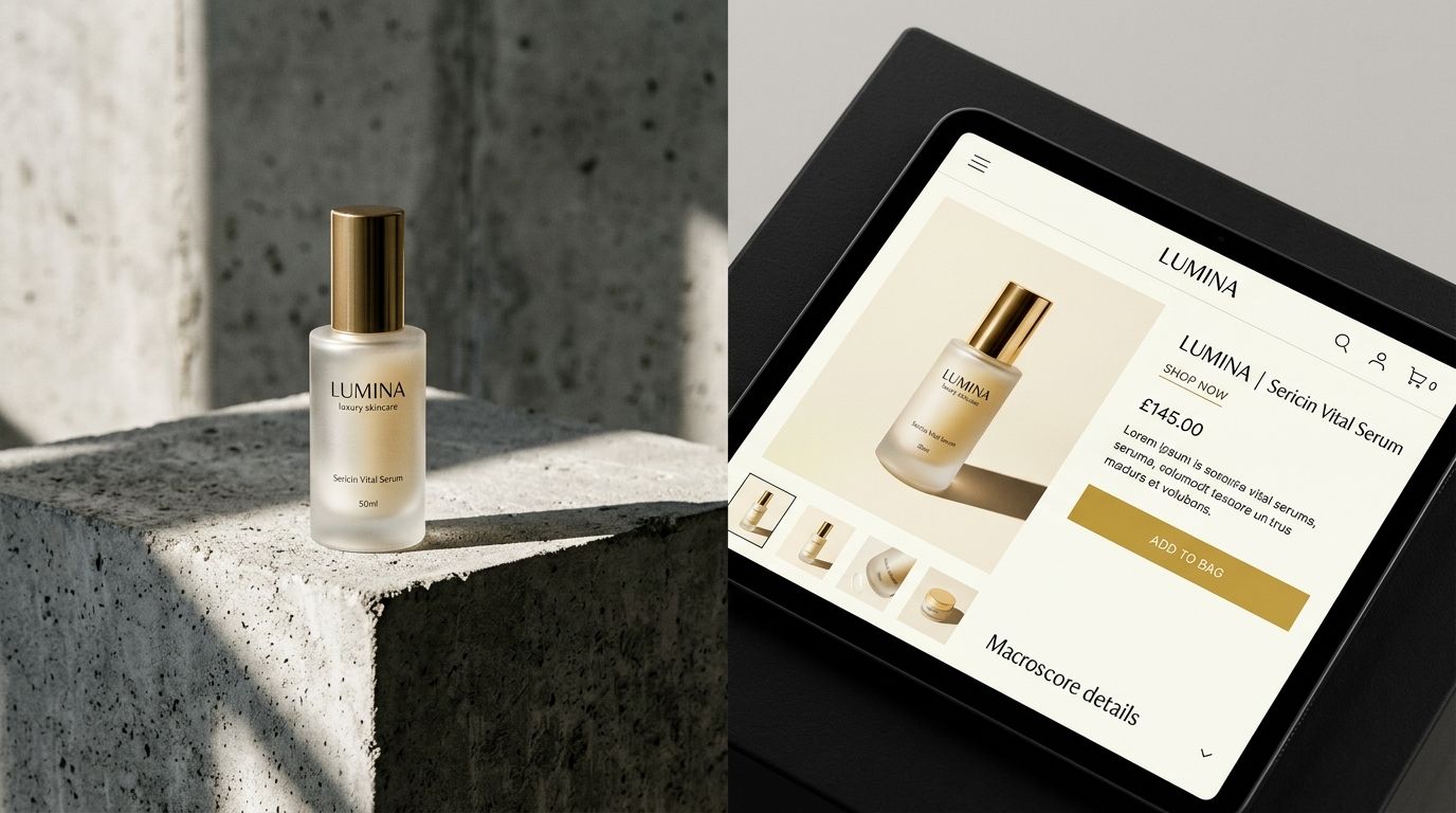
This is where smart founders are changing their workflows. When you need to generate ecommerce ad creative at scale, tools like CherryShot AI remove the bottleneck. You upload your base product image, select a visual mode that matches your current ad test, and generate a cohesive hero image in minutes. You get the alignment you need without paying a photographer to rent a studio for a half-day.
Fixing Paid Traffic Landing Page Optimization
Once you identify the disconnect, you have to execute the fix. The mistake most teams make is trying to overhaul the entire website. They spend weeks redesigning the product template. This is a waste of time. Speed of execution matters more than perfection when you are buying traffic.
Prioritizing the hero section
The first image in your product carousel does 90 percent of the heavy lifting. Leave the standard white background shots as the second, third, and fourth images in the gallery. Shoppers still need those clear shots to understand the details of the product. But the first image must be the bridge.
If your ad uses a Luxury visual mode with dark shadows and sleek reflections, make your product page hero image match that exact Luxury mode. If your ad uses a minimalist, brightly lit aesthetic, carry that bright minimalism into the top banner of the landing page. The goal is cognitive reassurance.
You want the customer to click the ad, see the page, and immediately think they are exactly where they are supposed to be. When the visual handoff is seamless, the bounce rate plummets. When the bounce rate plummets, your cost per acquisition drops. It really is that straightforward.
Frequently Asked Questions
How do I make my product page visually match my Facebook or Instagram ad?
Update the primary hero image on your landing page to reflect the exact lighting and setting used in your winning ad. Bridging this aesthetic gap prevents shoppers from bouncing when they transition from a dark lifestyle graphic to a sterile catalog background. Carry over the same color palette, typography, and model styling into the top fold of the site so the first impression validates the click.
What is message match in paid traffic and why does it matter?
Message match is the alignment between the aesthetic promise made in an ad and the visual reality presented on the landing page. Consistent imagery reduces cognitive friction and prevents shoppers from bouncing before reading your product features. Maintain the same emotional tone across both touchpoints so buyers who click for a specific solution feel validated the moment they arrive.
How do I audit the visual alignment between my ads and product pages?
Click through your best-performing ad on a mobile phone to experience the visual transition to your product page. Observing this handoff firsthand reveals whether your background environments shift drastically from dynamic outdoor lifestyle settings to plain white studio shots. Correct any glaring visual disconnects within those first three seconds by updating the page's main hero section to mirror the original creative.
What should I change first: the ad or the product page?
Modify the product page if your current ad generates cheap clicks and maintains a high click-through rate. The creative has already proven its ability to capture attention, making the landing page the actual bottleneck in your funnel. Swap the hero image to match the ad aesthetic and add a lifestyle banner before deciding to kill a profitable traffic source.
Stop letting good ad traffic die on bad product pages. Fixing the visual alignment between your top of funnel creative and your bottom of funnel landing page is the fastest way to improve your baseline conversion rate. Match the aesthetic, keep the momentum, and watch your metrics improve.
Audit your product page images before your next campaign
Review your top-performing ad creatives and verify that your landing page hero sections match their specific aesthetic. If your catalog photography causes visual friction after the click, generate cohesive, on-brand lifestyle images instantly.
Try CherryShot AI