Product Page Audit for Paid Traffic: The 7-Point Visual Checklist Before You Spend Another Dollar on Ads
You are burning cash if you send paid traffic to a product page that has not been optimized for cold visitors. Founders spend weeks arguing with their media buyers about CPMs and click-through rates. They obsess over the first three seconds of a TikTok ad. Then they send all that expensive, hard-won traffic to a product page featuring one blurry studio image and a block of text copied directly from the manufacturer.
Definition
A product page audit is a systematic review of an ecommerce landing page specifically designed to identify visual and functional friction points that cause paid traffic to bounce. It compares the visual promise of the ad creative against the actual shopping experience to ensure a cohesive transition for cold visitors.
Paid traffic only buys you a visitor. The product page buys you the customer. If the visual experience on the landing page does not match the promise of the ad, the user will bounce in three seconds. That means your ad budget is subsidizing the platforms rather than growing your business.
(To be fair to founders, sometimes a raw and unpolished page actually converts well for highly technical products where the buyer only cares about specs. But for consumer ecommerce brands fighting for attention on social media, bad visuals will kill your margins entirely.)
Achieving perfect visual alignment takes effort, and delaying a campaign launch to fix a product page comes with its own opportunity cost. You have to balance speed to market with visual quality. But running an ecommerce product page audit before you launch your campaign is not optional. It is the only way to protect your return on ad spend.
Consistency between your ad creative and your product page is the strongest lever for conversion.
Why an ecommerce product page audit is mandatory
Cold traffic is skeptical. When a user clicks an ad on Instagram or Google, they have zero loyalty to your brand. They are looking for a reason to leave. If the page takes too long to load, if the images look cheap, or if the layout is confusing, they will abandon the session.
Consider the basic math of customer acquisition. If you pay one dollar per click and your page converts at one percent, your customer acquisition cost is one hundred dollars. If you improve the visual clarity of that page and raise the conversion rate to two percent, your customer acquisition cost instantly drops to fifty dollars. You have doubled the efficiency of your ad spend without changing a single setting in your Facebook Ads manager.
Fixing the visual gap between ads and product pages is the highest leverage activity you can perform before scaling a campaign. Let us walk through the exact checklist you need to execute.
| Page Element | Unoptimized Approach | Optimized for Paid Traffic |
|---|---|---|
| Hero Image | Blurry or poorly lit with a distracting background | High resolution with sharp focus on a clean background |
| Mobile Layout | Critical pricing and buttons hidden below the fold | Price, reviews, and buy button visible instantly |
| Ad Continuity | Mismatched visual aesthetic causing immediate bounce | Consistent transition of visual tone from ad to page |
| Image Gallery | Single static manufacturer photo lacking detail | Multiple alternate angles and contextual lifestyle shots |
The 7-Point visual audit checklist
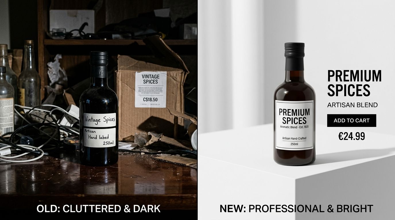
1. Analyze the hero image quality instantly
Your hero image carries the entire weight of the first impression. When a user lands on the page, the main image is the first thing their brain processes. It needs to clearly and immediately communicate what the product is, its core value, and its quality level.
A strong hero image sits on a clean background, is sharply in focus, and takes up the majority of the image frame. If your hero image is muddy, poorly lit, or features distracting background elements, the user will assume the product itself is low quality. You need crisp, high contrast imagery that pops off a mobile screen. If your primary photo looks amateur, the visitor will hit the back button before they even read the title.
2. Confirm ad creative match and visual continuity
If your ad features a moody, cinematic lifestyle video of someone wearing your jacket in the rain, your landing page cannot feature that same jacket lying flat on a wrinkled white sheet under harsh fluorescent lights. This disjointed experience causes immediate distrust.
The transition from ad to product page must feel seamless. The color grading, the lighting style, and the overall vibe must match. If you are struggling with underperforming ad creative, the culprit is often not the ad itself, but the jarring transition to a mismatched product page. The customer clicked the ad because they bought into the aesthetic. You must carry that aesthetic all the way through the checkout process.
3. Optimize the mobile above the fold rendering
Over seventy percent of paid traffic comes from mobile devices. If you are auditing your product page on a twenty-seven inch desktop monitor, you are looking at a fantasy. You need to pull out your phone.
Above the fold refers to everything the user can see before they scroll. On mobile, this space is incredibly cramped. Your hero image, product title, price, review stars, and the add to cart button must all be visible immediately. If the user has to scroll down to figure out how much the product costs or to find the buy button, your conversion rate will plummet. Shrink massive logos, tighten up line heights, and ensure the image aspect ratio leaves room for the critical purchase actions.
4. Provide social proof and trust signals
Cold traffic does not trust you yet. You have to borrow trust from other people. This means placing review stars directly beneath the product title, right above the price.
Further down the page, visual trust signals become just as important. Customer photos, unboxing videos, and secure payment badges reassure the buyer that real people have purchased this item and received it safely. Do not bury your reviews at the very bottom of a massive page. Bring the most compelling visual social proof up into the main product gallery.
5. Include alternate angles and detail shots
Shoppers cannot touch your product, feel the fabric, or pick it up to examine the weight. Your visual gallery must do the heavy lifting of a physical retail environment. A single photo is never enough to justify a purchase to a cold lead.
You need a minimum of four to six images in your gallery. This should include the main hero shot, an alternate angle, a close up macro shot showing texture or hardware details, and an image indicating scale. If you are launching new SKUs rapidly, running a traditional studio shoot for every angle is too slow and too expensive. You can upload a single clear photo to CherryShot AI, select different visual modes, and generate the necessary alternate angles and aesthetic variations in minutes.
6. Add contextual lifestyle imagery
A white background shot proves what the product is. A lifestyle shot proves what the product does. Contextual imagery helps the buyer envision the item in their own life.
If you are selling a coffee machine, show it sitting on a modern kitchen counter next to a steaming mug. If you are selling sunglasses, show them being worn in bright sunlight. This used to require flying a crew to a location. Now, tools like CherryShot AI allow you to select a Lifestyle or Influencer mode to instantly place your product in high end, realistic environments without the logistical nightmare of a location shoot.
7. Balance page speed against image resolution
You need high quality images, but you cannot afford a slow website. Paid traffic bounces aggressively if a page takes more than three seconds to load. Large, uncompressed image files are the number one cause of slow product pages.
Audit your image file sizes. Compress all product photos using modern formats like WebP. Implement lazy loading so that images further down the page only load when the user scrolls near them. You must achieve visual sharpness without forcing the user's browser to download ten megabytes of data before the add to cart button appears.
Key Takeaways
- Review your product page exclusively on a mobile device to match the experience of paid social traffic.
- Maintain strict visual continuity between your ad creative and your product page imagery to prevent immediate bounces.
- Ensure the hero image, price, reviews, and buy button are all visible without scrolling.
- Use AI tools to rapidly generate contextual lifestyle images and alternate angles without booking costly studio time.
Running paid traffic is an amplifier. It will amplify a high converting page and print money for your business. It will also amplify a poorly optimized page and drain your bank account rapidly.
Do not turn on the ad spend until you are confident in the landing page experience. If a lack of image variety is holding you back, how AI product photography works to solve this is worth exploring. Platforms like CherryShot AI remove the production bottleneck entirely, letting you generate campaign ready visuals in minutes so you can launch your ads with confidence.
Frequently Asked Questions
How do I audit my product page for paid traffic?
Audit your product page by navigating the live mobile site on a cellular connection to mimic a cold visitor clicking an Instagram ad. This forces you to experience the exact loading delays and cramped screen space your actual buyers face. Check that your hero image clearly identifies the product within two seconds and verify the add to cart button remains visible above the fold without any scrolling.
What should I check on my product page before spending money on ads?
Confirm your hero image is high resolution, mobile page load speed sits under three seconds, and the above the fold layout clearly displays the price and review stars. These baseline visual and functional elements prevent instant bounces from skeptical cold traffic. You must also verify that alternate product angles and close-up detail shots are present in the image gallery to answer common buyer objections before launching campaigns.
What are the most important product page elements for paid traffic conversion?
The primary hero image dictates immediate visitor retention and sets the quality expectation for the entire brand. Visual social proof placed directly below the product title then steps in to quickly validate the user's purchase intent. You must follow this with secondary lifestyle imagery that clearly proves the physical scale and practical use case of the item in a real environment.
How do I know if my product page is ready for paid advertising?
Your page is ready when a stranger can tap your ad on a mobile phone and state the product type, price, and core value proposition within five seconds. This test proves your visual hierarchy actually functions under real browsing conditions rather than just looking nice on a desktop monitor. If the user must aggressively scroll to find basic information or squint at blurry photos to examine textures, pause your ad spend until you fix the layout.
Audit your product page images before your next campaign
Review your current mobile landing page against the visual checklist above. If your image gallery lacks contextual lifestyle shots or alternate angles, you can generate them instantly without booking a studio. Upload a basic photo to CherryShot AI to create campaign-ready visual variations.
Try CherryShot AI