Product Page Heatmap Analysis: What Shoppers Actually Look at Before They Decide to Buy or Leave
A product page heatmap ecommerce analysis tells you exactly what shoppers look at before they buy. They look at your main visual first, scan the price, ignore your long description, and hunt for the add to cart button. If your visuals fail to capture them in those first three seconds, the rest of the page does not matter. The data proves that buyers trust their eyes over your copy.
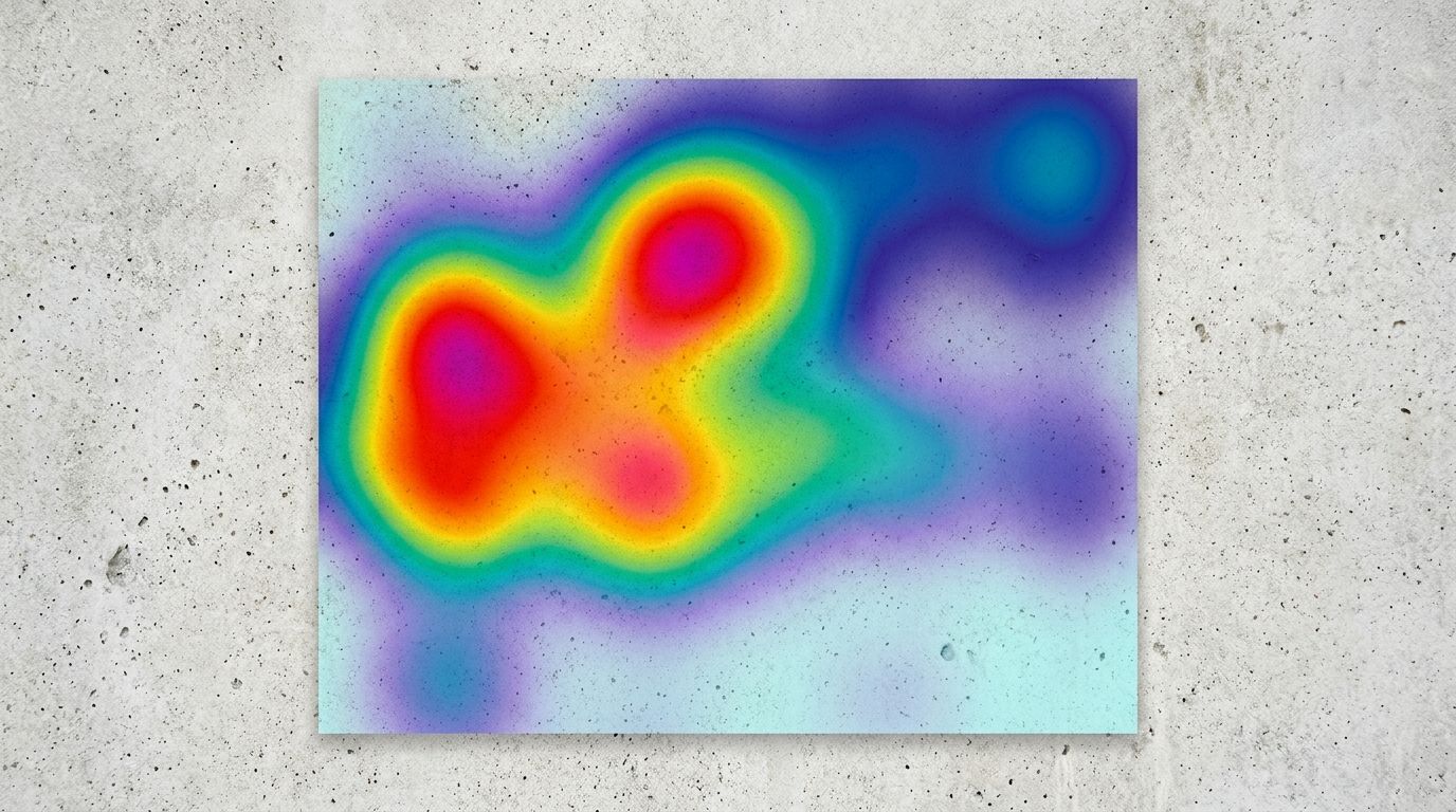
Definition
An ecommerce product page heatmap is a visual representation of user behavior that uses color-coded overlays to show exactly where shoppers click, scroll, and hover. Hot zones indicate high interaction, while cold zones reveal areas that users ignore. Store owners use this data to identify friction points and optimize layouts for higher conversions.
I have spent years running ecommerce brands and optimizing funnels. Most founders obsess over the written word. They spend weeks wordsmithing the perfect brand story. Then we install a tracking tool and look at the heatmap analysis product page results. The cold, blue void covering their beautifully written copy is always a shock.
Shoppers simply do not read unless they are already sold on the visual.
Heatmaps consistently prove that visual assets dictate where user attention flows on a product page.
The hard truth hiding in your heatmap data ecommerce reports
When you start looking at product page eye tracking studies, patterns emerge immediately. We call it the F-pattern in web design, but on a mobile product page, it is really more of a vertical plunge. Users drop in, judge the aesthetic of the item instantly, and begin scrolling to find validation.
If they do not find it fast, they leave.
| Page Element | Assumed Shopper Focus | Actual Heatmap Behavior |
|---|---|---|
| Hero Image Gallery | High | Extreme (Hottest Zone) |
| Long Form Description | High | Very Low (Cold Zone) |
| Trust Signals & Reviews | Medium | High (Click Clusters) |
| Secondary Copy Below Fold | Medium | Near Zero (Below Drop-off) |
Measuring hero image attention
Your primary image is doing the heavy lifting. The glowing red spot on an ecommerce product page heatmap is almost always centered directly on the main hero image. It is the visual anchor. If that image looks like it was shot in a dark basement with a smartphone, the perceived value of your product plummets. Shoppers associate cheap visuals with cheap manufacturing.
You cannot afford a mediocre first impression. Brands used to spend thousands on a traditional studio shoot just to get that one perfect hero shot. Today, the logistics have shifted. With tools like CherryShot AI, you can take a basic product photo, select the Minimalist or Luxury mode, and generate a flawless hero image in minutes. The quality is indistinguishable from a four-hour professional shoot, and it costs pennies compared to a studio invoice.
Knowing what makes product photos convert on e-commerce sites is no longer about hiring the best freelance photographer. It is about understanding what aesthetic your target market expects and deploying it instantly.
The brutal reality of scroll depth
Your scroll depth metric is a harsh critic. A standard heatmap will show a solid red band across the top of the page, fading to yellow just below the product title, and turning completely blue by the time you reach the bottom of the description. Most of your audience never sees the bottom of your page.
If you bury your sizing chart, key material benefits, or shipping policies below the fold, you are hiding them from the majority of your potential buyers. The golden rule of scroll depth is simple. If it matters to the buying decision, it must live above the fold or right alongside the product gallery.
Mapping the visual journey from click to checkout
The journey a shopper takes from clicking an ad to hitting the checkout button is fragile. Every element on the screen either builds momentum or introduces friction.
When you run social ads, you set a visual expectation. If a user clicks a vibrant lifestyle image on Instagram and lands on a stark white page with a tiny product shot, the jarring transition breaks trust. Closing the visual gap between ads and product pages is essential for keeping the heatmap hot as users transition from top-of-funnel content to your actual storefront.
Finding the add to cart button
The add to cart button should be the second brightest spot on your click map. If it is not, your layout is broken. I have audited stores where the buy button was camouflaged into the brand colors or pushed down below an absurdly large text block. Users should never have to search for the button that takes their money.
(Worth noting: some highly technical or expensive B2B products do require long-form copy to justify the price before asking for the sale, but for general consumer goods, shoppers buy the aesthetic first.)
Trust signals placement and validation
Right next to the buy button, your heatmap should show activity around your trust signals. Star ratings, reviews, and secure checkout badges act as psychological safety nets. When a shopper hovers over the price, their eyes dart to the review count. If the trust signals placement is awkward or missing entirely, the mouse cursor drifts up toward the back button.
There is a catch to all this tracking data. Heatmaps will show you exactly where people click and where they abandon your page, but they cannot tell you why a shopper feels uninspired by your layout. You still have to interpret the data and make the necessary aesthetic upgrades yourself.
Using session recordings to diagnose hidden friction
While heatmaps give you the aggregate picture, session recordings give you the individual narrative. Tools like Microsoft Clarity or Hotjar let you watch anonymous replays of actual users navigating your store.
Watching these recordings is often a humbling experience.
Spotting rage clicks in the product gallery
One of the most common issues you will spot in session recordings is the rage click. This happens when a user repeatedly clicks on an element expecting it to do something. The product gallery is a notorious hotspot for this. Users click on thumbnails expecting high-resolution zoom, or they click repeatedly trying to find an angle that shows the back of the product.
If your gallery only has two images, users feel cheated. They want context. They want to see the item in use. This used to require booking a separate lifestyle location shoot, coordinating models, and waiting weeks for edits. Now, you can use the Lifestyle or Influencer modes in CherryShot AI to generate multiple high-context angles from a single base image. You can populate a rich, satisfying product gallery without ever leaving your desk.
Removing the clutter
Session replays will also show you how distracting your secondary elements can be. If you have pop-ups firing, floating chat widgets blocking the screen, and cross-sell carousels loading aggressively, the user becomes visually overwhelmed. The cursor moves erratically. Implementing fundamental product page fixes to increase e-commerce conversion rates usually starts by systematically removing everything that distracts from the product image and the buy button.
Frequently Asked Questions
What do shoppers look at most on an ecommerce product page?
Shoppers look at your main product image before engaging with any other element on the page. Heatmap tools confirm that the hero image commands the vast majority of initial visual attention, followed quickly by the price and the add to cart button. You must secure high-quality primary visuals that look premium, because users will bounce before reading a single word of your painstakingly written description if the aesthetic feels cheap.
What do heatmaps reveal about product page design?
Heatmaps reveal that conventional web design logic often clashes with actual shopper behavior by highlighting cold zones over dense text blocks. Shoppers heavily interact with visual elements like thumbnail carousels, size selectors, and customer reviews instead of reading secondary value propositions placed below the main image. You must provide a diverse gallery showing the product from multiple angles to satisfy buyers who need visual verification of quality before committing to a purchase.
How do product images show up in ecommerce heatmap data?
Product images register as the hottest interaction zones on any ecommerce page layout. Click maps show intense clustering over the product gallery as users attempt to zoom in or cycle through alternative angles rather than scrolling down. You must provide a gallery with rich variety and lifestyle context, because relying on a single sterile white background forces users into a visual dead end that kills your conversion rate.
How do I use heatmaps to improve my product page conversion?
You improve product page conversion by analyzing scroll depth to identify where shoppers abandon the page and moving critical assets above that drop-off point. You should watch session recordings to locate areas where users rage-click on non-clickable elements or struggle to navigate the gallery. Simplify the layout immediately surrounding your add to cart button while ensuring your lifestyle images answer common customer objections regarding product quality and scale.
Key Takeaways
- Shoppers look at your main product image before engaging with any written content on the page.
- Scroll depth data proves that critical buying information must sit above the fold to be seen.
- Session recordings reveal friction points like rage clicks on limited product galleries.
- Heatmaps expose visual gaps but require human intuition to fix the underlying aesthetic issues.
A product page heatmap is an incredible diagnostic tool, but it is only as valuable as the action you take after looking at it. Once you see that shoppers are obsessed with your visuals, the mandate becomes clear. You need better images, more angles, and faster iteration.
Stop letting scheduling bottlenecks dictate your conversion rate. When you are ready to give your customers the premium visual experience they are searching for without the studio overhead, CherryShot AI delivers campaign-ready assets in minutes.
Audit your product page visuals against your heatmap data
Review your top-performing product pages to see if your hero images command the attention they deserve. If your click map is hot but your conversion rate is low, your gallery likely needs richer lifestyle context or higher-resolution assets. You can generate professional, multi-angle product photography directly from your existing images using CherryShot AI.
Try CherryShot AI