Product Page Heatmap for Ecommerce: Deciphering Click and Scroll Data
Most brands install a heatmap tool, watch a few session replays, look at a glowing red blob over their add-to-cart button, and learn absolutely nothing new. A product page heatmap for ecommerce is not there to tell you people click the buy button. It is there to show you exactly where your visual merchandising fails. The real insights hide in your scroll map drop-offs and the specific thumbnails users ignore.
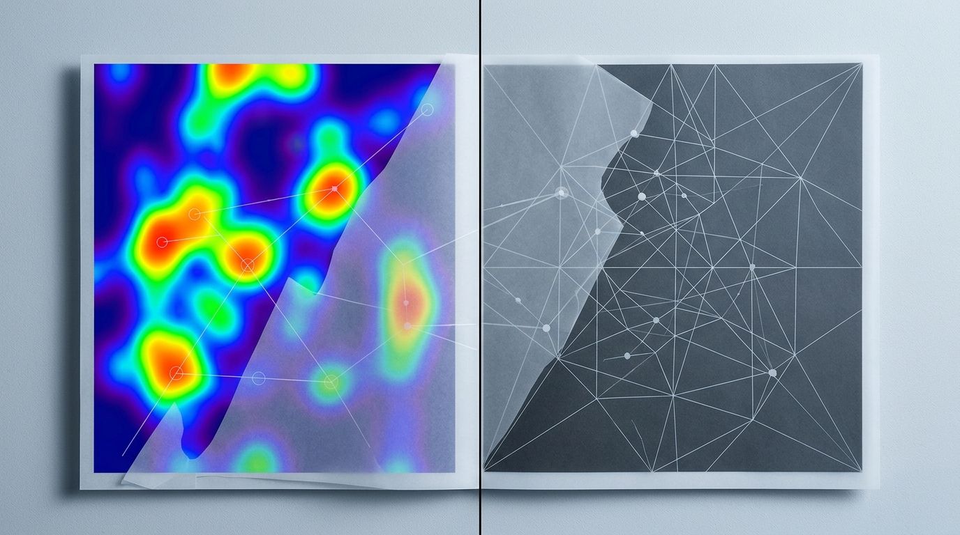
Definition
A product page heatmap is a visual data tracking tool that records how users interact with an ecommerce listing. It displays aggregated click locations, scrolling depth, and cursor movements using a color-coded gradient overlay. This data helps merchandisers identify which visual elements attract attention and where usability issues occur.
(Worth noting: heatmaps only show where attention goes. They never tell you why someone left. You still have to interpret the behavior through the lens of your product category.)
The trade-off of relying entirely on visual data like a hotjar heatmap is the traffic requirement. If you only have fifty visitors a day, your heatmaps are just random noise. You need volume to reach statistical significance. But once you have that volume, the data patterns become undeniable. When you learn how to read these maps correctly, you stop guessing about what visual assets you need. The click and scroll data writes your next production brief for you.
| Heatmap Type | Primary Metric Monitored | Ecommerce Application |
|---|---|---|
| Click Map | Clicks, taps, and dead clicks | Identifying ignored thumbnails and broken zoom functions. |
| Scroll Map | How far down users scroll | Detecting visual false bottoms and unread specifications. |
| Movement Map | Cursor hovering paths | Understanding reading patterns and hesitation points. |
Decoding the product page click map
A click map looks simple. Warm colors mean heavy interaction. Cold colors mean zero interaction. But the interpretation is entirely contextual. A glowing red spot on a thumbnail means it is highly engaging. A glowing red spot on static text often indicates user frustration.
The heavy zoom interaction pattern
The biggest concentration of clicks will always sit directly on your primary product image. Users instinctively tap or click the hero shot. They want to trigger the zoom function. They want to inspect the texture of the fabric or the specific finish of the hardware.
If your heatmap analysis ecommerce data shows incredibly heavy clicking on the main image but your overall conversion remains flat, you have a highly specific problem. You are successfully pulling them in. They are interested enough to investigate closer. But the detail they see when they zoom is killing the sale. The resolution might be blurry. The material might look cheap up close. If you are stuck in this exact scenario, identifying why your product images losing conversion usually requires auditing your high-resolution assets.
The ghost clicks on lifestyle photos
One of the most valuable insights a product page click map provides is the detection of rage clicks or ghost clicks. This happens when users repeatedly tap an element that is not interactive.
We see this constantly with embedded lifestyle images sitting further down the page in the description area. A brand embeds a beautiful editorial shot of a model wearing a jacket. The user wants a closer look at how the collar sits. They tap the image. Nothing happens because it is a static JPG embedded in the description block. They tap it three more times. The heatmap logs this as an intense cluster of clicks on a dead element. This tells you exactly what your customer values. They want lifestyle context, and they want it in the main interactive gallery where they can actually inspect it.
Click clusters over the primary image usually indicate heavy use of the zoom function. If conversion is low, your zoom resolution may be failing you.
Scroll map product page insights
While the click map shows intent, the scroll map product page view shows endurance. It visualizes the exact percentage of users who make it down to specific page sections. The drop-off is rarely a smooth slope. It usually looks like a cliff.
Surviving the above fold product image trap
Everyone in ecommerce talks about the fold. The scroll map will show you exactly where the fold actually sits for your average mobile user. It changes based on the device mix of your specific audience.
The critical mistake brands make is pushing the actual product image down to accommodate massive promotional banners or bloated site headers. If your primary product image is not fully visible above the fold on a standard mobile screen, your engagement heatmap will show an immediate and severe bounce. The scroll map will go from red to dark blue before the user even sees the add-to-cart button. The primary image must anchor the top of the mobile experience.
The false bottom disaster
Look at the area directly beneath your image gallery and buy box. If your scroll depth product images show a sudden drop from warm colors to cold colors right in this specific zone, you likely have a false bottom.
A false bottom occurs when the page layout visually implies the content has ended. Massive stretches of white space, hard horizontal lines, or poorly formatted collapsible menus create a visual wall. The user assumes there is nothing left to see. They never scroll down to read the detailed specifications or the customer reviews. Your secondary lifestyle images placed further down the page become completely useless because ninety percent of your traffic never scrolls past the buy box.
Transforming heatmap data into a production brief
Data without action is just trivia. Staring at an image engagement heatmap is pointless unless you plan to change the images based on what you find. The patterns you uncover should directly influence your visual merchandising strategy.
Restructuring the thumbnail sequence
Your heatmap will reveal exactly when users stop clicking through your gallery carousel. Most brands see a steep drop-off after the third or fourth thumbnail. If you have placed your crucial sizing chart or your most compelling lifestyle shot in the sixth slot, you are wasting those assets. Almost no one is seeing them.
You must order your images based on buyer priority. Lead with the clean front shot. Follow immediately with the critical detail angle. Then provide scale. Then provide lifestyle context. Understanding exactly how many product images convert for your specific audience prevents you from bloating the page with redundant angles that users never click. Once you establish the correct sequence, you need a system to test variations. Implementing a process to A/B test product photos to drive sales is the only way to know if your new gallery order actually improves your baseline metrics.
The AI production advantage
This is where traditional logistics break down completely. Let us say your product page heatmap ecommerce data tells you a clear story. It reveals that users are desperately searching for lifestyle context. They are clicking heavily on the one weak lifestyle photo you have. You realize you need four new contextual angles for every SKU in your current catalog.
If you rely on a traditional studio shoot, that single realization just cost you twenty thousand dollars. It also cost you a month of production time. You have to book a location. You have to hire a stylist. You have to coordinate samples. By the time the new images are ready, the selling season is halfway over.
This is exactly why CherryShot AI exists. You do not need to book a location to get a high-converting lifestyle shot. You upload a standard flat lay or basic product image. You select the Lifestyle, Minimalist, or Influencer mode. CherryShot AI generates those missing contextual angles in minutes. Your heatmap data dictates the specific need. AI fulfills that need immediately. The per-image cost drops to under five dollars. The turnaround drops from three weeks to an afternoon. You solve the visual gap before your traffic even notices.
Key Takeaways
- A product page click map is highly effective for identifying ignored thumbnails and broken gallery sequences.
- Heavy zooming on primary images paired with low conversion indicates a severe resolution or texture problem.
- Scroll depth heavily depends on preventing visual false bottoms immediately after your image gallery.
- Use AI tools to rapidly fulfill the missing visual context identified by your heatmap data without waiting for another studio shoot.
Frequently Asked Questions
What does a product page heatmap show?
A product page heatmap displays user interactions and engagement on your website through distinct visual color gradients. This tracking method maps out the precise locations of customer clicks, scroll depths, and cursor movements across the entire screen interface. Evaluating these ecommerce metrics highlights the specific product images capturing the most attention while pinpointing the exact visual zones where shoppers lose interest before adding items to their cart.
How do I use heatmaps to improve product pages?
You apply heatmaps to locate user friction points and discover visual content gaps across your website. Observing a massive scroll drop-off directly below the main image indicates a false bottom that requires immediate layout redesigning. When click tracking reveals shoppers ignoring specific thumbnails, you must replace those low-performing assets or reorder the gallery sequence to present high-converting angles much earlier.
What heatmap patterns indicate a product image problem?
Rage clicks on non-zoomable lifestyle images indicate a severe functionality problem within your visual merchandising strategy. Shoppers naturally want to examine product details in a contextual setting, but poor image resolution or restricted site features block this action. Observing high zoom interaction on the primary image paired with a low add-to-cart rate suggests the magnified details appear blurry or reveal an unexpected product flaw.
Which area of a product page gets the most clicks?
The primary product image and the add-to-cart button consistently receive the highest volume of clicks on almost every ecommerce page. Shoppers instinctively tap the main hero shot to trigger the zoom function or expand the fullscreen gallery for closer inspection. Following this initial engagement, the distribution of interaction across the remaining thumbnails drops significantly after the third image in the sequence.
How do I set up a heatmap for my Shopify product page?
You set up a heatmap by installing a dedicated tracking script from a provider like Hotjar or CrazyEgg directly into your Shopify theme code. After confirming the installation, you configure the software platform to monitor user behavior across specific target URLs. Prioritizing your highest traffic product pages first ensures you gather the significant visitor volume necessary to generate highly reliable and actionable data patterns.
Looking at a heatmap is only step one. The real work is fixing the visual gaps the data exposes. Stop waiting weeks for freelance photographers to deliver the lifestyle angles your scroll maps say you desperately need. With AI photography, you can map the problem on Monday and deploy the visual solution by Tuesday morning.
Audit your product page gallery based on your heatmap data
Review your current click maps to identify which lifestyle images users are ignoring. If you need new contextual angles to fill visual gaps, you can generate them instantly without booking a studio. CherryShot AI turns your basic flat lays into high-converting lifestyle assets in minutes.
Try CherryShot AI