Product Photography Color Palette: Defining Your Brand's Visual Temperature
Pure white backgrounds belong on Amazon listings and wholesale line sheets. Everywhere else, defaulting to a pure white backdrop is a massive missed opportunity to communicate your brand identity. Your product photography color palette does the heavy lifting of telling a customer exactly how much your product costs and who it is for before they ever read a single line of copy.
Definition
A product photography color palette is the deliberate selection of background colors, surface textures, and lighting tones used to frame items in marketing imagery. It serves as a visual system that aligns your product presentation with your target customer's expectations.
I have watched founders spend tens of thousands of dollars on custom packaging just to shoot those beautiful boxes on a sterile gray seamless paper roll that makes the product look like a drugstore knockoff. If you want a customer to pay premium prices, your imagery must establish a premium visual temperature immediately.
Worth noting, pure white backgrounds remain a strict requirement for most major third party marketplaces. This conversation is specifically about the owned channels where you control the presentation and need to stand out.
The psychological weight of color choices in product photography
Color theory in product photography is not about picking your favorite hex codes. It is about understanding the deeply ingrained subconscious associations your customers already have. Every shade has a specific visual weight.
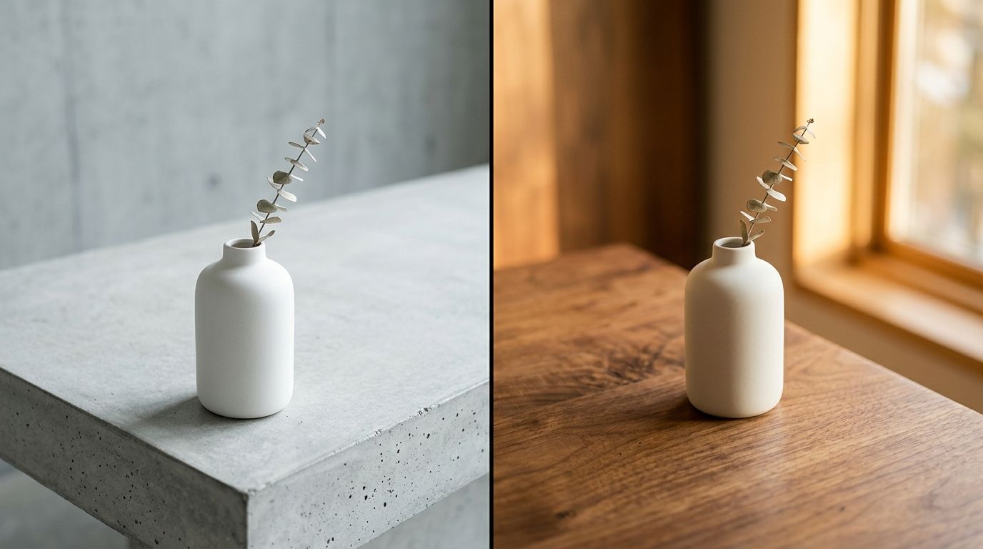
When you place a matte black coffee tumbler on a stark slate background, the image feels heavy, durable, and expensive. It feels engineered. When you place that exact same black tumbler on a warm pastel yellow background, the image suddenly feels light, energetic, and completely devoid of luxury context. The product did not change. The perceived value did.
Understanding this psychological leverage is vital when you are establishing your brand's visual identity. You cannot expect a customer to read an entire paragraph about your artisanal sourcing methods if the background color of your hero image screams factory line production.
Defining your brand's visual temperature
Visual temperature refers to the spectrum of warm to cool tones present in your product photo background color selection. This is the foundation of your aesthetic.
Cool backgrounds project clinical efficacy and high end exclusivity. Think icy blues, cool concrete grays, slate, and stark white. These are the default choices for technology products, luxury watches, and high science skincare. Cool temperatures create a deliberate emotional distance. They say the product is serious and precise.
Warm backgrounds project accessibility, organic origins, and human connection. Think terracotta, warm sand, ochre, blush pink, and creamy off whites. These are the dominant choices for natural supplements, organic apparel, and artisan homewares. Warm temperatures invite the viewer in. They say the product is safe and approachable.
Surfaces and textures over pure color
| Style | Visual Impact | Best For |
|---|---|---|
| Matte Plaster | Organic & Tactile | Homewares |
| Brushed Metal | Modern & Industrial | Electronics |
| Frosted Acrylic | Clean & Precise | Skincare |
| Velvet Fabric | Luxury & Rich | Jewelry |
A common mistake founders make is looking at a brand guideline PDF and telling their photographer to match the background to a flat hex code. Flat color rarely looks premium on camera. Premium product photography background colors rely heavily on the texture of the surface holding the product.
Let us say your brand color is navy blue. A flat navy blue seamless paper roll will look decent if lit perfectly, but it often ends up looking like construction paper. Now imagine that same navy blue tone applied as a textured velvet surface, a painted plaster wall, or a piece of frosted acrylic. The color remains the same but the texture adds depth, shadow, and a tactile quality that drives conversion.
Selecting a highly saturated backdrop has a very real drawback. If the background color is too vibrant and the surface is too smooth, it will swallow the product and completely ruin your conversion rate. The eye naturally goes to the brightest, most saturated part of an image. If your background is louder than your product, the customer stops looking at what you are trying to sell them.
The logistical nightmare of physical color sets
If you have ever managed a physical studio shoot, you know the absolute headache of trying to test multiple background colors. Physical backdrops are expensive and cumbersome. A single roll of high quality seamless paper costs around eighty dollars. It gets dirty the second a model steps on it. It creases. It tears.
I have sat in studios for four hours just watching an art director fight with a lighting assistant to make a beige seamless paper roll look like the warm cream color the client actually wanted. Because light alters color on camera, achieving brand color consistency photography in a physical studio requires intense post production color grading.
This exact friction is why so many catalogs default back to white or gray. Testing five different visual temperatures for a single SKU in a traditional studio would take an entire day and cost thousands of dollars in set changes alone. This is completely unsustainable when you are launching ten new products a month and need elements that make product photos convert immediately.
Using AI to build a systemic color logic
The fastest way to test a product photography color palette today is through AI generation. The days of buying dozens of paper rolls and crossing your fingers are over.
With CherryShot AI, you upload a flat image of your product and instantly place it into different visual environments. You can run the same product through a warm Minimalist mode to see how it looks against soft terracotta and sunlight, and then run it through a cool Avant Garde mode to see how it looks against dark slate and harsh studio flash. You get answers in minutes, not weeks.
This level of rapid iteration allows you to actually build a logical system for your visual temperature. Instead of guessing what might work, you can generate twenty variations, drop them into your Shopify staging environment, and see exactly which palette makes your product pop.
Once you find the winning combination, the challenge becomes maintaining consistent product visuals across your entire catalog. Consistency is what builds trust. If a customer scrolls through your collection page and sees a chaotic mix of warm sunny backgrounds and dark moody backgrounds, the brand feels disorganized.
Establishing rules for your palette
A strong visual identity relies on strict rules. You do not need twenty background colors. You need three.
First, identify your hero background. This should be a subtle, muted tone that supports your core brand identity and houses eighty percent of your catalog. Second, identify an accent background for social media and secondary product shots that introduces a slightly bolder tone. Finally, establish your dark mode or premium background for limited edition drops or high ticket items. Keep the logic simple and never deviate from it.
Audit your product page images before your next campaign
Review your catalog to see if your background colors are consistent or disjointed. Use CherryShot AI to regenerate your inconsistent hero images into a single cohesive visual language so your store feels like a premium destination.
Try CherryShot AIFrequently Asked Questions
How do I choose product photography background colors?
Start with the specific emotion you want to evoke. High end skincare often requires clinical trust, which translates to cool tones like slate, icy blue, or stark black. Organic snacks perform better with warmth found in terracotta, sage, or soft cream. Once you define this visual temperature, pick three core colors and apply them consistently throughout your product imagery.
What color backgrounds work best for product photography?
Neutral earth tones and muted pastels provide the best results across most ecommerce categories. These colors create sufficient contrast without competing with the product for attention. Bright neon colors often fatigue the human eye on a product page, which leads to higher bounce rates. Prioritize subtle tones that enhance the item while maintaining a clean, professional aesthetic for your storefront.
How does background color affect brand perception?
Color choices dictate the perceived price point before a customer views your pricing. Darker, cooler tones signal luxury and exclusivity, which is ideal for premium items. Conversely, brighter and warmer tones signal accessibility and energy, which suits lifestyle goods. If you place a luxury item on a bright yellow background, the conflicting visual signals will confuse the shopper regarding the actual value.
Should product photography backgrounds match brand colors?
Avoid matching backgrounds to your primary brand colors for photography. Your brand colors belong on logos, buttons, and typography where they serve as functional navigation aids. Placing a product on a loud, branded background results in a visually overwhelming experience that detracts from the item. Use complementary muted tones for photography instead to keep the customer focused on the product itself.
Can AI photography generate different color palette options?
Tools like CherryShot AI allow you to test multiple color palettes in minutes. You simply upload your product and choose a visual mode such as Minimalist or Magazine. The system handles the environment, lighting, and background color settings automatically. This technology removes the need to purchase, rig, and photograph dozens of physical paper backdrops just to see which aesthetic performs best.