Product Photography Style: How to Define and Maintain a Recognizable Visual Style Across Your Catalog
The fastest way to devalue a good product is to place it next to five other products shot in five completely different lighting setups. A catalog without a defined product photography style looks like a clearance rack. Your photography is the visual DNA of your brand. Consistency is infinitely more profitable than creativity when it comes to selling physical goods at scale.
Definition
Product photography style refers to the specific combination of lighting, angles, backgrounds, and color grading that a brand uses to present items consistently. It acts as a set of visual constraints that ensures every image looks like it belongs to the same collection, regardless of when or where it was shot.
A consistent product photography style transforms a random grid of products into a cohesive catalog.
Most founders treat photography as an afterthought. They launch a site with ten SKUs shot perfectly in a studio. Six months later they add four more items and hire a different freelancer. A year later they shoot quick content on an iPhone. Suddenly the store grid is a chaotic mess of bright white backgrounds, moody natural light, and varying shadow angles.
Defining a photography aesthetic is not about making pretty pictures. It is about establishing a set of visual rules so rigid that any future product you add to your catalog looks exactly like it belongs there.
The Four Elements That Make Up Your Product Photography Style
A recognizable brand photography style is built on four pillars. If you change even one of these variables between shoots, the illusion of a cohesive brand breaks entirely.
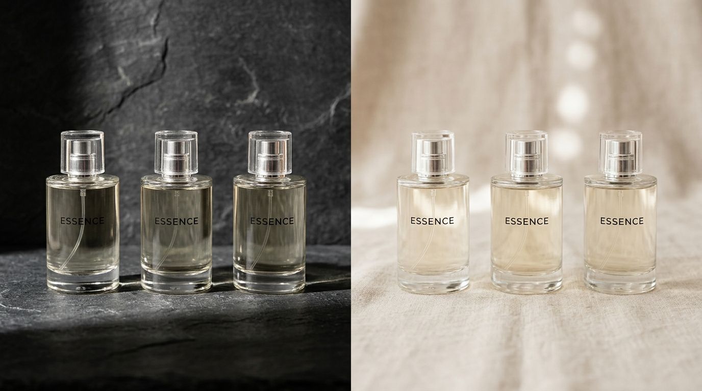
Lighting Direction and Contrast
Lighting dictates mood. Hard, direct light creates sharp shadows and high contrast. Soft, diffused light creates gentle gradients and minimal shadows. You cannot mix these on a category page.
If your skincare brand relies on soft morning sunlight filtering through a window, that is your style. Every single bottle must be shot in that exact environment. If your street apparel brand uses harsh on-camera flash against a concrete wall, you must replicate that exact harshness every time you drop a new t-shirt. Lighting is the hardest element to match during reshoots because freelancers will naturally default to their own preferred setups.
Color Palette and Prop Rules
Your product image visual style depends heavily on the secondary elements in the frame. You need strict parameters for the colors allowed around your product. A minimalist brand might restrict props entirely. A loud luxury brand might incorporate deep jewel tones and metallic accents.
Props are dangerous. They are the easiest way to accidentally drift from your core aesthetic. If your style is clean and clinical, adding a random fern leaf to a lifestyle shot just because it looked nice on set ruins your consistency.
Camera Angle and Focal Length
How the lens sees your product matters just as much as how the light hits it. Eye-level shots convey honesty and accessibility. Low-angle hero shots project dominance and luxury. Top-down flat lays focus purely on geometry and arrangement.
Focal length distorts physical reality. A shoe shot at 35mm looks dramatically different than the exact same shoe shot at 85mm. When you write the rules for your photography mood and feel, you must lock in the exact millimeter length and camera height your team uses.
Background Material and Texture
The surface your product sits on is the anchor of your product photography style. A seamless gray paper sweep communicates something entirely different than a slab of textured travertine.
This is where logistics often ruin brand aesthetics. A studio might not have the same colored paper backdrop in stock three months later. Knowing your core materials is essential, and this requires learning the nuances of choosing product backgrounds to ensure they can actually be sourced repeatedly.
| Style Element | Minimalist Approach | Luxury Approach |
|---|---|---|
| Lighting | Soft, diffuse, even | Dramatic, high contrast |
| Background | Pure white or neutral | Texture, stone, dark wood |
| Composition | Centered, geometric | Layered, off-center |
| Props | None | Metallic or premium accents |
How to Document Your Product Photo Style Guide
A style guide living in your head is useless. It must exist as a document that you can hand to an absolute stranger and get back images that perfectly match your website. To get there, you need to deliberately establish your visual brand identity before booking any creative talent.
Start with a mood board, but do not stop there. Mood boards are notoriously vague.
Create a "Do Not Do" list. This is often more valuable than your inspiration images. Show an example of lighting that is too harsh. Show an example of a background that is too busy. Point out shadows that fall in the wrong direction. Tell the photographer exactly what failure looks like.
Next, document the technical specifications. Record the RGB values of your background colors. Write down the distance from the lens to the product. Detail the exact size of the light modifiers being used. When you know how to build a strict photography brief for consistency, you stop paying for creative experimentation and start paying for reliable execution.
Why Brands Fail to Maintain Consistent Photography
The intention is always good. The execution breaks down because of scheduling dependencies and margin pressure.
It usually takes two or three failed catalog updates before a founder realizes that handing a mood board to three different freelance photographers will result in three completely different visual interpretations.
When you introduce a new product line, you need images quickly. The original photographer is booked out for a month. The studio rental rates went up. You hire someone new who promises they can match the style. They cannot. They use a slightly different focal length. The background paper is a shade warmer. The shadows are slightly softer. You publish the images anyway because the launch date is fixed.
The reality of enforcing a strict product photo style guide is that you will occasionally have to reject a beautiful photograph. That is the genuine trade-off of maintaining a cohesive visual identity. A stunning image that breaks your lighting rules hurts your catalog more than an average image that follows them perfectly.
Using AI to Codify Visual Rules
This is exactly why high-volume brands are moving away from traditional studio retainers. A general-purpose AI image tool will give you random results every time. But purpose-built tools eliminate the human drift entirely.
Upload a product image, pick a visual mode like Minimalist or Magazine, and CherryShot AI generates campaign-ready photos in minutes. The system inherently understands the rules of shadow, contrast, and environmental logic for that specific aesthetic.
You no longer have to argue with a retoucher about the depth of a reflection. The mode defines the math. When you need to launch a new variant next Tuesday, you do not have to coordinate three schedules and rent equipment. You upload the reference, select your locked-in brand style, and generate images that perfectly match the SKU you launched six months ago.
The bottleneck shifts from coordinating physical production to simply deciding what to sell next.
Key Takeaways
- A consistent photography style prevents your catalog from looking like a disorganized clearance rack.
- Lighting, color rules, camera angles, and backgrounds must remain identical across all shoots.
- Your style guide must include a strict "Do Not Do" list to eliminate freelancer drift.
- Purpose-built AI tools maintain consistency by locking in visual parameters perfectly every time.
Audit your product page images before your next campaign
Review your category pages to identify where your lighting or background consistency has drifted. You can use CherryShot AI to normalize these older assets into your current brand aesthetic without reshooting your entire inventory.
Try CherryShot AIFrequently Asked Questions
How do I define a product photography style?
Auditing your current brand identity reveals the visual parameters you need for your imagery. Typography, color palettes, and target demographics inform the specific rules for lighting, camera angles, and textures. You then write these details into a formal visual style guide that dictates exactly how every future product must be shot to ensure uniformity.
What elements make up a product photography style?
Lighting, color, composition, and background are the four primary pillars of any cohesive visual aesthetic. Lighting choices determine the mood through shadow depth and contrast levels. Color rules dictate the props and accents allowed within the frame to maintain focus. Camera angles and focal lengths ensure that the physical proportions of the product remain consistent across your entire catalog.
How do I maintain consistent style across my catalog?
Maintaining a consistent aesthetic requires an uncompromising visual style guide that covers every SKU. You prevent drift by forbidding photographers from reinterpreting your core mood boards during individual sessions. Use detailed lighting diagrams, strict focal length requirements, and a defined list of acceptable props. Alternatively, you can use automated tools to lock in your specific visual mode for every product upload.
Can AI maintain a brand's photography style?
AI tools provide a reliable way to sustain a brand's visual identity over time. By locking in specific environmental parameters and lighting rules, the system eliminates the human inconsistencies that happen when different photographers interpret a creative brief. Each image receives identical treatment once a visual mode is set. This ensures that every product in your catalog maintains the exact same aesthetic signature.
What is a visual DNA in product photography?
Visual DNA represents the collection of rules that make your imagery recognizable without a visible logo. It comprises the specific combination of shadow density, color grading, and spatial arrangement that belongs entirely to your brand. A strong visual DNA ensures that consumers immediately associate a specific image style with your company while scrolling through their social media feeds.
Owning your product photography style is not a luxury reserved for massive enterprise brands. It is a fundamental requirement for anyone trying to build trust with online buyers. Decide what your brand looks like, write the rules in stone, and never let production logistics force you into a compromise again.
If you want to permanently lock in your brand aesthetics without the headache of coordinating another studio shoot, try CherryShot AI to see how effortlessly those visual rules can be automated.