Trust Badges for Ecommerce: Which Increase Conversion?
Trust badges do not create trust. They simply answer logistical questions at the exact moment a customer is deciding whether to abandon their cart. If your site looks unprofessional, pasting a bright green security logo next to your checkout button will not save the sale. In fact, relying heavily on loud, aggressive badges usually makes an ecommerce store look like a cheap dropshipping operation trying too hard to seem legitimate.
Definition
Trust badges are small graphics or icons displayed on an ecommerce site to reassure buyers about the safety and reliability of their purchase. Common examples include accepted payment logos, return policy guarantees, and technical security seals. These visual indicators act as a baseline signal to reduce friction during the checkout process.
I spent eight years running ecommerce operations before moving to the software side. In the early days, we obsessed over these tiny icons. We A/B tested different padlock graphics. We debated whether the McAfee logo needed to be in color or grayscale. We thought we were optimizing for conversion. We were actually just rearranging deck chairs on a visually cluttered product page.
True ecommerce conversion relies on a hierarchy of signals. Technical trust badges are at the very bottom of that hierarchy. They are necessary, but they are completely powerless if the visual foundation of your store is weak.
The Core Types of Ecommerce Trust Badges
Not all badges serve the same purpose. A customer looking for a PayPal logo is trying to solve a different problem than a customer looking for a return policy guarantee. Understanding the distinction helps you clean up your product pages and keep the buyer focused on the product.
| Trust Signal Type | What It Communicates | Optimal Placement |
|---|---|---|
| Payment Method Icons | Logistical convenience (e.g., Apple Pay) | Directly under the Add to Cart button |
| Policy Guarantees | Low purchase risk (e.g., Free Returns) | Near product price or site footer |
| Security Padlocks | Data encryption and safe browsing | Inside the final checkout flow |
| Product Photography | Brand legitimacy and product quality | Above the fold on the product page |
Technical Security Badges
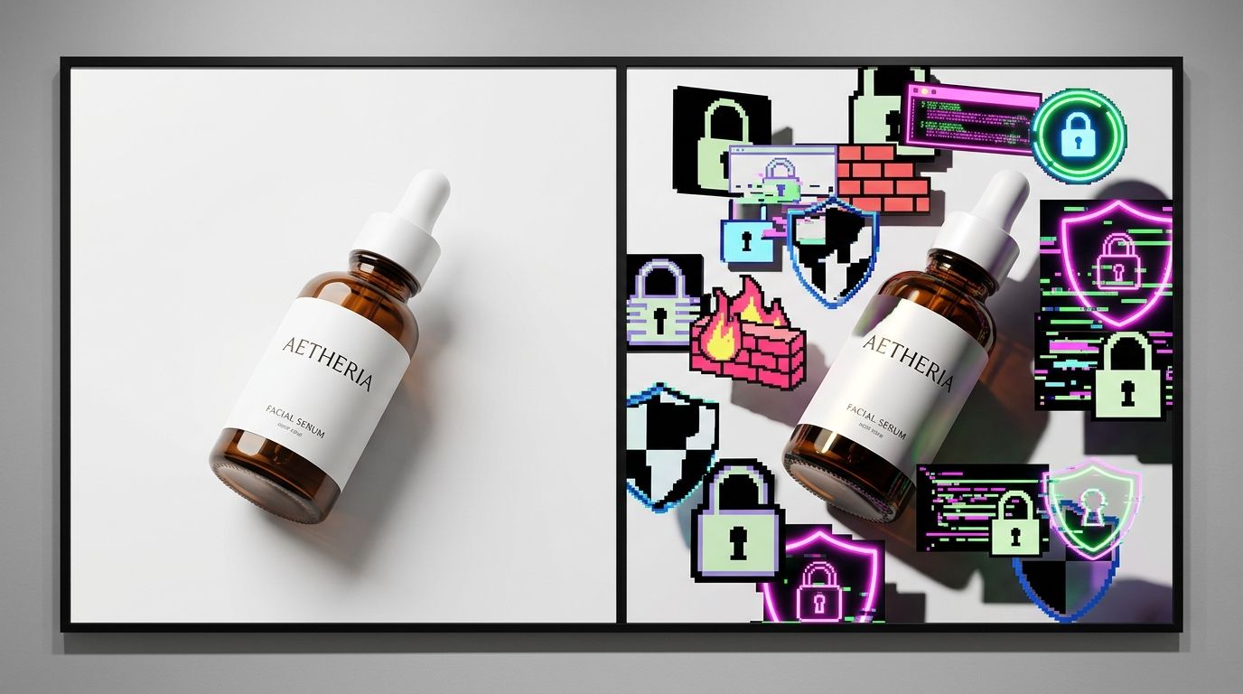
Ten years ago, highlighting your SSL certificate was a major conversion driver. Today, modern web browsers handle this natively. If your site is not secure, Chrome or Safari will actively warn the user before the page even loads. Because basic encryption is now table stakes, slapping a massive "100% Secure Checkout" badge on your page is redundant.
(Worth noting: older demographics and shoppers buying highly sensitive medical or financial products do sometimes still look for traditional padlock icons. But for the vast majority of modern consumer brands, heavy technical badge usage feels incredibly outdated.)
If you are working to establish building trust for small brands, you might feel the urge to overcompensate with security logos. Resist it. A simple, minimalist padlock icon inside the checkout flow is more than enough to reassure a skeptical buyer without cheapening your brand design.
Payment Method Icons
These are the only badges that universally deserve space on your product page. Payment icons answer a direct, practical question: "Can I use my preferred method to pay for this?"
When a customer sees the Apple Pay or Google Pay logo, they instantly know they will not have to get off the couch to find their physical credit card. That realization alone drastically reduces friction. Displaying accepted payment methods in a clean, horizontal row below your primary call to action is a proven win. I highly recommend keeping these icons monochromatic or strictly aligned with your brand colors to prevent them from looking like a NASCAR vehicle.
Policy and Guarantee Badges
"Money Back Guarantee" or "Free Returns Within 30 Days" badges address emotional friction. Customers buying apparel or high-ticket electronics are inherently taking a risk. They cannot touch the item. They cannot try it on. A visual reminder that reversing the transaction is easy provides a massive psychological safety net.
However, the badge itself must be linked to a reality. If you display a "Hassle-Free Returns" graphic but bury your actual return policy in a confusing block of legal text at the bottom of the site, customers will catch on. The badge is just the hook. The policy must back it up.
Where to Place Trust Signals on Your Product Page
Placement is just as important as the badge itself. Throwing graphics randomly across the page creates cognitive overload. The customer's eye should naturally flow from the product image to the price, to the selection options, and directly to the buy button.
Near the Add to Cart Button
The area immediately surrounding your "Add to Cart" or "Buy Now" button is the most valuable real estate on your entire site. This is where friction peaks. A subtle row of payment icons directly underneath the button confirms logistical details right when the customer needs them.
Do not put brightly colored guarantee badges above the button. You want the button itself to be the most visually striking element in that specific container. If you want to see how top brands structure this flow, studying ecommerce conversion rate benchmarks reveals that the highest performing sites almost always favor minimalist badge integration.
Inside the Checkout Flow
Once the customer leaves the product page and enters the cart, the game changes. They have already made the emotional decision to purchase. Now, they are evaluating risk. This is the correct place for your minimalist security padlock and your clear shipping guarantees.
If you are struggling with a sudden drop-off at this stage, the issue is rarely a lack of trust badges. More often, it is a sudden change in layout or unexpected fees. We have detailed how design inconsistencies lead to visual trust and checkout abandonment, and the fix is almost always simplifying the page rather than adding more icons.
Visual Trust Trumps Technical Trust Every Time
You can have the most secure checkout process in the world, certified by every major cybersecurity firm. It will not matter if your product photos look like they were taken with a dirty smartphone under fluorescent warehouse lighting.
The human brain processes image quality in milliseconds. When a customer lands on your page, they make an instantaneous judgment about the legitimacy of your brand based entirely on the photography. Clean lighting, sharp details, and professional styling tell the customer that you run a serious operation. Poor photography tells them you cut corners. If they believe you cut corners on the product presentation, they will assume you cut corners on the product quality and the shipping logistics too.
The Role of Product Photography
I have personally sat through studio shoots that ran four hours over schedule. I have paid invoices that arrived two weeks after a campaign was supposed to launch. I know exactly how painful it is to maintain a high standard of visual trust when you are launching dozens of SKUs every quarter. Historically, brands had to choose between burning their margins on constant studio rentals or accepting lower conversion rates with mediocre flat lays.
AI product photography completely rewrites those constraints.
Fixing the Visual Gap
This is why we built CherryShot AI. Brands upload a simple product image, select a visual mode like Luxury or Minimalist, and get campaign-ready photos in minutes. The per-image cost drops to under $5. The turnaround goes from weeks to an afternoon.
When your product imagery looks like it belongs in a high-end magazine, the customer stops looking for technical trust badges. They already trust you. The professional aesthetic of the photography does the heavy lifting. You no longer have to convince them you are a real company with loud security graphics.
High-end AI product photography will not fix a site with fundamentally broken shipping calculators or terrible customer service. But it absolutely prevents the immediate visual rejection that stops a customer from ever reaching your checkout flow in the first place.
Key Takeaways
- Trust badges prevent hesitation but they do not generate desire.
- Payment icons are the most universally effective trust signals for modern shoppers.
- Aggressive security badges often make a brand look less legitimate to younger buyers.
- High-quality product photography builds visual trust faster than any technical badge.
Frequently Asked Questions
Do trust badges actually increase ecommerce conversion rate?
Trust badges prevent checkout hesitation rather than generating active buyer desire. These graphical signals provide immediate baseline reassurance for shoppers who are already interested in completing a transaction on your store. Place a few well-chosen payment icons directly adjacent to the add-to-cart button to reduce friction, but avoid covering the entire page in aggressive security graphics that make the design look unprofessional.
Which trust badges work best for ecommerce product pages?
Payment method icons are universally the highest performing trust signals for ecommerce stores. Showing recognizable logos like Visa, Mastercard, PayPal, and Apple Pay answers direct logistical questions for the buyer regarding checkout. Guarantee badges that state a clear return policy also perform strongly, while traditional cybersecurity seals like Norton or McAfee matter far less today than they did ten years ago.
Where should I place trust badges on my product page?
Position trust badges directly under or immediately adjacent to your primary call-to-action button. This strategic placement catches the buyer's eye at the exact moment they are deciding whether to proceed with the transaction. Keep the badge designs muted so they do not visually compete with the button itself, and reserve secondary badge placements for the site footer or the final checkout steps.
Is product photography more important than trust badges for conversion?
High-quality product photography builds visual trust instantly and influences conversion far more than any technical badge. Badges require the shopper to stop and process technical information, whereas professional imagery immediately communicates brand legitimacy and product value. Ensure your visual foundation is strong first, because no amount of bright security icons will save a sale if the product photos look cheap, poorly lit, or highly inconsistent.
Stop trying to patch a leaky funnel with cheap clipart. Give your customers a reason to trust the quality of your catalog from the very first glance. If you want to see how much faster you can produce high-converting product imagery without booking another expensive studio day, try out CherryShot AI.
Audit your product page trust signals right now
Open your product page on a mobile device and count how many graphic badges compete with your primary button. Remove redundant security logos and let high-quality imagery do the heavy lifting for your brand credibility. If your visual foundation needs an upgrade, you can generate clean, professional photos without booking another studio shoot.
Try CherryShot AI