Twitter Banner Size 2026: Exact Dimensions, Templates, and Design Tips
The exact Twitter banner size for 2026 is 1500 pixels wide by 500 pixels tall. If you only came here for the numbers, those are the dimensions you need to drop into your design software. But if you have ever uploaded a perfectly crafted graphic only to watch the platform crop out half your product on a mobile screen, you already know the raw dimensions are only part of the job.
Definition
A Twitter banner is the wide, horizontal header image displayed at the top of a user's profile page. It acts as the primary visual backdrop for a brand's identity and serves as a major indicator of account quality for potential customers.
Every week, thousands of brand managers upload a new cover photo that looks flawless on their office monitor. Then they pull out their phone on the train ride home and realize their logo is hidden behind their profile picture. Getting this right is not about graphic design talent. It is entirely about understanding how social platforms scale images across different devices.
Your profile header is the largest piece of free digital real estate your brand owns on the platform. Treat it like a billboard. If the text is cut off or the image looks like it was compressed through a blender, you are wasting an impression.
The exact Twitter banner dimensions for 2026
Twitter relies on a 3:1 aspect ratio for its profile headers. The maximum file size you can upload is 2MB. If your file exceeds this limit, the platform will simply reject the upload. If you try to upload a massive 4500 by 1500 pixel file to get better resolution, the platform will aggressively compress the image until it meets their server constraints.
Supported file formats
You can upload your banner as a JPEG, PNG, or WebP file. The format you choose actually impacts how the final image looks on screen. If your banner features sharp text, vector logos, or high-contrast graphics, you should absolutely export it as a PNG-24. JPEG files introduce artifacts around text edges during compression. If you want a deep dive into how file choices impact quality, reviewing the best image file formats for digital storefronts will save you hours of troubleshooting.
Navigating the invisible mobile safe zone
This is where most brands fail. An image that measures 1500 by 500 pixels does not display uniformly across all devices. Twitter uses a responsive layout. The container holding your banner stretches and shrinks depending on whether your customer is holding an iPhone, an Android device, or sitting at a desktop monitor.
The bottom left corner of your banner is a dead zone. Your profile picture sits directly on top of this area. On a desktop screen, that circular profile photo covers roughly a 400 by 400 pixel area of your banner. Any text, product feature, or crucial branding placed in the bottom left quadrant will be invisible to your audience.
| Device Type | Visible Area | Focus Area |
|---|---|---|
| Desktop | Full 1500x500 | Center-Right |
| Mobile | 1500x400 (Approx) | Center |
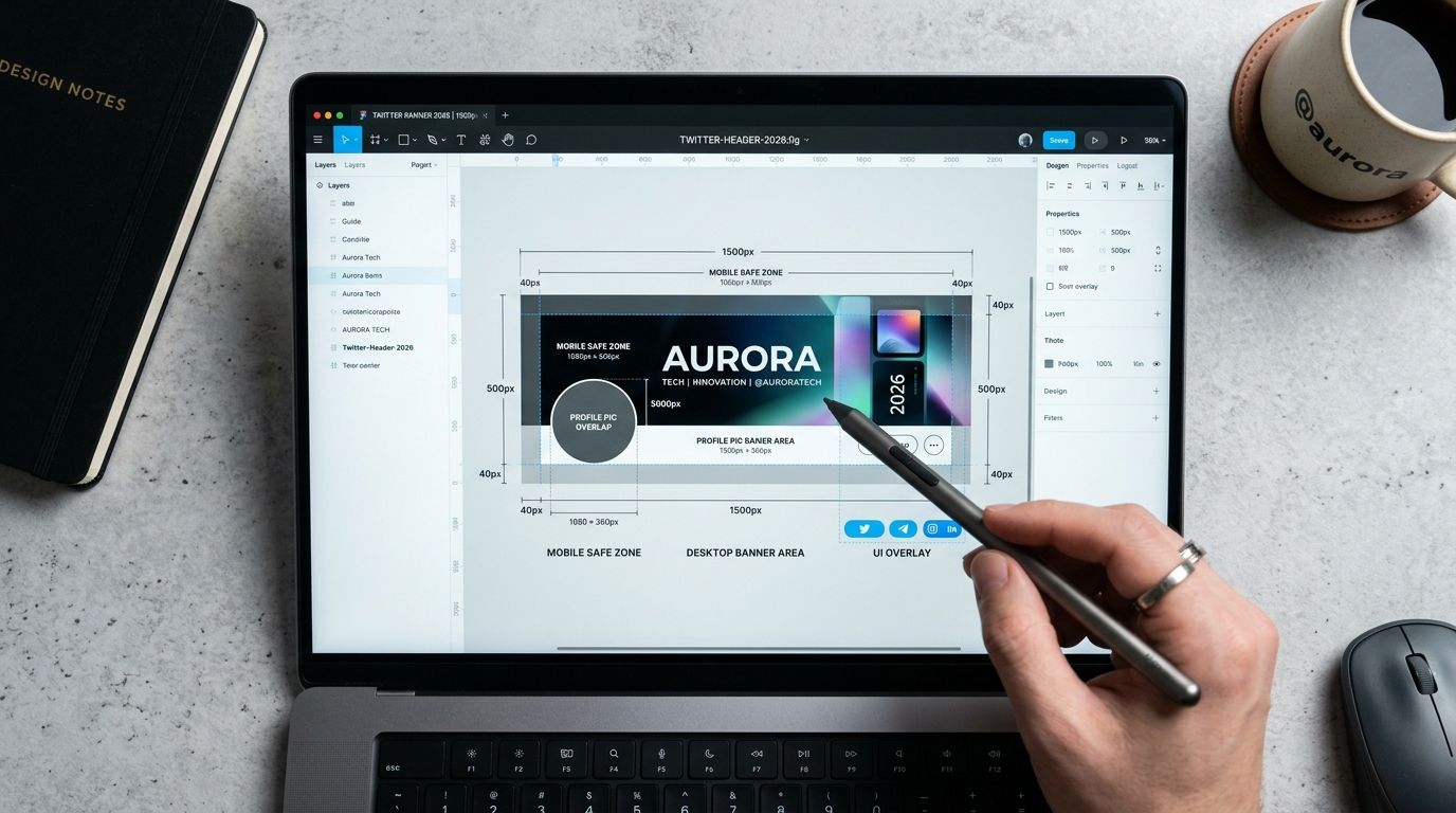
Always account for the profile picture overlap when placing your primary product image in a header design.
Top and bottom edge trimming
Mobile devices introduce another variable. Because phone screens have vastly different aspect ratios than desktop monitors, the Twitter app zooms in slightly on your image to fill the available space. This process trims approximately 50 pixels off the very top edge and another 50 pixels off the bottom edge.
You cannot prevent this cropping. It is hardcoded into the app interface. The only solution is to design around it by leaving the top and bottom borders free of vital information.
Your true safe zone is the center of the image, biased slightly to the right. Place your product photography on the right side. Keep your text centered. Let the far left side of the graphic serve as negative space.
Why your Twitter cover photo size matters for product brands
Ecommerce brands often treat social headers as an afterthought. They set a generic lifestyle photo during the account creation process and ignore it for three years. This is a missed opportunity. Your banner sits above every single interaction a customer has when they view your profile.
When someone clicks through to your profile after seeing a viral post, the banner is their first visual cue. It dictates whether they perceive you as a premium label or a drop-shipping operation. Building a strong visual brand identity requires consistency across every touchpoint. The header should reflect your current seasonal campaign, not a generic texture.
Common mistakes that make your Twitter banner look blurry
You followed the dimensions perfectly. You left space for the profile picture. You uploaded the file. And it looks completely blurry. I have sat in marketing meetings where an entire team spent thirty minutes refreshing the page, convinced their browser cache was broken. The reality is usually simpler.
Overworking the export settings
Designers naturally want to upload the highest possible resolution. They will export a banner at 3000 by 1000 pixels. They assume the platform will downscale it cleanly. This is false. Social media platforms use aggressive, cheap server-side compression algorithms. When you force Twitter to resize a massive file, their algorithm crushes the pixel data to save bandwidth. The result is a fuzzy, artifact-heavy image.
You must export your file at exactly 1500 by 500 pixels. Do not force the platform to do the math. Hand them an image that requires zero resizing.
Design tips for ecommerce banners in 2026
A good product banner answers one question immediately: what do you sell? If a customer lands on your profile and has to read your bio to understand your category, your banner failed.
The most effective strategy I have seen is rotating your header to match your paid campaigns. If you are pushing scroll-stopping social ad images into your funnel, use the exact same hero photography for your profile header. Consistency builds trust. When a user clicks an ad for a new red handbag and lands on a profile featuring that same red handbag in the banner, they know they are in the right place.
Using AI to generate banner photography
The main reason brands neglect their headers is logistics. Booking a studio shoot to grab wide-angle landscape shots specifically for a 3:1 banner ratio is expensive. Standard catalog photos do not fit the dimensions without leaving awkward blank space on the sides.
This is where AI product photography solves the margin problem. If you only have a standard square product shot, you do not need to hire an agency to build a banner. You upload that standard product image to CherryShot AI, select a wide aspect ratio, and drop it into a Lifestyle or Minimalist mode. The platform generates an aesthetic, campaign-ready background around your product in minutes. You get a perfect 3:1 asset without organizing a half-day shoot.
Keep the design clean. A busy background distracts from the product. Your goal is to guide the eye toward your profile bio and the link to your storefront.
Update your banner to reflect your current product season
Use your high-converting product shots to populate your Twitter banner at the correct 3:1 aspect ratio. You can instantly generate studio-quality, wide-format backgrounds that fit these dimensions perfectly using our tools.
Try CherryShot AIFrequently Asked Questions
What size should my Twitter banner be?
The ideal Twitter banner size is exactly 1500 pixels wide by 500 pixels tall. Save your file as a JPEG, PNG, or WebP format while keeping the total file size under two megabytes. Adhering to these specific dimensions ensures the platform does not trigger an automatic compression algorithm upon upload.
Has Twitter changed its banner dimensions in 2026?
Base dimensions remain 1500 by 500 pixels across the platform interface. How the mobile app handles top and bottom edge cropping has evolved toward tighter margins for content. Designers must keep primary visuals in the center to avoid losing critical information on smaller phone screens.
Why does my Twitter banner look blurry?
Blurriness occurs when platform compression algorithms struggle with massive resolution files. Uploading an exact 1500 by 500 pixel image prevents the server from forcing a destructive resize on your graphic. PNG-24 format works best for images containing text to maintain edge sharpness.
What is the safe zone for Twitter banners?
Safe zones center around the middle of your header image. Profile pictures occupy a large 400 by 400 pixel area in the bottom left corner on desktop displays. Mobile devices trim roughly 50 pixels off the top and bottom edges, requiring a centered layout for maximum visibility.
How do I design a Twitter banner for my product brand?
Treat your banner as a digital billboard designed for immediate brand recognition. Use negative space on the left side to accommodate the profile picture overlap. Place your high-resolution product photography on the right side and swap these graphics regularly to align with your current marketing campaigns.
Key Takeaways
- The mandatory Twitter banner dimensions are 1500 x 500 pixels.
- Keep text and vital logos out of the bottom left corner to avoid profile picture overlap.
- Export exactly at the recommended dimensions to prevent platform compression blur.
- Use PNG files instead of JPEGs if your banner contains text or sharp graphics.
Every pixel of your social presence contributes to your overall brand equity. Stop treating your Twitter banner like a mandatory form field. By mastering the dimensions and utilizing smart design workflows, you can turn a basic header into a dynamic storefront window.