Ecommerce Conversion Rate by Device in 2026: Why Desktop Dominates and Images Matter
Traffic comes from phones. Margin comes from laptops. The ecommerce conversion rate by device has stubbornly favored desktop for over a decade, and it has absolutely nothing to do with your checkout flow. Brands spend millions optimizing mobile payment gateways, yet desktop continues to convert at nearly double the rate. The problem is not friction. The problem is visual confidence. Mobile users cannot see the product details they need to trust your brand.
Definition
Ecommerce conversion rate by device measures the percentage of website visitors who complete a purchase, segmented by the hardware they use to browse. This metric reveals performance gaps between desktop monitors, tablets, and smartphones. Tracking these distinct rates helps retailers identify platform-specific friction points in their shopping experience.
Any brand manager who has logged into Google Analytics in the past month knows this pain. You pull the device category report. The story is always the same. Mobile drives seventy-five percent of your sessions. Desktop drives sixty percent of your revenue. You spend the next month tweaking the mobile site, removing form fields, and adding one-click payment buttons. The conversion rate barely twitches.
If you want to fix your mobile vs desktop conversion rate, you have to stop looking at your code and start looking at your product photos.
The Reality of Ecommerce Device Conversion Benchmarks
Founders look at the mobile conversion gap and assume their mobile experience is broken. It is not broken. Mobile and desktop simply serve different psychological functions in the buying journey. Mobile is an engine for discovery. Desktop is an engine for purchasing.
A customer scrolling Instagram on their commute taps an ad for a leather jacket. They land on your mobile product page. They are interested, but they are on a moving train. The screen is glaring. They cannot clearly see the grain of the leather. They bounce. Later that evening, they remember the jacket. They open their laptop, pull up your site, inspect the high-resolution images, and buy.
In your analytics platform, mobile gets penalized with a bounce, and desktop gets rewarded with a conversion.
This behavior creates the massive delta we see in desktop vs mobile ecommerce CVR. Desktop users arrive with higher intent, but they also arrive at a platform that makes buying inherently easier. The screen real estate available on a laptop natively removes the hesitation that blocks a sale.
Screen Real Estate and Visual Trust
On a desktop monitor, a customer sees the hero image, four thumbnail variations, the product description, the sizing chart, and the add-to-cart button simultaneously. Their eyes dart across the screen gathering data points in seconds. When they want a closer look, they simply hover their mouse. The image zooms smoothly without altering the page layout.
On a mobile phone, that experience is shattered. The customer sees one image. To see the next, they swipe. To see the price, they scroll. To see the details of the fabric, they pinch to zoom. Pinching often misfires, either swiping to the next image or zooming in so far that the image pixelates. The friction is exhausting.
Trust requires detail. Desktop provides detail natively. Mobile requires the user to work for it. When users cannot easily inspect the details they care about, their confidence evaporates and their session ends. If you are constantly getting clicks but no sales because your product images are losing the conversion, device rendering is almost certainly the culprit.
| Factor | Desktop Environment | Mobile Environment |
|---|---|---|
| Visual Context | Image, text, and price visible simultaneously | Requires sequential scrolling to view details |
| Image Interaction | Hover-to-zoom maintains page layout | Pinch-to-zoom risks layout shifts or pixelation |
| Optimal Image Framing | Wide landscape shots with negative space | Tight vertical crops filling 80% of the screen |
| Typical Buyer Intent | High purchasing intent | High discovery and browsing intent |
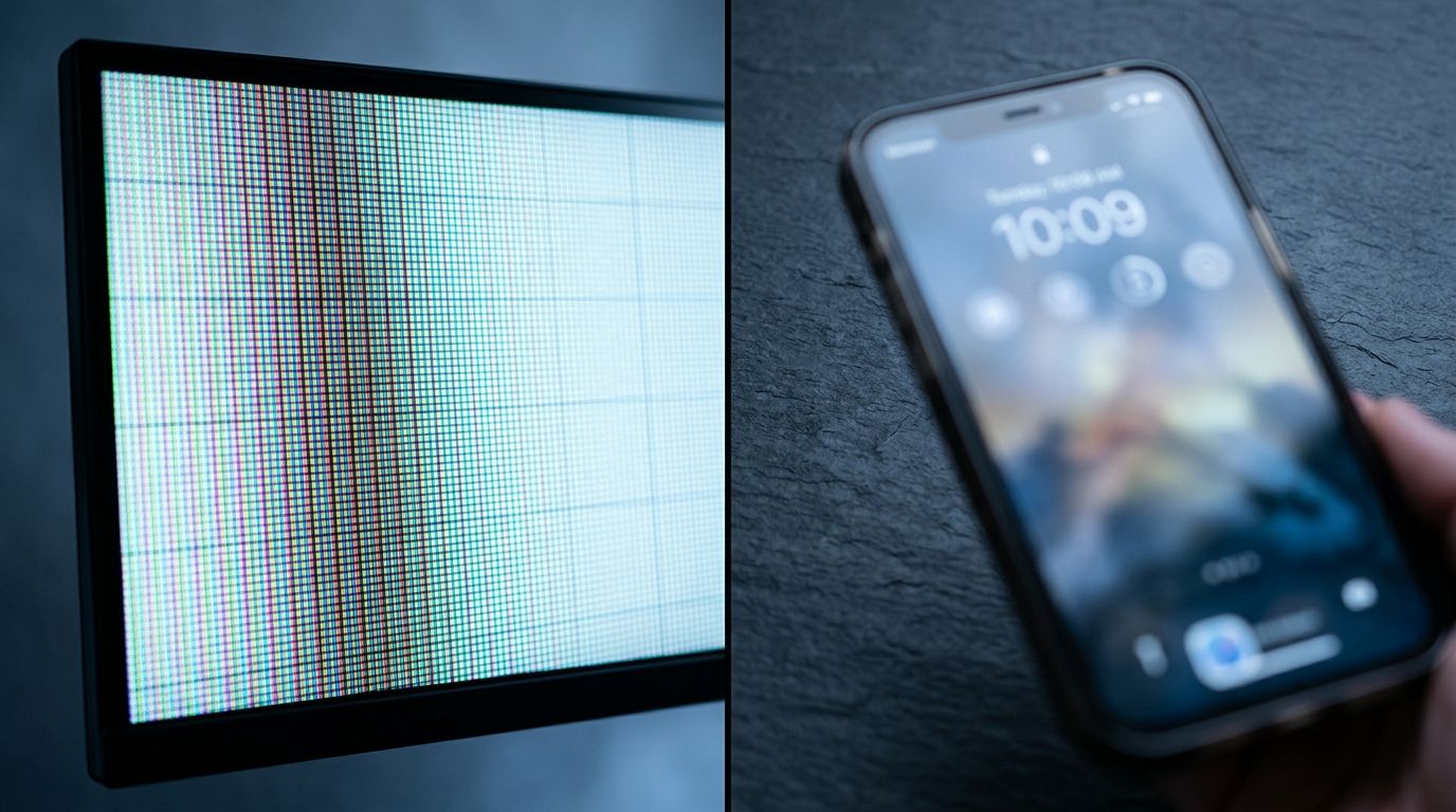
The same product image viewed on desktop versus mobile. Without device-specific cropping, mobile users stare at empty white space instead of product details.
How Product Image Mobile Rendering Ruins Margins
The root cause of the mobile conversion gap usually traces back to a studio shoot that happened six months ago. Most brands shoot for desktop. They book an expensive studio, put a product on a pedestal or a model against a white cyclorama wall, and shoot wide.
That wide shot looks incredible on a twenty-seven-inch monitor. The negative space feels luxurious. The composition breathes. But when you take that exact same image asset and force it onto a six-inch phone screen, the product itself shrinks to the size of a postage stamp. It takes up fifteen percent of the frame. The remaining eighty-five percent is empty white pixels.
Customers cannot see the stitching on the hem. They cannot see the texture of the serum. They cannot see the clasp on the necklace. They are forced to rely on your written copy, and nobody reads written copy on mobile.
The Mobile-First Photography Mandate
Creating visuals for the small screen demands a different set of rules. Mobile first photography requires tight crops. The product needs to dominate the vertical frame. You need aggressive contrast because mobile screens are often viewed outdoors under direct sunlight where subtle gradients disappear completely.
Here is the honest limitation that brands face. Shooting twice is incredibly expensive.
Historically, building a device-specific asset library meant doubling your shot list. The art director needed a wide shot for the desktop hero banner and a tight, high-contrast crop for the mobile product carousel. The studio time doubled. The editing time doubled. The invoice doubled.
(Many brands tried to bypass this cost by simply cropping their high-resolution desktop images in post-production, but this inevitably ruined the composition and exposed massive compression artifacts when the file was squeezed through mobile content delivery networks.)
Founders had to choose between mobile optimization and their profit margin. Most chose margin. They served desktop images to mobile traffic and accepted the abysmal conversion rate as the cost of doing business.
Solving the Desktop vs Mobile Ecommerce CVR Gap
You cannot force users to buy on their phones. You can only give them the visual proof they need to pull out their credit card without hesitation. This is where AI product photography completely rewrites the budget.
Any brand still running a full studio shoot for standard catalog images in 2026 is paying for logistics, not quality. With CherryShot AI, you no longer have to compromise on device-specific conversion strategies. You upload a single reference photo of your product. You select a visual mode. You generate campaign-ready photos in minutes.
You can output a wide, minimalist aesthetic for your desktop product page performance. Ten minutes later, you can select the Influencer mode and generate a tight, dynamic lifestyle shot specifically formatted for mobile scrolling.
The per-image cost drops from $150 to under $5. The bottleneck shifts entirely from production budget to creative testing. When you can generate device-specific imagery in an afternoon instead of booking another shoot day, you finally have the tools to attack your mobile conversion gap mathematically.
Load Speed and Compression Failures
Even if you crop your images perfectly for mobile, you can still destroy your conversion rate if those files take too long to render. Mobile traffic heavily relies on cellular networks. A four-megabyte hero image that loads instantly on a corporate Wi-Fi connection will stall completely on a 5G network in a crowded area.
When images fail to load within three seconds, the user bounces. They do not wait. Ensuring you have the correct image size for mobile conversion and load speed is just as critical as the aesthetic composition of the photo. If the image never renders, the crop does not matter.
This means your ecommerce infrastructure needs to serve entirely distinct assets. High-resolution, wide-aspect images for desktop. Highly compressed, tightly cropped vertical images for mobile.
The Path Forward in 2026
The brands that are closing the gap between desktop and mobile conversion are not relying on better checkout buttons. They are relying on better visual communication. They understand that a customer holding a phone needs immediate, undeniable proof of product quality.
Stop serving compromised assets. Stop asking your mobile traffic to squint. Address the visual gap, and you will see your mobile revenue finally align with your mobile traffic volume.
Frequently Asked Questions
What is the average ecommerce conversion rate by device?
Desktop ecommerce conversion rates average between 2.5 and 3.5 percent, while mobile rates linger around 1.5 to 2.0 percent globally. This consistent performance gap exists because consumers strongly prefer finalizing purchases on larger monitors where product details appear clearly without excessive scrolling. Auditing your device-level analytics will reveal exactly how much potential revenue you lose to poor mobile image rendering.
Why does desktop convert more than mobile?
Desktop environments yield higher sales because large monitors present all critical purchasing information to the buyer simultaneously. Shoppers can easily view the primary hero image, alternative product thumbnails, precise pricing, and sizing charts without ever needing to scroll. Replacing your wide desktop photos with tightly cropped vertical assets on mobile prevents users from abandoning their session out of visual frustration.
Do product images affect mobile conversion differently than desktop?
Product imagery carries drastically more behavioral weight on mobile phones compared to traditional desktop computers. Smaller smartphone viewports force the main photo to act as the sole source of truth, completely removing the surrounding descriptive text available on a large monitor. Cropping your visual assets tightly ensures the physical item fills the entire screen, delivering the immediate visual proof required to convert.
How do I optimize product images for mobile ecommerce?
Optimizing visual assets for smartphones requires implementing tight crops, high contrast levels, and aggressive file compression techniques. Wide studio shots leave excessive empty white space on narrow screens, causing your merchandise to appear microscopic to the average buyer. You must upload vertical image formats where the physical product occupies at least eighty percent of the active frame to prevent immediate bounce rates.
What is the mobile ecommerce conversion benchmark in 2026?
The standard global benchmark for mobile ecommerce conversion currently sits near 1.8 percent across most major retail categories in 2026. Brands stuck relying on outdated wide-format desktop photography often see their metrics stall well below 1.2 percent due to severe visual friction. Generating mobile-specific vertical product images allows direct-to-consumer retailers to routinely push their smartphone checkout success rates above the 2.5 percent threshold.
Key Takeaways
- Desktop outconverts mobile because larger screens build visual trust faster through simultaneous information display.
- Serving wide desktop image assets to mobile users creates empty screen space and hides critical product details.
- Mobile-first photography requires tight crops and high contrast to combat small screens and outdoor viewing environments.
- AI product photography eliminates the cost barrier of producing separate visual asset libraries for different devices.
If you are tired of watching mobile traffic bounce because your product photos fail to translate to a small screen, it is time to change your production workflow. Stop paying studio day rates for assets that only perform on laptops. Visit CherryShot AI to generate device-specific, high-converting product photos in minutes.
Audit your mobile image framing today
Pull up your top-performing product page on your smartphone right now. If the item occupies less than eighty percent of the vertical screen, you are actively losing mobile sales. Generate a tight, high-contrast mobile asset to see how much faster visual trust builds.
Try CherryShot AI