Ecommerce Conversion Rate by Device in 2026: Desktop vs Mobile Benchmarks
Desktop ecommerce conversion rate averages 3.8% in 2026. Mobile conversion rate trails significantly at 2.1%. Tablet conversion rates land in the middle at 2.9%. The gap between desktop and mobile is not a failure of your design team. Brands waste hundreds of thousands of dollars trying to force a mobile conversion rate to match desktop. You cannot force mobile users to buy at desktop volumes. You can only remove the friction that actively prevents them from buying when they are ready.
Definition
Conversion rate by device measures the percentage of unique website visitors who successfully complete a purchase, categorized by the specific hardware they used to access the store. Tracking this metric across desktop, mobile, and tablet traffic reveals hidden layout issues and clarifies exactly where distinct friction points block sales on smaller screens.
Accepting this reality requires a shift in how you build product pages. Optimizing heavy hero images for instant mobile loading will slightly degrade the ultimate retina quality of the file. That speed tradeoff is mandatory. A crisp image that takes four seconds to load on a 5G connection will kill your conversion rate far faster than a slightly compressed image that loads instantly.
(If you want to feel better about your mobile metrics, remember that a massive portion of mobile traffic is top-of-funnel discovery via Instagram or TikTok. Desktop traffic has much higher buying intent baked in from the very first click.)
Mobile traffic drives the majority of discovery volume but desktop continues to dominate final purchase conversions.
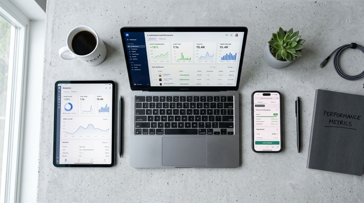
Device conversion rate benchmark ecommerce figures
Looking at aggregated data across North American merchants reveals exactly where the baseline sits. If your store operates wildly outside of these parameters, you likely have a critical UX flaw on a specific device.
| Device Type | Average Conversion Rate | Traffic Share |
|---|---|---|
| Desktop | 3.8% | 28% |
| Mobile | 2.1% | 70% |
| Tablet | 2.9% | 2% |
Desktop vs mobile conversion rate ecommerce realities
The desktop vs mobile conversion rate ecommerce gap is primarily a story of traffic quality. Mobile traffic volume is massive. It represents nearly three quarters of all site visits. Most of those visitors are bored. They are sitting in waiting rooms, riding trains, or avoiding work. They click an ad on social media, scroll through your product page, and leave.
Desktop traffic volume is smaller but highly intentional. Very few people are idly browsing Instagram on their work laptop. If someone is on your site via a desktop computer, they likely searched for your brand or product category explicitly. They have multiple browser tabs open. They have their credit card nearby. They are researching to buy. You cannot expect a casual mobile browser to convert at the same rate as an intentional desktop researcher.
Why the mobile desktop conversion gap refuses to close
Founders have spent the last ten years obsessed with mobile-first design. We introduced sticky add-to-cart buttons. We simplified navigation menus into sleek hamburger icons. We enabled Apple Pay and Shop Pay to make the actual checkout process a one-click interaction.
None of this closed the mobile desktop conversion gap.
The physical reality of screen size
A desktop screen is a luxury of space. When a user lands on a product page on desktop, they instantly see the product title, the price, a massive high-resolution image gallery, the product description, and the buy button. Their brain processes the entire offering in a single glance. No action is required to understand the value proposition.
Mobile is a sequence of forced interactions. You simply do not have the pixel real estate to show everything at once. The user must scroll to understand the context. They see the image first. Then they scroll to see the price. Then they scroll again to read the details. Every single swipe is a moment where they can lose interest. If they encounter any friction during that scrolling sequence, they leave. Understanding exactly what makes product photos convert is heavily dependent on mastering this sequential mobile layout.
How product photography mobile experiences kill conversions
The biggest offender in mobile bounce rates is bad visual asset management. Traditional photography shoots are fundamentally hostile to mobile screens. A photographer working in a studio will typically frame shots in a wide landscape format because they are looking through a traditional viewfinder. Those wide landscape shots look brilliant as desktop hero banners.
When you upload that exact same horizontal file to a mobile product page, the image shrinks dramatically to fit the width of the phone. The product becomes tiny. The customer cannot see the texture of the fabric or the finish on the metal.
This is exactly why CherryShot AI exists. Instead of paying a photographer to reshoot everything in vertical aspect ratios, you upload a single product image to our platform. You select your visual mode. In minutes, CherryShot AI generates campaign-ready photos perfectly framed for 4:5 mobile aspect ratios. The per-image cost drops to under $5. You get the exact vertical crop you need to fill a mobile screen without running a four-hour studio reshoot.
Above the fold mobile real estate
The above the fold mobile experience dictates your conversion fate. When a user lands on a product page, the first viewport must contain enough information to convince them to scroll. If your image takes up 90% of the screen but the product is tiny within that frame, you have wasted your most valuable real estate.
You need tight crops. You need vertical images that maximize screen height while clearly showing product details. If your mobile images are not communicating value instantly, you are burning your ad spend. The mechanics of optimizing product page images for conversion require ruthless attention to crop ratios and focal points.
Gallery UX and responsive images
A seamless gallery UX is the second hurdle. Mobile users expect to swipe. If your image gallery relies on tiny thumbnail clicks instead of fluid swiping, you are creating frustration. Worse still is the technical execution of the images themselves.
Image loading speeds are silent killers of the mobile conversion rate. A desktop connected to fiber internet can download a 3MB uncompressed image instantly. A mobile phone on a congested 4G network cannot. When heavy images load slowly on mobile, they cause layout shifts. The user tries to click the add to cart button, the image finally loads, the page jumps, and the user accidentally clicks an unrelated link.
You must serve responsive images. Your platform needs to detect the user device and serve a tightly compressed WebP file specifically sized for their exact screen width. Using CherryShot AI helps resolve this by giving you total control over the output size and ratio before the file ever touches your server. You get clean, lightweight files that load instantly instead of giant raw exports from a freelance photographer.
When images load cleanly and clearly, users trust the brand. When they trust the brand, they buy. When they buy exactly what they expected to receive, they do not return the item. If you want to understand the long-term margin impact, look at how product photography affects return rates when mobile details are obscured by bad formatting.
Key Takeaways
- Desktop conversion rates hold strong at 3.8% due to high user intent and spacious screen real estate.
- Mobile conversion rates average 2.1% largely because mobile traffic relies on low-intent social media discovery.
- Horizontal images that look beautiful on desktop fail completely on mobile by rendering products too small to see.
- Slow mobile image loading causes layout shifts that actively prevent interested customers from clicking add to cart.
Frequently Asked Questions
What is the average ecommerce conversion rate by device in 2026?
In 2026, desktop ecommerce conversion rates reach an average of 3.8%, while mobile devices lag significantly behind at 2.1% and tablets land in the middle at 2.9%. This persistent statistical hierarchy remains identical across almost all retail categories because shoppers interact with these specific screen sizes under entirely different psychological conditions. Merchants must accept this permanent gap by designing dedicated visual asset layouts for each device type rather than forcing a single desktop layout onto smaller smartphone screens.
Why does desktop convert better than mobile for ecommerce?
Desktop devices produce higher sales volumes due to strong user intent and a massive reduction in interface friction. A shopper browsing on a laptop typically sits with dedicated focus, allowing them to easily compare multiple open tabs, input complex shipping details, and comfortably complete an order. Large monitors display the main product image, exact pricing details, critical specifications, and the checkout button simultaneously above the fold, which drastically lowers the mental effort required to finalize a purchase.
What causes the ecommerce conversion gap between mobile and desktop?
This performance gap stems directly from varying traffic source quality and severe physical screen limitations. Smartphone traffic consists primarily of top-of-funnel social media clicks from bored users browsing purely out of casual curiosity, whereas desktop visitors arrive through highly intentional search queries. Severe physical limitations like tiny cropped product images, clumsy swiping galleries, and the endless scrolling required to locate basic specifications actively block these mobile users from eventually converting.
How do product images affect mobile vs desktop conversion rate differently?
Horizontal lifestyle photography performs exceptionally well on desktop monitors because the expansive wide screen accommodates the entire scene naturally without shrinking the core subject. When those identical horizontal files load on a smartphone, the system aggressively shrinks the image width, forcing the actual physical product to appear completely illegible to the shopper. You must serve tightly compressed vertical or square responsive images on mobile devices to prevent slow loading speeds and jarring layout shifts that block the checkout button.
Optimizing your site for both devices does not require a massive agency retainer. It requires understanding the fundamental differences in how users behave on different screens. Serve horizontal images to your desktop users. Serve lightweight vertical assets to your mobile users. If you need a fast way to generate those vertical assets without renting a studio, look at what CherryShot AI can do for your catalog.
Audit your mobile image crops before launching your next campaign
Pull up your top three best-selling product pages on your smartphone right now. If the hero images are horizontal and force the product to look tiny, generate proper vertical mobile crops using CherryShot AI to stop losing high-intent traffic.
Try CherryShot AI