Infographic Product Images for Ecommerce: When Visual Information Overlays Increase Conversion
Users do not read your product descriptions. They swipe through your image carousel and make a decision based entirely on what they see. If you sell a highly technical product and rely on a wall of text below the fold to explain why it matters, you are actively losing sales. Infographic product images for ecommerce solve this by putting feature callouts directly onto the photo. Text overlays ensure your core value proposition is actually seen.
Definition
Infographic product images are ecommerce photos that feature text overlays, arrows, and graphical callouts to highlight specific item details. They extract technical specifications from the written description and place them directly onto the visual assets. This strategy ensures mobile shoppers consume critical buying information while swiping through the primary image carousel.
(I learned this the exact wrong way a few years ago when managing an outdoor apparel brand. We spent weeks agonizing over the copywriting for our new waterproof zippers, only to look at heat maps and realize ninety percent of mobile users never scrolled past the third photo in the gallery.)
Putting text on images does clutter the visual frame. A clean, minimalist hero shot will always look more artistic than a photo covered in text. A product infographic overlay actually converts the hesitant buyer who needs specific details to justify the purchase. If you care about sales more than portfolio aesthetics, visual information overlays are mandatory.
The conversion math behind product image text annotation
Why visitors ignore your bullet points
Think about the physical act of shopping on a mobile phone. The thumb naturally swipes left to right. The brain processes visual information thousands of times faster than written words. By the time a user has swiped through your five product photos, they have already subconsciously decided if they want the item.
If you are getting clicks but no sales on your store, the disconnect usually happens right here. You bought the traffic, the user landed on the page, they looked at a pretty picture of a blender, and they left. They left because they did not know the blender had a silent motor and surgical steel blades. That information was hidden down in the description tab.
When you introduce a feature callout product image into that carousel, you force the user to consume your best selling points during their natural swiping behavior. You take the friction out of learning. The user does not have to hunt for the battery life or the material specs because you placed those facts directly over the product itself.
When to use a feature callout product image
Complexity demands visual explanation
Not every product needs a text overlay. If you are selling a basic ceramic coffee mug, an infographic telling the customer that it holds coffee is a waste of pixels. You use a product benefit image when the value of the item is not immediately obvious just by looking at it.
Nutritional supplements are a perfect example. A plastic bottle looks like a plastic bottle. An annotated product photo for ecommerce that points to the label and calls out "Clinically dosed at 500mg" or "No artificial fillers" transforms that basic photo into a persuasive sales asset.
The same rule applies to consumer electronics, technical luggage, specialized skincare, and high-performance athletic wear. Any time your product costs more because of a specific feature, that feature must be highlighted in the image gallery. Shoppers will not pay a premium if they cannot see the premium.
How to design an annotated product photo for ecommerce
Keep the text minimal and the contrast high
There is a fine line between a helpful product feature overlay and a chaotic mess. The goal is not to copy and paste your entire product description onto the image. The goal is to highlight three to four key facts.
The text must be legible on a tiny mobile screen. Use heavy, sans-serif fonts. Keep the contrast stark. If your product is dark, use white text. Do not overlay text directly across the main body of the product. Place your callouts in the negative space around the item and use simple, thin lines pointing to the specific features.
Understanding what makes product photos convert means understanding visual hierarchy. The product remains the hero. The text is the supporting cast.
Watch your file sizes
Adding text and graphic elements often results in people exporting massive, uncompressed PNG files. You still need to optimise your Shopify product page images before uploading them. A slow-loading infographic image will hurt your conversion rate more than a lack of information ever could. Compress your final files to keep your page speed fast.
Plain photography vs product benefit image: A direct comparison
Your image carousel should never be exclusively one or the other. A high-converting product page relies on a mix of visual assets doing different jobs. You still need that flawless hero shot. You just need the infographic product shot to do the heavy lifting later in the gallery.
| Metric | Plain Product Photo | Infographic Product Image |
|---|---|---|
| Primary Function | Establish visual appeal and form | Communicate specific features and value |
| Carousel Placement | Image slots 1 and 2 | Image slots 3, 4, and 5 |
| Information Density | Zero text, purely aesthetic | High context, scannable bullet points |
| Best Used For | First impressions and emotional desire | Rationalizing the purchase and answering objections |
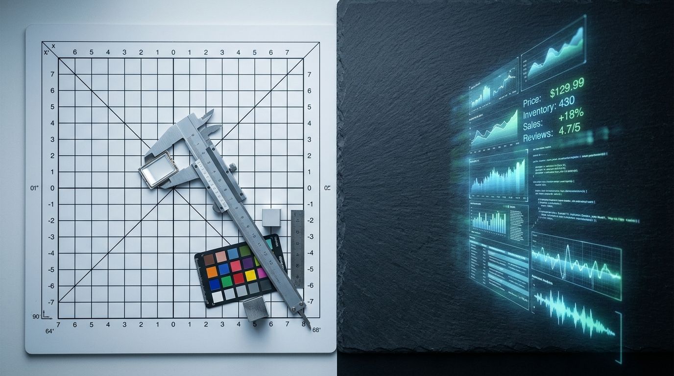
Generating the base assets for your infographic product shot
Removing the studio bottleneck
Before you can add text annotations, you need a flawless base photo. A low-resolution, poorly lit image with text slapped on top of it looks like a cheap internet meme. It destroys brand trust instantly. You need a crisp, high-resolution product shot with enough negative space around the edges to house your typography.
Getting that base asset used to mean booking a photographer, setting up a white cyclorama wall, and waiting two weeks for the retouched files. For a startup testing new variations, the math simply does not work anymore. That is exactly where CherryShot AI changes the production timeline.
Instead of waiting weeks, you can snap a quick reference photo of your product and upload it to CherryShot AI. By selecting the Minimalist or Classic mode, the AI strips away your messy background and generates a studio-quality asset in perfect lighting. The product is isolated perfectly, giving you a massive canvas of clean negative space.
Once you have that pristine AI-generated asset, you just export it into your preferred design tool, add your feature callouts, and upload it straight to your store. A process that used to cost hundreds of dollars and span multiple weeks now takes twenty minutes and costs roughly five dollars. The bottleneck completely disappears.
Frequently Asked Questions
What are infographic product images?
Infographic product images are standard ecommerce photos enhanced with text overlays, arrows, and graphical elements designed to highlight specific item specifications. Shoppers typically swipe through visual galleries on mobile devices rather than reading lengthy product descriptions located below the fold. Adding concise text directly onto a clean product shot ensures buyers immediately understand technical details like battery capacity, material durability, or exact dimensions before they scroll away.
Do text overlays on product images increase conversion?
Text overlays reliably increase conversion rates by educating buyers during their natural swiping behavior rather than forcing them to hunt for details. Modern consumers prioritize visual galleries over written descriptions when making rapid purchasing decisions on mobile devices. Placing critical selling points like clinical dosages or waterproof ratings directly onto the secondary carousel images significantly reduces page bounce rates for complex or premium items.
When should I use infographic product photos?
You should deploy feature callout photos whenever an item possesses hidden technical specifications, premium materials, or unique components that justify a higher price point. Basic visual appearances rarely communicate the complete value proposition of specialized goods to hesitant buyers. Incorporating annotated images works exceptionally well for dietary supplements, consumer electronics, and performance athletic wear where shoppers need hard facts to finalize their purchase decision.
What products work best with feature callout images?
Items designed to solve specific functional problems or offer measurable performance metrics benefit the most from annotated imagery. Complex merchandise requires visual proof of its claims to establish immediate trust with the browsing customer. An outdoor brand selling a technical waterproof jacket must use visual pointers to highlight the taped seams and specialized zippers instead of expecting the user to discover these facts in the text.
How do I create infographic product images?
Begin the process by generating a pristine base photo featuring substantial negative space around the isolated item. A cluttered background severely limits legibility and makes typographic overlays look incredibly unprofessional to the end user. Import this clean studio asset into design software like Figma to apply stark, high-contrast text blocks and simple pointer lines that direct attention to three or four specific physical features.
Key Takeaways
- Shoppers consume visual information in the image carousel long before they read the text below the fold.
- Feature callouts bridge the gap between a nice aesthetic and a persuasive sales pitch.
- Text overlays work best for complex, premium, or technical products where the value is not obvious.
- You need a perfectly lit, isolated base image with ample negative space to house your typography cleanly.
Your product page is not an art gallery. It is a sales mechanism. Every image in your carousel needs to answer a specific buyer objection or highlight a key benefit. By generating clean base assets with CherryShot AI and turning them into scannable infographics, you stop relying on hope and start actively guiding the customer toward the checkout button.
Generate clean base images for your infographics
Audit your product catalog to identify technical items that need feature callouts. Use CherryShot AI to quickly generate flawless, isolated base photos with enough negative space for your text overlays.
Try CherryShot AI