Mobile Product Image Optimization: How to Make Photos Work on Small Screens
You are probably reading this on a phone right now. Your customers are definitely shopping on one. Mobile product image optimization ecommerce strategies rarely get the attention they deserve. We take a gorgeous desktop hero image, shrink it down to a four-inch piece of glass, and wonder why the conversion rate plummets. The answer is simple. A mobile product photo must communicate weight, texture, and scale in a space smaller than a playing card. If the customer has to pinch and zoom just to figure out what the item is, you have already lost them.
Definition
Mobile product image optimization is the process of strictly formatting, compressing, and cropping ecommerce photography for smartphone screens. It ensures visual assets load rapidly over cellular networks while maintaining enough textural clarity to confidently drive a purchase decision.
(To be fair, perfectly optimized mobile images will not save a fundamentally flawed product. You still need an item people actually want to buy.)
But when you have a winning product, bad mobile presentation kills its potential immediately. Most founders I speak with treat mobile imagery as an automatic step handled by their website theme. They upload a massive file and assume Shopify or WooCommerce will sort it out. This passive approach creates bloated pages, frustrating user experiences, and a massive leak in your revenue funnel. Fixing this requires understanding the physics of the small screen and changing how you approach asset creation from the very beginning.
The visual reality of ecommerce product images smartphone screens
When you commission a traditional studio shoot, the photographer is framing the shot while looking at a large monitor. They naturally leave negative space around the product to let it breathe. On a twenty-inch display, this negative space feels luxurious. On an iPhone screen, it makes your product look like a distant speck.
A mobile interface is incredibly crowded. The browser URL bar takes up space at the top. The operating system status bar sits above that. The website header and cart icon consume more real estate. By the time you account for the swiping dots and the add-to-cart button at the bottom, your actual canvas for product photos on mobile ecommerce sites is drastically reduced.
| Image Element | Desktop Display Strategy | Mobile Display Strategy |
|---|---|---|
| Framing & Composition | Abundant negative space for breathing room | Tight crop filling 80% of the screen |
| Image Dimensions | Standard resolutions mapped to 1x displays | Double resolution to support Retina density |
| File Delivery | Standard browser loading sequences | Strict lazy loading with defined aspect ratios |
Eliminating the negative space
To succeed on mobile screens, you must ruthastically crop your images. The product itself should occupy at least eighty percent of the image frame. If you are selling shoes, the toe and heel should nearly touch the edges of the photo. If you are selling jewelry, the intricate details of the clasp need to be visible without requiring the user to zoom in.
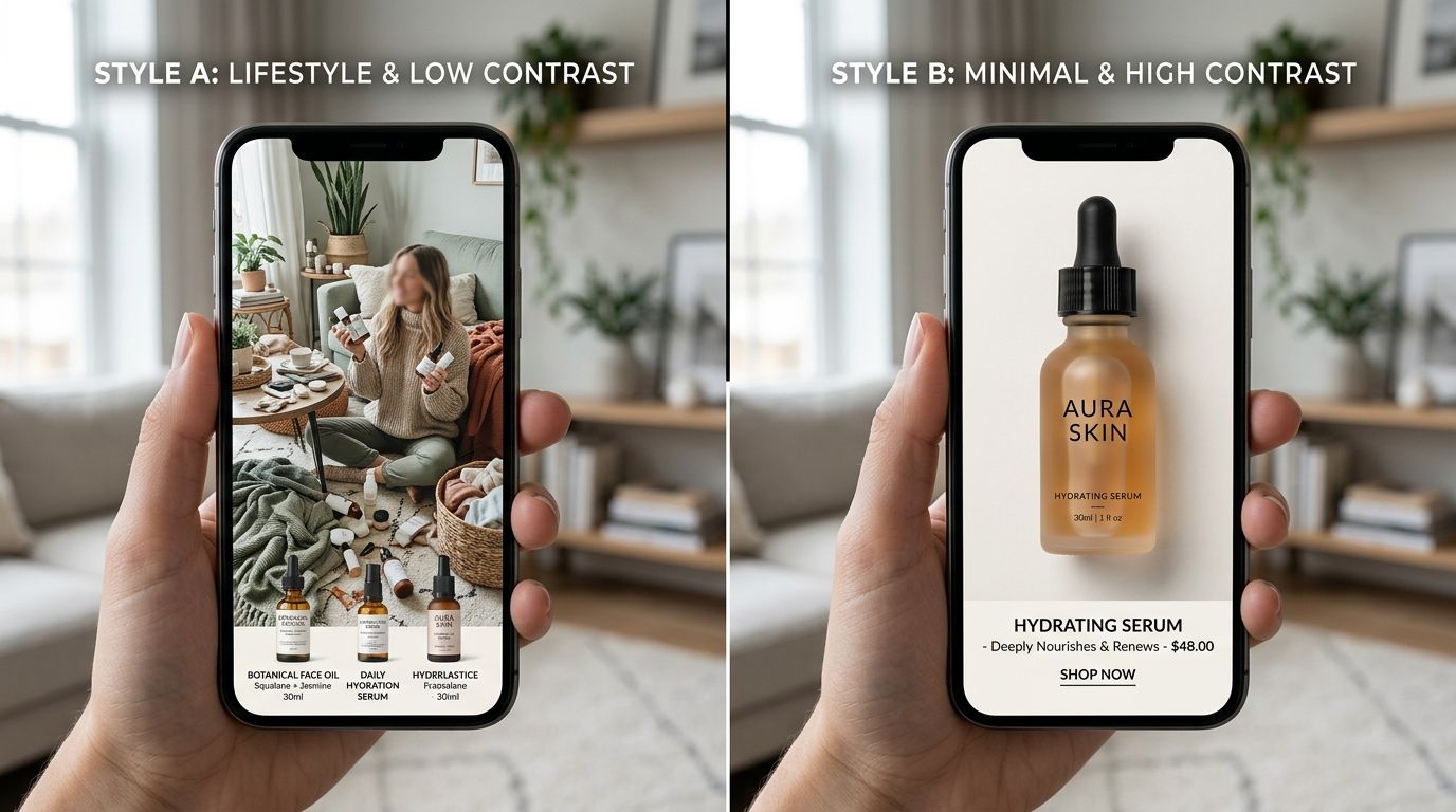
This is where volume becomes a bottleneck for traditional workflows. Asking a freelance photographer to provide specific mobile crops for three hundred SKUs will result in an enormous invoice and a delayed launch. CherryShot AI solves this entirely. Because our system is built for ecommerce efficiency, you can upload a single reference photo, select the Minimalist or Lifestyle mode, and instantly generate tightly cropped, campaign-ready images scaled perfectly for mobile views. The per-image cost drops to under $5, and you can test different zoom levels in minutes instead of weeks.
Retina displays and pixel density
Cropping is only half the visual battle. You also have to consider pixel density. Modern smartphones use high-density screens, often branded as Retina displays by Apple. These screens pack twice or even three times as many pixels into the same physical space as an older monitor.
If your website calls for an image that displays at 400 pixels wide on the screen, supplying a file that is exactly 400 pixels wide will look incredibly blurry on a modern phone. The screen will artificially stretch those pixels to fill the high-density grid. To look sharp, that image actually needs to be supplied at 800 or 1200 pixels wide, depending on the device multiplier. You have to balance this demand for high resolution against the strict limits of cellular data speeds.
Formatting and image compression for speed
There is a real trade-off here between file size and visual fidelity. If you compress an image too much to hit a perfect Google Lighthouse score, you introduce compression artifacts that make your premium product look cheap and untrustworthy. If you prioritize massive, lossless files, the page will take five seconds to load on a 4G connection. By the third second, half of your potential buyers have already hit the back button.
Speed is the silent killer of mobile conversion rates. Every additional megabyte you force a smartphone to download is a roadblock between the customer and your checkout page.
Choosing the right file type
The days of uploading massive JPEG and PNG files directly to your storefront are over. For modern mobile product image optimization, you must utilize next-generation formats. WebP format is currently the gold standard. It provides superior compression characteristics compared to traditional JPEGs, often reducing file sizes by thirty percent or more while maintaining the exact same visual quality.
Choosing the right format is critical. Our complete guide covering image formats for ecommerce breaks down the exact file size differences and browser compatibility metrics you need to know. Most modern ecommerce platforms can serve WebP automatically, but if you are managing a custom build, ensuring your server delivers WebP to supported browsers is non-negotiable.
Implementing lazy loading without layout shifts
Your product page likely contains a main hero image and a carousel of five to eight secondary images. If the browser tries to download all nine images before displaying the page, the user is left staring at a blank screen. Lazy loading solves this by telling the browser to only load the image that is currently visible on the screen. The rest are loaded seamlessly as the user scrolls or swipes.
However, lazy loading comes with a significant trap. If you do not specify your exact image dimensions mobile browsers will not know how much vertical space to reserve for the photo before it loads. As the image finally pops in, it shoves all the text and buttons down the screen. This is called a Cumulative Layout Shift. It frustrates users who were just about to tap the buy button, and it actively damages your search engine rankings. Always declare your width and height attributes in your image tags, or use CSS aspect-ratio properties to hold the space open.
Navigating the mobile product gallery
Image optimization goes beyond file sizes and pixel counts. It extends entirely into how the user interacts with the gallery. The mobile product gallery is the digital equivalent of holding the item in your hands. It needs to feel tactile, responsive, and completely frictionless.
The touch interface expectation
Desktop users click arrows. Mobile users swipe. Your touch gallery must support fluid, native-feeling horizontal swipes. If a user swipes left and the image hesitates or stutters because the next photo is still downloading, the illusion of quality is broken.
Customers also expect to double-tap to zoom in on specific materials. If your source image is too low-resolution to support zooming, the user assumes you are hiding something. A confusing or inadequate mobile view directly impacts your bottom line. We have seen firsthand how poor product photos and returns are intimately connected. When a customer cannot accurately see the texture of a fabric or the true color of a finish on their phone, they guess. When they guess wrong, they return the item. You pay the shipping both ways.
Rethinking the production pipeline
Getting all these technical details right requires starting with the right raw assets. You need wide shots for desktop banners. You need tight square crops for Instagram. You need vertical lifestyle images for TikTok and specific aspect ratios for your mobile product pages.
Trying to capture all these variations during a traditional studio day is exhausting and expensive. It forces art directors to compromise, usually resulting in a middle-of-the-road image that excels nowhere. When you implement AI tools into your workflow, you completely decouple the creation of the image from the constraints of the physical shoot. It is a core part of optimizing Shopify images for the modern mobile shopper.
You no longer have to settle for the one shot the photographer managed to capture before the studio rental expired. You can generate a dozen variations, pick the one that frames perfectly on a smartphone screen, and discard the rest. When you control the production timeline, your mobile experience finally gets the dedicated assets it requires to convert.
Key Takeaways
- Crop mobile images aggressively to eliminate negative space and highlight product details.
- Serve images at twice the display resolution to maintain clarity on high-density Retina screens.
- Use modern formats like WebP to compress file sizes without sacrificing visual quality.
- Implement lazy loading with strict aspect ratios to prevent jarring layout shifts during page load.
Frequently Asked Questions
How do I optimize product images for mobile ecommerce?
Crop out unnecessary negative space so the actual product fills at least eighty percent of the vertical frame. Modern file formats like WebP maintain crisp visual details while drastically shrinking file sizes for slower cellular networks. Serve your final image assets at exactly twice the display resolution to satisfy high-density smartphone screens, and strictly apply lazy loading to any photos placed below the fold.
Why do product images often look worse on mobile?
Brands frequently use the exact same landscape image files for both their desktop and mobile page layouts. Wide photos that look beautiful on a large desktop monitor shrink into tiny, unreadable slivers when forced onto vertical phone screens. You must supply dedicated mobile-specific resolutions, because mobile browsers will aggressively compress oversized files and create ugly, blurry edges around your items.
What image format is best for mobile ecommerce product photos?
WebP stands as the absolute best format for mobile performance across modern storefronts. This file type provides vastly superior compression compared to traditional JPEG or PNG options, ensuring rapid page load times on slower cellular networks. Export your catalog updates as WebP files to keep data footprints small while maintaining the crisp, high-resolution visual details that demanding smartphone users expect.
How should I frame product photos differently for mobile vs desktop?
Mobile framing requires extreme focus rather than the broad lifestyle environments frequently used in desktop banners. A successful smartphone image forces the actual product to occupy at least eighty percent of the available vertical frame. Eliminate wide margins completely and zoom tightly on the specific material textures or hardware clasps that otherwise vanish entirely on a four-inch piece of glass.
Stop treating your mobile traffic like an afterthought. If the majority of your visitors arrive via smartphone, your visual strategy must be built for the smartphone first.
Generating countless image variations for mobile optimization used to require an endless studio budget. Today, you can upload a single flat lay, pick a visual mode, and let CherryShot AI handle the rest. At pricing that starts at just $10 for 50 images, you can finally afford to build out a touch gallery that looks incredible on every screen size. Try CherryShot AI and start building product pages that actually convert.
Audit your product page images on a mobile screen today
Pull up your top-selling product on a smartphone right now to evaluate the negative space. If the item does not fill the vast majority of the vertical frame, crop it significantly tighter before your next ad campaign. You can generate perfectly dimensioned, mobile-ready variations instantly using our AI tools.
Try CherryShot AI