Upsell Photography for Ecommerce: How Visual Product Comparisons Move Buyers to Higher-Value Options
You cannot charge premium prices for products that look exactly like your entry-level options. If you sell a standard product for fifty dollars and a pro version for one hundred and fifty dollars, the customer needs to see that hundred-dollar difference the second the page loads. When a brand shoots an entire good-better-best product range with the exact same lighting on the exact same white backdrop, they are asking the buyer to read a feature list to justify spending more money. Buyers rarely do that.
Definition
Upsell photography is the practice of using distinct lighting, styling, and composition to visually differentiate premium products from standard models. It establishes a visual hierarchy across an ecommerce catalog, ensuring higher-priced items immediately look more valuable than entry-level options. This approach reduces reliance on written descriptions by proving the upgrade's worth at a glance.
Distinct visual modes separate entry-level products from premium upgrades instantly.
Any brand trying to execute a good-better-best pricing strategy with identical photography is actively suppressing their own revenue. The visual weight of a product sets its perceived value. If the basic model and the premium model share the same visual weight, the customer will almost always anchor to the lower price. They will assume the upgrade is an arbitrary markup rather than a meaningful step up in quality.
This is the core concept of upsell photography in ecommerce. It is the deliberate manipulation of lighting, environment, and composition to communicate a hierarchy of value. You have to visually telegraph that the premium tier belongs in a different class entirely.
The problem with catalog batch shooting
I spent years running ecommerce operations where we tried to photograph our entire catalog in three days. We would hire a studio, set up one master lighting arrangement, and run hundreds of SKUs through the exact same process. A soft front light, a bright fill, and a pure white seamless sweep. It was incredibly efficient for logistics. It was a disaster for upselling.
When you shoot a basic canvas tote bag and a full-grain leather weekender under the exact same flat catalog lighting, you flatten the value gap. The canvas bag looks perfectly fine. The leather bag looks lifeless because the flat lighting washes out the texture that makes it expensive. The customer views both side by side on a collection page and wonders why they should pay triple for the leather version when it looks just as flat as the canvas one.
Understanding what makes product photos convert requires looking at the psychology of the upgrade. Buyers do not upgrade because they logically need more features. They upgrade because the premium option feels better. It looks heavier, richer, and more permanent. Flat catalog photography strips away all of those emotional cues.
Creating visual hierarchy across tiers
To fix this, you have to break the catalog into tiers before you ever create an image. Each tier requires its own visual rules.
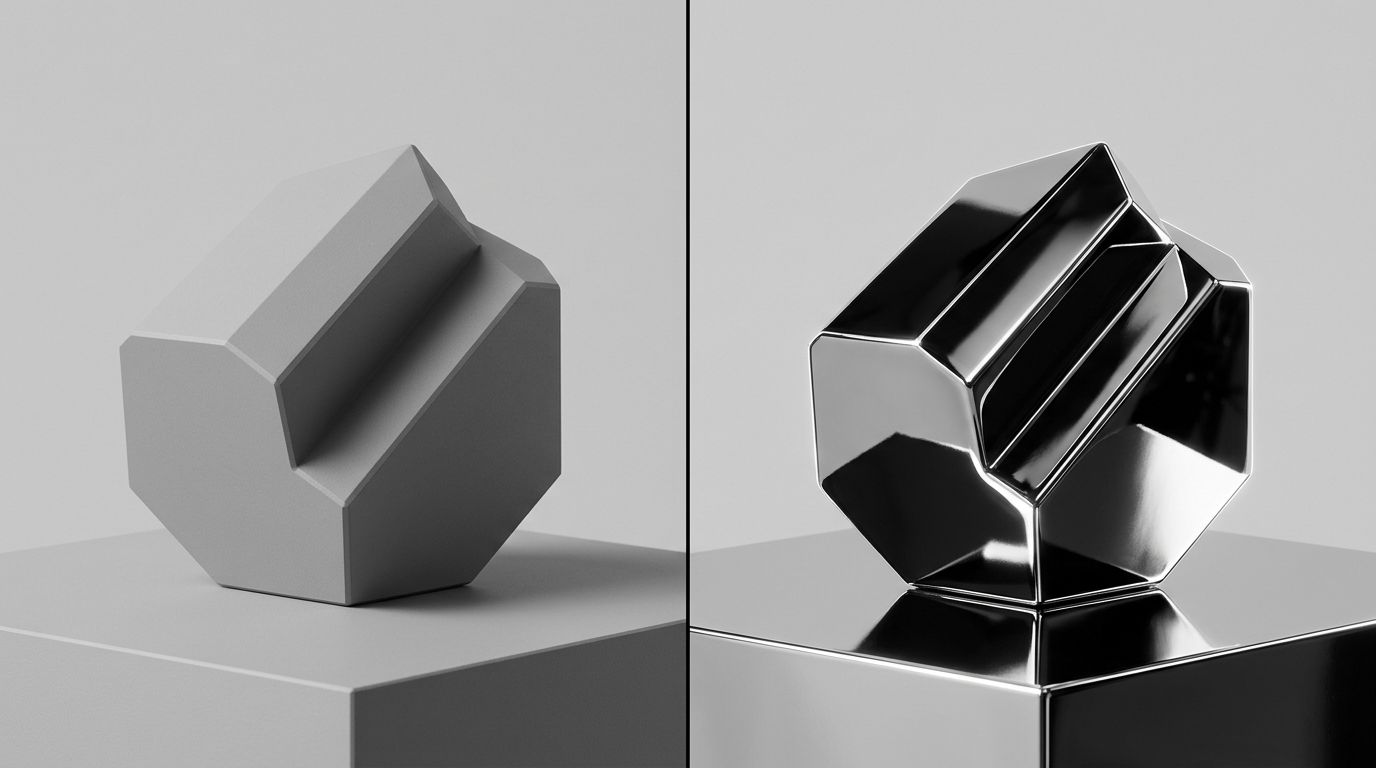
The entry-level product needs to look functional and accessible. You want clean, bright, even lighting. You want the product fully visible with no deep shadows hiding the details. The background should be simple. It needs to communicate value and utility. It should never look cheap, but it should look straightforward.
The premium product demands an entirely different approach. You drop the bright, even lighting. You introduce directional light that creates deep, dramatic shadows. Shadows imply depth and texture. You move away from pure white backgrounds and introduce richer tones or natural environments. The premium product should own its space.
| Photography Element | Standard Product Tier | Premium Upsell Tier |
|---|---|---|
| Lighting Style | Bright, even, and flat | Directional with deep shadows |
| Background | Pure white or simple grey seamless | Rich tones or natural lifestyle environments |
| Visual Focus | Utility and accessible function | Texture, material quality, and luxury |
| Image Count | 3 to 4 standard angles | 6 to 7 images including macros |
(Showing a base product next to a premium model sometimes sacrifices standard tier sales to secure the upgrade, but the higher margin usually makes this a profitable trade. The goal is higher overall revenue, not just higher volume on low-margin goods.)
The logistics of shooting for the upsell
The reason most brands do not use distinct visual styles for different pricing tiers is simple. It is a massive operational headache. Asking a traditional freelance photographer to switch between a bright, airy setup for basic SKUs and a moody, directional setup for premium SKUs adds hours to a shoot day.
You end up paying for studio rental and crew downtime while they move light stands and change background paper. The invoice inflates, the delivery timeline stretches by weeks, and you eventually compromise by telling them to just shoot everything on grey seamless to save time.
This is exactly where AI product photography changes the production math. You no longer have to compromise on visual hierarchy because of studio logistics. With CherryShot AI, you upload a standard flat image of your product. For the entry-level tier, you select the Classic or Minimalist visual mode. For the premium tier, you run the exact same process but select the Luxury or Magazine mode.
You get campaign-ready images that look entirely distinct in minutes. The per-image cost drops to under $5. The premium product gets the heavy shadows and rich context it needs, and the entry-level product stays bright and accessible. You build the visual gap instantly without paying for a lighting changeover.
Building the side-by-side comparison
Having distinct photography styles is only half the battle. You have to put those images in front of the buyer at the critical moment of decision. The visual upsell works best when the customer is actively comparing their options.
If you want to increase average order value with product photography, you must build comparative layouts on your product pages. Do not hide the premium option in a "You May Also Like" carousel at the very bottom of the page. Put a direct visual comparison right beneath the primary image gallery or buy box.
Show the standard product shot in its clean, bright style directly next to the premium product shot in its luxury environment. The contrast in the photography does the heavy lifting. The customer sees the standard item and thinks it looks good. Then their eye moves to the premium item, and the darker lighting, the sharper texture, and the elevated environment make the standard item feel basic by comparison. That is how you trigger the upgrade.
Detailing the premium difference
Beyond the overall aesthetic, premium tiers usually cost more because of better materials or additional components. Your photography has to prove this.
If your pro-level jacket uses a proprietary weatherproof zipper while the basic jacket uses a standard nylon zipper, you need a macro shot of that weatherproof hardware. If the premium coffee machine comes with a dedicated milk frother and a specialized portafilter, you cannot just show the machine from the front. You have to lay out the accessories in a way that feels abundant.
There is a real limit to how much a photo can do if the premium product does not actually solve a better problem for the buyer. If the only difference is the color of the plastic, customers will eventually notice and feel misled. But if the material quality is genuinely higher, failing to shoot extreme close-ups of that texture is leaving money on the table.
Brands often wonder how many product images convert best for premium items. The answer is always more than the entry-level tier. A fifty-dollar product might convert perfectly well with four solid images. A two-hundred-dollar upgrade needs six or seven images to justify the leap. You need the hero shot, the lifestyle context, the macro material shots, and the scale references. The more expensive the product, the more visual proof the customer demands before clicking add to cart.
Selling the outcome, not just the object
The final piece of effective upsell photography is showing the product in use. Standard products are often shot statically. They exist as objects to be purchased. Premium products should be shot dynamically. They exist to elevate the customer's lifestyle.
If you are selling a basic set of kitchen knives, showing them sharply lit on a block is fine. If you are selling the professional Japanese steel upgrade, show the knife mid-slice through a piece of meat with rich, warm kitchen lighting in the background. The visual mode shifts from "here is a tool" to "here is the experience of using this tool."
CherryShot AI handles this translation beautifully. Using the Lifestyle or Influencer modes, you can place a product into a lived-in environment without booking a location shoot. The context changes the perception of value immediately. When the customer sees the product living in a premium space, they unconsciously assign a premium price tag to it.
Key Takeaways
- Identical lighting across pricing tiers destroys the perceived value of premium products.
- Entry-level items need bright, functional photography while premium items require deep shadows and rich textures.
- Place contrasting visual styles side by side on product pages to anchor the buyer and trigger the upgrade.
- Use AI tools to generate distinct visual modes for different tiers without paying for expensive studio lighting changeovers.
Frequently Asked Questions
Can product photography increase upsell conversion?
Product photography directly increases upsell conversion by visually proving the value gap between standard and premium tiers. When buyers see a clear distinction in material quality and presentation, they can easily justify the higher price tag without reading a feature list. You must shoot your premium items with richer lighting and detailed macro angles to communicate this value instantly.
How do I photograph premium and standard product tiers differently?
Separate your product tiers completely through deliberate lighting choices and environmental context. Standard entry-level items require clean, bright, and even lighting to focus purely on utility and accessible function. To photograph premium items effectively, you must introduce directional lighting that creates deep shadows, incorporate richer background tones, and add curated lifestyle elements that clearly signal luxury positioning.
What is upsell photography in ecommerce?
Upsell photography in ecommerce is the deliberate manipulation of visual styling to naturally guide a customer toward a higher-priced product. This practice builds a clear visual hierarchy across your entire catalog to differentiate basic models from luxury options. You execute this by applying dramatic lighting and richer environmental context to premium items so they look undeniably more valuable.
How do I show the value difference between product tiers visually?
Highlight the specific premium features that directly drive the price increase to show the exact value difference. If the higher-tier item uses superior materials, capture extreme macro shots of that specific texture rather than relying on wide angles. Placing the entry-level and premium products together in a single side-by-side comparison frame provides immediate visual context that encourages the upgrade.
What photography techniques make a product look premium?
Directional lighting that creates deep shadows and emphasizes rich surface textures instantly makes any product look premium. Moving away from pure white backgrounds toward darker tones or monochromatic styling naturally elevates the perceived value of the item. You should combine tight macro material shots, lower camera angles, and carefully curated environmental props to finalize this high-end positioning.
The difference between a customer who buys your entry-level product and one who upgrades to your premium tier often comes down to a split-second visual judgment. If your catalog photography makes everything look equally valuable, you are fighting an uphill battle on average order value. By introducing deliberate, varied photography styles for each product tier, you give the customer permission to spend more. If you are ready to build that visual gap without the massive studio invoice, you can start generating distinct product tiers today at CherryShot AI.
Audit your product pages for visual hierarchy
Open your website and compare your standard and premium products side by side. If they look identical in lighting and style, you are forcing customers to read feature lists to understand the price difference. Build distinct visual modes for your premium tiers in minutes.
Try CherryShot AI