Why Are My Product Photos Not Converting? The 12-Point Diagnosis
Your product photos are not converting because they fail to answer the specific visual questions your customer has before they buy. A sharp image is not automatically a selling image. Most founders confuse high resolution with high conversion. You spent thousands on a professional studio shoot, but if the images do not show scale, texture, or real context, the customer will simply bounce.
Definition
Conversion-focused product photography refers to images specifically engineered to provide the functional context and physical reassurance a shopper needs to complete a purchase. Unlike catalog-style photography meant for inventory listing, these images prioritize demonstrating scale, material quality, and real-world usage scenarios to eliminate buyer uncertainty.
A perfectly lit studio shot on a pure white background is the fastest way to make a premium product look cheap and generic.
(Worth noting: this does not mean you delete every traditional studio shot you have. A basic white background image is still necessary for Google Shopping feeds and Amazon compliance. For actual on-site conversion on your own storefront, you need much more.)
High-resolution does not mean high-converting. If your photos lack context, buyers will leave without clicking add to cart.
Why Your Customers Are Bouncing Without Buying
The foundational disconnect in your visual strategy
Most ecommerce stores are built on a fundamentally flawed premise. Founders assume that if they show what the product looks like, the customer will buy it. That is no longer enough. The modern shopper does not just want to see the product. They want to experience the product through the screen. When your visual assets fail to simulate that physical experience, you lose the sale.
If you are experiencing strong traffic but poor sales numbers, run your current image carousel through this exact twelve point diagnostic framework.
The 12-Point Diagnosis For Product Photos Not Selling
1. The scale is impossible to guess
Shoppers cannot touch your product. They cannot pick it up to feel the weight or hold it next to their phone to understand the exact size. If your primary image is a close up of a handbag floating in a white void, the customer has to guess if it holds a large laptop or just a compact wallet. Guessing creates friction. Friction kills sales outright.
You need a concrete visual anchor. Show the product next to a universally recognized object or positioned in a setting that instantly communicates scale without requiring the customer to read the dimensions in the description tab.
2. The texture is completely washed out
Flat lighting destroys texture. If you sell a heavy knit sweater or a matte ceramic mug, the customer needs to physically feel the material through the screen. Over-lighting a product erases the natural shadows that define grain, weave, and finishing details.
If your images look perfectly smooth and oddly plastic, buyers will naturally assume the product feels cheap in real life. They will never pay a premium price point for an item that looks like it came from an overseas discount marketplace.
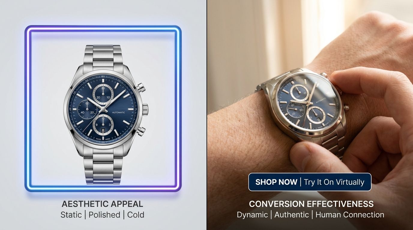
3. You have too many pure white background shots
Catalog shots are incredibly safe. They are also incredibly boring. If your carousel consists entirely of five angles of a product sitting on a stark white background, you are forcing the buyer to do all the heavy imaginative work. They have to picture it in their home or picture themselves wearing it.
When you leave the creative work entirely to the buyer, you see product images losing conversion at an alarming rate. Shoppers want to see the product already living in the world.
| Feature | Catalog Style | Contextual Style |
|---|---|---|
| Primary Goal | Stock identification | Consumer persuasion |
| Buyer Mental Load | High effort | Low effort |
| Usage Setting | Void/Empty | Real-world environment |
| Conversion Impact | Baseline | Conversion driver |
4. The angles do not match the reading path
We read left to right. We scroll top to bottom. If your product photos do not naturally lead the eye toward the add to cart button or the key feature bullet points, you are wasting valuable visual real estate. Every angle must serve a distinct and deliberate purpose in the buying journey.
The front profile hooks them. The three-quarter angle shows structural depth. The top-down shot reveals the interior compartments. If you are just shooting random angled shots without a sequential strategy, you are just filling space instead of building a logical argument for the sale.
5. There is no lifestyle context
An espresso machine looks like a block of heavy metal until you show it resting on a marble counter next to a handmade ceramic cup and spilled coffee beans. Lifestyle context creates immediate desire. It tells the browsing customer exactly who this product is built for and how it seamlessly fits into their desired aesthetic.
This is where CherryShot AI becomes invaluable. You can upload a basic flat product shot, select the Lifestyle or Loud Luxury mode, and instantly generate dozens of rich contextual scenes in minutes. You get the environmental selling power without renting a studio or hiring a prop stylist for a half-day shoot.
6. The lifestyle context is overwhelming the product
The opposite problem is just as deadly to your conversion rate. You booked a beautiful architectural location, hired gorgeous models, and styled the set perfectly. The resulting images belong in a magazine. The only critical issue is that the average customer cannot figure out what you are actually selling.
If the background elements, the expensive props, or the model draw more attention than the product itself, the image has failed its primary commercial job. The product must always remain the undisputed hero of the frame.
7. Color accuracy shifts between slides
Nothing causes a faster spike in return rates than color mismatch. If your hero image shows a warm mustard yellow and the third lifestyle image makes it look like a pale lemon, the buyer loses trust instantly. They simply do not know what will actually show up in the mail when they order.
Color grading is tedious work, but it is strictly mandatory. Absolute visual consistency across every single image in your carousel builds the subconscious trust required to secure a high conversion rate.
8. The cropping feels claustrophobic
Negative space is a powerful psychological tool. If your product is cropped so tightly that it almost touches the hard edges of the image frame, the photo feels tense and crowded. It actively prevents the customer from taking in the overall shape and attractive silhouette of the item.
Give your products room to breathe on the page. Proper visual margins around the subject make the image look effortlessly premium. Tight and awkward crops scream discount catalog.
9. You are missing the macro details
If someone is going to spend eighty dollars on a leather wallet, they demand to see the stitching quality. They want to see the specific hardware finish. A wide lifestyle shot is fantastic for establishing the overall brand vibe, but macro detail shots actually close the deal.
Detail shots prove the exact quality you claim in your written product description. If you claim a product features premium finishes but refuse to show them up close, you will naturally suffer a low add-to-cart rate because buyers will not take you at your word.
10. The lighting makes premium materials look cheap
Poor lighting is the single fastest way to ruin a beautifully engineered product. Soft boxes placed directly in front of the subject wash out essential highlights and fill in crucial defining shadows. Premium materials like blown glass, brushed steel, or fine leather require highly directional lighting to properly highlight their unique physical characteristics.
If your photos look completely flat, your product will inevitably be perceived as cheaply made.
11. You failed to show the product in its packaged state
Unboxing is a massive part of the modern retail psychological experience. If your product comes in a beautifully designed custom box or includes a high quality travel pouch, you must show it. Excellent packaging visually communicates immense value.
It tells the customer they are receiving an entire premium experience, not just a utilitarian item in a poly mailer. Understanding what makes product photos convert often comes down to showing the entire value proposition, including the very box the product arrives in.
12. You are too slow to test new visual modes
When an ad campaign underperforms, most brands simply accept the loss. They cannot afford to book another expensive shoot to try a completely different aesthetic. That rigid, sluggish process is exactly why conversion rates stagnate over time.
AI product photography changes the timeline and the math completely. If a clean minimalist aesthetic is clearly not resonating with your audience, you can easily run your base images through CherryShot AI using the Magazine or Avant Garde modes. You get entirely new campaign assets back in twenty minutes. The financial barrier to testing a totally new visual angle drops to zero.
AI image generation is not magic. It comes with real trade-offs. AI product photography is incredibly fast for generating brilliant lifestyle variations, but if you have a highly reflective product with complex metallic facets, you might still need to spend a little time dialing in the reference image or using the Upload Ref feature to get the lighting exactly right. It requires a baseline level of creative direction to get the absolute best results.
Audit your product page images before your next campaign
Review your top five SKUs against the 12 points listed above to identify immediate gaps. If you notice a lack of scale, texture, or lifestyle context, you can quickly bridge those gaps by generating missing assets today.
Try CherryShot AIFrequently Asked Questions
How many product images do I need per listing?
You need a minimum of five to seven images per product listing to provide adequate visual information. This quantity allows you to include a hero image, lifestyle shots, macro detail views, and a scale reference. Providing this variety prevents customers from making assumptions about dimensions or quality that lead to abandoned carts. Always prioritize visual variety over repeating the same angle across multiple files to keep your conversion metrics high.
Why do my product photos look professional but not convert?
Technical perfection in photography does not equate to a successful selling asset for your online store. While high resolution and sharp focus are standard requirements, they do not answer the specific questions a buyer has about material feel or usage. A crisp image in a void lacks the social proof that drives actual sales. Shift your focus toward showing the product in contexts that mirror your customer's life.
What's the most common product photography mistake that hurts sales?
Failing to provide a clear visual anchor for scale is the primary reason customers hesitate to complete a purchase. When products appear isolated on a white background, shoppers lose their sense of spatial awareness regarding size. Including a common household item or a human element alongside the product provides the immediate context shoppers need to feel secure. This simple addition removes the fear of buying the incorrect size.
How do I know if my product photos are the conversion problem?
High traffic levels paired with a near-zero add-to-cart rate typically point toward a failure in your visual communication strategy. If users spend significant time on your product page but refuse to proceed, your photos are likely failing to validate their decision to purchase. Compare these engagement metrics against your site-wide averages to confirm the pattern. If traffic is high but conversion is stagnant, the visual narrative is likely missing.
What is a good product photo conversion rate?
Healthy ecommerce benchmarks generally place conversion rates between two and three percent for most product-focused retail sites. Falling below a one percent threshold suggests that your imagery is not effectively communicating the value proposition of your items. Improving these results requires a systematic audit of your product photography against your current price points. Ensure every image actively works to justify the cost to your potential buyers.
Key Takeaways
- Pure white backgrounds strip away the scale and context buyers need to feel confident.
- Every image must answer a specific customer objection regarding texture, size, or usage.
- Visual consistency in color and lighting builds the trust required to close premium sales.
- Replacing expensive reshoots with AI generation allows you to test aesthetics until you find the one that converts.
Stop paying for logistical delays and settling for mediocre conversion rates. CherryShot AI gives you the immediate tools to test, iterate, and discover what actually converts your audience in an afternoon instead of a month.