Why Is My Ecommerce Conversion Rate So Low? The Visual Root Cause Most Guides Skip
Your ecommerce conversion rate is low because the visual evidence on your product page does not match the promise made in your ad. You are likely spending significant budget driving high-intent traffic to a page that forces buyers to look at uninspiring, flat, or confusing product imagery. When the perceived value drops below the price tag, buyers bounce.
Definition
An ecommerce conversion rate is the percentage of website visitors who successfully complete a purchase during their session. Visual trust refers to the customer's belief in a product's physical quality based entirely on the photography provided on the landing page. When images fail to clearly show scale, texture, and real-world context, the conversion rate drops because the perceived value falls below the asking price.
Most brand founders waste weeks tweaking button colors, testing font sizes, and arguing with developers about site speed when the real leak is right in front of them. The primary product image looks like it was shot in a basement. If you want to fix a sub-1% conversion rate, you have to stop looking at code and start looking at what the customer actually sees.
(To be completely fair, site speed absolutely matters if your page takes ten full seconds to load on a mobile device. You need a functional foundation. But once you pass that baseline standard, shaving milliseconds off your load time will never save a bad product presentation.)
Why is my ecommerce conversion rate low after fixing all technical issues?
Founders love fixing technical problems because technical problems are measurable. You can run a Lighthouse audit and get a definitive score on your site performance. You can look at a heat map and see exactly where users scroll. You cannot easily measure visual trust. Because visual trust is emotional and subjective, it gets pushed to the bottom of the priority list.
The media buyer blames the landing page structure. The CRO agency blames the offer. The founder blames the ad creative. Nobody looks at the primary product image because it has been sitting there for six months and everyone internally went completely blind to it.
The trust gap between your ad and your product page
Think about the typical customer journey. A user is scrolling through social media. They see a beautifully produced video ad that highlights your product in a lifestyle setting. The lighting is perfect. The vibe is aspirational. They click the link.
They land on your Shopify store and are greeted by a stark, poorly lit photo of the product sitting awkwardly on a gray background. The transition is jarring. The cognitive dissonance is immediate. They wonder if they clicked the wrong link or if the brand is actually a drop-shipping scam. If you are currently getting clicks but no sales, this exact scenario is likely playing out on your store hundreds of times a day.
Your conversion rate problems are rarely a traffic issue. They are a retention issue built on a foundation of broken trust.
What causes a low conversion rate specifically on Shopify?
Shopify makes it incredibly easy to build a store. That ease of use is a double-edged sword. It creates an environment where a brand can launch with a world-class checkout experience but fill it with amateur content.
The premium theme trap
When you buy a premium Shopify theme, you are buying a container that was designed to hold spectacular photography. The demo store looked incredible because it was populated with high-end editorial imagery. When you install that theme and upload your iPhone photos shot against a wrinkled bedsheet, the contrast between the high-end user interface and the low-end imagery destroys your brand credibility.
A direct comparison of a flat catalog image versus a lifestyle environment that answers customer questions about context.
Buyers notice this immediately. They might not be able to articulate why the site feels cheap, but their wallet stays in their pocket. If you are experiencing a low add-to-cart rate despite having plenty of sessions, your visitors are telling you that your product presentation does not justify your price point. They are reading the reviews, checking the shipping policy, and then leaving because the photos did not push them over the edge.
How do I diagnose a conversion rate problem on my product page?
You cannot diagnose visual problems by looking at Google Analytics. You have to look at the page through the eyes of a skeptical stranger who has never heard of your brand.
Three visual questions you must answer
Open your best-selling product page on your phone right now. Hide the title, hide the price, and hide the description text. Look only at the image carousel. Ask yourself these three questions.
First, do these images prove the quality of the materials? If you sell a leather bag, does the photo show the grain of the leather, or does it look like flat plastic? Second, do these images explain the scale? A water bottle shot on a solid white background could be twelve ounces or forty ounces. The buyer should not have to read the description to find out. Third, do these images create desire? A product photo should not just document that the item exists. It should make the buyer want to own it.
If you answered no to any of those questions, you have found the root cause of your ecommerce conversion problem.
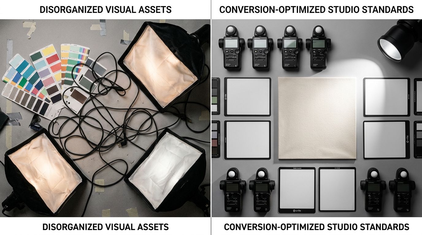
The old way versus the new math of product photography
When I ran ecommerce brands, I knew our photography was holding us back. But fixing it was a logistical nightmare. Booking a freelance photographer meant coordinating schedules, paying day rates, waiting weeks for retouched files, and ultimately arguing about whether the angles were close enough to the brief.
Most founders I talk to cannot even name the per-image cost of their last studio shoot. When they finally do the math, factoring in the studio rental and the stylist, the number is usually between $80 and $200 per finished image. That is why product pages stagnate. The cost of experimentation is simply too high.
Fixing the visual gap without breaking the budget
This is where the math has completely changed. You no longer need to accept a poor conversion rate just because you cannot afford a ten-thousand-dollar studio day. General-purpose AI image tools struggle with product accuracy, but purpose-built tools solve this exact bottleneck.
With CherryShot AI, you can upload a basic product photo, select the Minimalist or Lifestyle mode, and generate campaign-ready photos in minutes. The per-image cost drops to under $5. The turnaround goes from three weeks to a Tuesday afternoon. You can generate a fresh hero image for your landing page that perfectly matches the aesthetic of your latest TikTok ad. When the visual experience is seamless from the first click to the checkout screen, trust remains intact.
| Diagnostic Approach | The Fix | Impact on Conversion |
|---|---|---|
| Technical Site Audit | Minifying scripts, lazy loading | Marginal lift if site was already functional |
| Copywriting Tweaks | Rewriting headlines and bullets | Moderate lift for high-intent readers |
| Visual Trust Audit | Upgrading primary photography | High lift across all traffic sources |
Aligning your visual strategy with your business goals
Every element on your product page has a specific job. The title confirms the user found the right item. The price sets the terms of the transaction. The reviews provide social proof. But the images carry the heaviest burden. They have to replace the physical retail experience.
If your conversion rate is hovering around 0.8%, you do not need a new popup app offering a 10% discount. You need to prove to your customers that your product is worth buying. Visual gaps costing sales are the silent killers of ecommerce margins because they hide in plain sight. We assume the photos are "good enough" because we already know what the product looks and feels like in real life. Your customer does not have that context.
Stop treating your product imagery as a one-time setup task. Treat it as a continuous conversion rate lever. When you launch a new ad campaign, update the product page imagery to match the visual language of the ad. When you notice a high bounce rate on a specific SKU, swap the primary image from a flat white background to a lifestyle context shot.
Key Takeaways
- Sub-1% conversion rates are rarely caused by minor technical issues once a baseline is met.
- A visual disconnect between a high-quality ad and a low-quality product page destroys buyer trust instantly.
- Premium Shopify themes require premium imagery to maintain brand credibility.
- AI product photography eliminates the traditional scheduling bottlenecks that keep bad images live on your site.
Frequently Asked Questions
What causes a low ecommerce conversion rate?
A low ecommerce conversion rate stems from a mismatch between user expectations set by advertisements and the visual reality of the landing page. Buyers instinctively judge product quality based entirely on the photography presented during the shopping experience. You must audit your product pages by hiding the text to see if the images alone can convince a skeptical stranger to complete their purchase.
How do I find out why my conversion rate is low?
Identify conversion leaks by isolating exactly where users drop off within your specific sales funnel. A high ad click-through rate combined with an immediate product page bounce indicates your visual presentation fails to sustain buyer interest. Compare your active ad creative directly against your landing page images to ensure visual consistency, confirming that product scale, texture, and physical quality are clearly visible without reading text.
Is product photography a common cause of low conversion rates?
Poor product photography remains the most common unaddressed cause of low conversion rates across ecommerce stores. Because online shoppers cannot physically interact with the item, they rely entirely on visual assets as a direct proxy for material quality and overall value. Replace isolated, poorly lit product photos with environmental lifestyle shots to immediately answer customer questions and justify your listed price point.
What is the most common reason ecommerce stores do not convert?
A severe lack of perceived value stemming from amateur visual presentation represents the primary reason ecommerce stores fail to convert. When a highly functional website features dark, poorly composed smartphone images, the perceived value of the product instantly drops below the required asking price. You should evaluate your competitor catalogs and guarantee your primary images project a higher level of professional polish than their offerings.
How do I diagnose a conversion rate problem on my product page?
Diagnose visual conversion problems by temporarily hiding all text on your product page to evaluate the standalone strength of your image carousel. This exercise reveals whether your photos effectively communicate product scale, material quality, and real-world usage context to skeptical visitors. Review your mobile layout on a physical device to guarantee the primary product image fills the screen without requiring users to manually zoom.
The next time you find yourself staring at a dismal Shopify dashboard wondering why traffic is not converting into revenue, step away from the code. Look at your photos. The fastest path to a higher conversion rate is showing your customers exactly what they want to see, in the highest quality possible. You can continue running expensive traffic to uninspired pages, or you can use tools like CherryShot AI to fix the visual gap today.
Audit your product page images before your next campaign
Open your highest-traffic product page on your mobile device and look strictly at the image carousel. If the photos fail to clearly explain the product's scale, texture, or real-world context, you are actively losing sales. You can use CherryShot AI to turn your basic product photos into professional lifestyle assets in minutes.
Try CherryShot AI