Why Are My Product Photos Not Converting?
If your product photos look beautiful but fail to convert, you have prioritized aesthetics over information. Beautiful images get likes on social media. Informative images get adds to cart. Your photos are not converting because they fail to answer the immediate, pragmatic questions your buyer has before reaching for their credit card.
Definition
Conversion-focused product photography refers to imagery created specifically to reduce buyer uncertainty and facilitate a purchasing decision. It prioritizes functional visibility and scale context over purely artistic presentation.
Most ecommerce founders waste thousands of dollars on expensive studio lighting just to deliver five identical angles of the front of a shoe. They treat product photography like art instead of treating it like customer service.
Worth noting, sometimes the product itself is the problem. No amount of perfect lighting will sell a poorly priced commodity item in a saturated market. But if the product sells well in person and tanks online, your imagery is the culprit.
If you are tired of watching traffic bounce, we need to look at exactly what visual information you are withholding from your buyers.
When a buyer cannot physically touch a product, your images must answer every functional question they have.
Why do buyers look at my images and leave?
The gap between a visitor and a customer is trust. In a physical store, a customer can pick up a bag, feel the canvas, check the zipper quality, and see how large it is against their body. Online, they only have your pixels. When those pixels fail, sales drop.
Reason 1: You prioritize aesthetics over information
A moody, perfectly styled shot of a coffee maker surrounded by fresh beans looks fantastic on a billboard. It tells me absolutely nothing about how large the water reservoir is, where the power cord exits the machine, or what the interface buttons look like.
Founders frequently hire freelance photographers who specialize in making things look pretty. The result is bad product photos ecommerce stores cannot actually use to sell. If you want to understand the gap between traffic and revenue, seeing why clicks do not lead to sales usually comes down to this exact missing information. The buyer likes the vibe, but they cannot verify the function. So they leave.
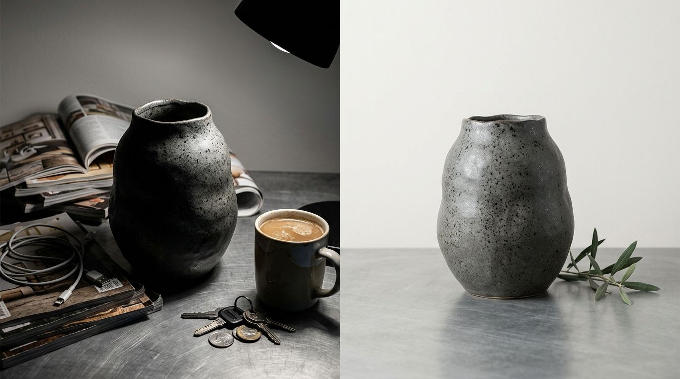
Reason 2: You provide zero context for scale
I have lost track of the number of Shopify stores I have audited where every single product floats in a white void. A 30-liter travel backpack looks identical to a 15-liter daypack when you shoot it perfectly isolated on a white background.
When buyers cannot determine scale, they either abandon the cart or they buy it, realize it is the wrong size, and return it. Returns destroy margin. You must provide a visual anchor. Show the bag on a human back. Show the ceramic mug held in a hand. Show the desk lamp next to a standard 15-inch laptop. Context creates confidence.
| Feature | Aesthetic Focus | Conversion Focus |
|---|---|---|
| Lighting | High contrast | Even, detail-revealing |
| Environment | Isolated background | Real-world context |
| Angles | Hero angle repetition | Multi-angle utility |
Reason 3: Your lighting hides the texture
Overexposure is the silent killer of product image conversion issues. In an attempt to make images look bright and clean, photographers often blast the product with so much light that the physical texture disappears completely.
If you sell a heavy knit sweater, the customer needs to see the weave of the yarn. If you sell leather boots, they need to see the grain and the stitching. When your lighting flattens those details into a smooth, featureless surface, the product looks cheap. It looks like plastic. What makes product photos convert is absolute clarity regarding the build quality.
Where is the friction in my image gallery?
Once a buyer clicks into your product page, the image gallery is their primary navigation tool. If they swipe through and feel frustrated, they are gone.
Reason 4: You uploaded redundant angles
Uploading six photos is pointless if they all show the exact same 45-degree angle of the product. Founders often ask how many product images convert best, assuming a higher number automatically equals higher trust. The truth is that every image must earn its place.
Image one shows the hero angle. Image two shows the back. Image three zooms in on a critical hardware detail. Image four shows the product in use. If image five is just image one zoomed out by ten percent, you are wasting your customer's time and diluting the buying momentum.
Reason 5: You forgot the lifestyle context
White background catalog shots are mandatory for clarity. Lifestyle shots are mandatory for desire. You need both to fix product photo conversion drops. If you only show the product in isolation, you force the buyer to imagine how it fits into their life. Most buyers are too lazy to do that mental work.
AI product photography generation is incredible for speed and volume, but you still have to know what visual information your customer actually needs to see. Booking a location shoot for every new product colorway is a logistical nightmare. The math does not work. This is exactly where CherryShot AI steps in. Upload a standard product photo, select the Lifestyle mode, and generate campaign-ready environmental shots in minutes. Your per-image cost drops to under $5, and you give the buyer the context they need immediately.
Reason 6: Your hero image works too hard
The first image in your gallery is the hero. Its only job is to get the click from the collection page. Yet, brands constantly clutter this image with text overlays, dimension arrows, and lifestyle props that obscure the actual item.
Keep the hero image clean. Let the product breathe. Save the detailed feature callouts and infographics for the third or fourth slot in your image carousel. When you overwhelm the eye on the first glance, the brain registers confusion, and confusion never converts.
What technical photo mistakes kill sales?
Sometimes the photography itself is flawless, but the execution on the website introduces massive friction. Technical errors signal amateur hour to the subconscious brain of the buyer.
Reason 7: Mobile cropping destroys your focal point
Over 70 percent of your traffic is on a mobile device. If your photographer framed the shot beautifully for a wide desktop monitor, that exact same image is going to get brutally center-cropped by your Shopify theme on an iPhone screen.
I see this constantly with fashion and apparel. The model's head is cut off, or worse, the actual handbag being sold is pushed entirely out of the frame. You must review your image gallery on a phone before you launch. If the mobile crop cuts off the critical detail, the sale is lost.
Reason 8: Slow load times kill the impulse
Uploading massive, uncompressed 10-megabyte PNG files directly from your photographer is a death sentence for your conversion rate. When a page takes five seconds to load, the buyer hits the back button.
Photography hurting ecommerce performance is a purely technical failure. Compress your files. Serve them in modern formats like WebP. A shopper's buying impulse has a half-life of about three seconds. Do not force them to stare at a loading spinner while your massive studio shots struggle to render over a cellular connection.
Reason 9: Inconsistent visual branding breaks trust
Nothing screams unreliable dropshipper louder than an image gallery stitched together from five different visual styles. If image one has a pure white background, image two has a grey background, and image three is a low-resolution selfie from a supplier, the buyer's trust evaporates immediately.
Consistency proves that you are a real brand with quality control. It shows you care about the details. If you use CherryShot AI to generate your lifestyle contexts, use the same aesthetic modes across your entire catalog. When your visual branding is locked in, the customer assumes your product quality is locked in as well.
Audit your product images today
Review your top three selling products on your phone right now. Ensure every image answers a unique question and that no layout elements obscure your product.
Try CherryShot AIFrequently Asked Questions
Why do my product photos look good but not convert?
High aesthetic quality does not guarantee sales. Browsers look for functional details instead of artistic flair. Providing specific visual evidence regarding dimensions, texture, and scale turns casual viewers into paying customers. Every image you host needs to answer a specific question a buyer has before they commit to a purchase.
What product photo issues hurt conversion the most?
Scale ambiguity tops the list of major conversion killers. Buyers cannot guess the size of your product without a physical reference point like a hand or common household object. Missing interior shots and overexposed lighting also rank highly as major sources of friction. These technical errors hide the exact information shoppers need to trust their purchase decision.
How do I diagnose product photography conversion problems?
Review your return data for common complaints regarding size or material texture. This feedback indicates exactly where your images fail to represent the physical reality of the product. Analyze session heatmaps to see where users stop swiping through your gallery. Engagement drops often signal that your secondary images lack the functional details necessary to keep a potential buyer interested.
How many product photos do I need to maximize conversion?
Include enough images to resolve every potential objection a customer might raise. A simple product like a basic t-shirt often requires only three or four high-quality angles. Complex gear pieces demand more extensive coverage to display every seam, strap, and interior compartment. Prioritize specific functional clarity over a set number of shots.
Can better product photography fix my conversion rate?
High-quality imagery increases sales if your product already has genuine market demand. Replacing vague catalog photos with informative, context-heavy shots bridges the gap between digital listing and physical experience. This visual clarity provides the confidence necessary for shoppers to complete the checkout process. Investing in better photography is a primary tactic for lifting site-wide conversion rates.
Key Takeaways
- Beautiful images that lack functional product information will artificially inflate your bounce rate.
- Failing to show your product next to a recognizable object guarantees a spike in returns due to scale confusion.
- Every single image in your product gallery must serve a unique purpose or answer a specific buyer objection.
- Inconsistent styling and massive file sizes destroy buyer trust before they ever reach the checkout page.
Stop settling for product photography conversion problems that are entirely within your control to fix. Your buyers are telling you exactly what they need to see through their behavior.
If you are tired of waiting three weeks for a studio to send back basic lifestyle shots that you need today, try generating your next campaign with CherryShot AI. Upload your base image, select your context, and get the high-converting visuals your product page desperately needs.