YouTube Thumbnail Size 2026: Exact Dimensions That Drive Clicks
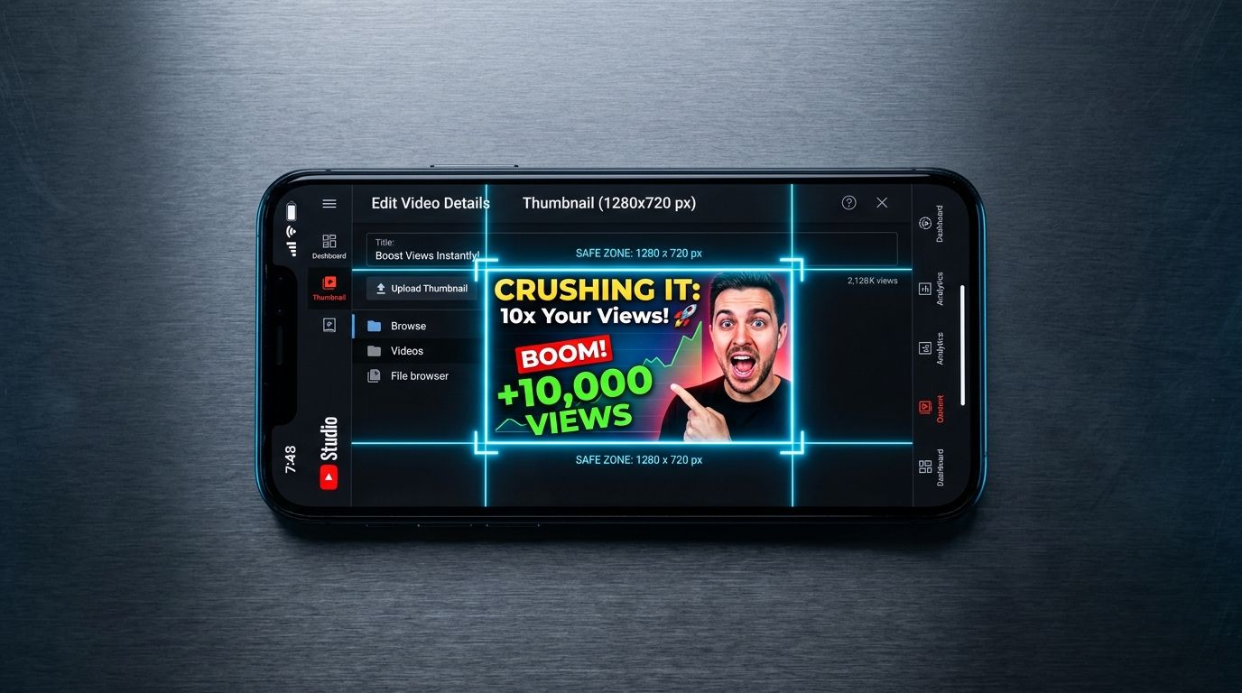
The ideal youtube thumbnail size for 2026 is exactly 1280 pixels wide by 720 pixels tall. If you upload anything smaller, the platform compresses your image into a blurry mess that signals low quality to potential viewers before the video even starts. Most ecommerce brands will spend ten thousand dollars on a product video shoot and then let an intern pick an auto-generated freeze frame for the thumbnail. This is why their view counts remain completely flat.
Definition
A YouTube thumbnail is the 1280x720 pixel preview image displayed in search results and home feeds before a video is played. It serves as the primary visual hook to encourage a click. In ecommerce, it acts as a digital billboard to convert interest into store traffic.
The thumbnail is never an administrative task. It is the only reason someone stops scrolling. Viewers do not read your carefully crafted video title until the thumbnail has successfully interrupted their feed. Treat the image cover with the exact same respect you treat the opening hook of the video itself.
The exact YouTube thumbnail specs for 2026
Let us get the strict technical youtube thumbnail dimensions out of the way before we talk about strategy. Getting the upload specifications wrong is an unforced error that instantly degrades your brand perception. YouTube is ruthless with its compression algorithms.
Your canvas must be built to the exact youtube thumbnail pixel size of 1280 x 720 pixels. The absolute minimum width YouTube will physically accept is 640 pixels. Uploading a 640-pixel image guarantees pixelation on smart TVs, retina displays, and modern smartphones. There is zero reason to ever upload the minimum size.
Your aspect ratio must be 16:9. If you attempt to upload a square Instagram image or a vertical TikTok cover, YouTube will forcefully crop it or slap massive black bars on either side of your image. Neither option is acceptable for a professional brand.
The file size limit is a hard ceiling of 2MB. This trips up many design teams. If you export a massive uncompressed file with dozens of layers from Photoshop, the file size will easily exceed 2MB and YouTube will reject the upload outright. You must save your file as a JPG, PNG, or GIF. Do not use a GIF format for thumbnails under any circumstances, as the platform does not animate them in the feed and the color rendering is objectively worse than a standard JPG.
Why ecommerce brands fail at thumbnail design
A beautifully lit product video does not automatically generate a good thumbnail. When an agency delivers a final video file, the immediate instinct is to scrub through the timeline and take a screenshot of the best looking frame. That frame was lit for motion. It was graded to be seen in the context of a sequence. When you freeze it, shrink it down to the size of a postage stamp on a mobile screen, and put it next to neon gaming thumbnails, your elegant product shot completely disappears.
Creating a completely bespoke composite image for every single video takes significant design resources, which means you have to choose between upload volume and thumbnail quality. Most brands simply accept lower quality to maintain their publishing schedule. They rely on the platform to auto-generate three options and pick the one where the founder's eyes are not closed.
Worth noting, while this guide focuses exclusively on individual video covers, your overarching youtube channel art dimensions and youtube banner size play a secondary role in channel conversion. But viewers rarely see your banner unless the thumbnail convinced them to click first.
To win the click, you must stop treating the thumbnail as a screenshot and start treating it as a billboard. The rules of outdoor advertising apply here. You have milliseconds to communicate what the product is, why the viewer should care, and what the emotional payoff of clicking will be.
Core design rules that drive clicks
Knowing the right youtube video thumbnail size means nothing if the canvas is filled with noise. The most successful channels on the platform operate on a very strict set of visual principles. They do not reinvent the wheel for every upload. They follow a system.
| Feature | Effective Approach | Avoid |
|---|---|---|
| Resolution | 1280 x 720 pixels | Anything below 640px |
| File Format | JPG | GIF |
| File Size | Under 2MB | Above 2MB |
| Aspect Ratio | 16:9 | 4:5 or 1:1 |
The three-element rule
A thumbnail should never contain more than three distinct visual elements. When an ecommerce brand tries to show the product, the packaging, the founder, a burst graphic with a discount code, and the company logo, the brain cannot process the hierarchy. It reads as visual clutter and the viewer scrolls past.
Pick three things. Typically, this is a human face displaying a strong emotion, the product itself scaled up dramatically, and a short text hook. That is it. Anything more than that actively hurts your click-through rate. Understanding what makes a user pause requires studying the mechanics of designing scroll-stopping visuals. Focus entirely on contrast and clarity.
Respecting the death zone
YouTube overlays a black box with the video duration timestamp in the bottom right corner of every single thumbnail. This overlay changes size depending on the device the viewer is using. If you place crucial product details, text, or a logo in the bottom right corner, YouTube will cover it up.
Designers call this the death zone. Keep the bottom right quadrant completely clear of essential information. Force your text to the left side of the frame because we read left to right. Place your primary subject on the right side, but elevate them so the timestamp sits safely below their focal point.
Color psychology and platform contrast
Most viewers browse YouTube in dark mode. If you upload a thumbnail with a black or dark gray background, your image blends directly into the platform interface. You want friction. You want your image to clash with the background so aggressively that the eye is forced to look at it.
Bright yellows, neon greens, and stark whites perform exceptionally well because they create massive contrast against YouTube's dark UI. If your brand guidelines strictly dictate muted earth tones, you need to find a compromise for your video covers. A muted beige thumbnail will sink to the bottom of the feed without a trace. Testing multiple background variations is mandatory. Running a controlled split test helps you figure out how to structure A/B testing images for sales instead of relying on gut feelings.
From product feed to YouTube asset
You already have a massive library of product photography sitting on your store. The trick is repurposing those existing assets into high-performing video covers without booking another studio shoot.
Repurposing catalog photography
You cannot just paste your raw Shopify images onto a YouTube canvas. Plain white backgrounds look like cheap display ads. You have to extract the product from the background and drop it into a contextual environment that creates curiosity. The environment should hint at the problem the product solves.
When you need a high-end lifestyle background for a product thumbnail, booking a shoot just for that one image is a complete waste of capital. Upload a clear catalog shot to CherryShot AI, select a Lifestyle mode, and generate the dramatic, campaign-ready asset you need in minutes. The lighting will be flawless and you can immediately drop the generated asset into your thumbnail template.
Always scale the product up. A common mistake is leaving the product at a realistic, true-to-life scale within the image. Thumbnails do not care about reality. They care about legibility. If you are selling a bottle of serum, that bottle needs to take up forty percent of the entire frame. If you are selling a shoe, the toe box should be practically touching the camera lens. If users cannot read your packaging label on a mobile phone screen, the product is too small.
You have to view your image requirements holistically. A thumbnail might drive the initial video click, but when that viewer finally clicks the link in your description, they expect the same level of quality on your site. If your product page visuals look amateurish compared to your YouTube presence, the trust breaks instantly. This is a common reason why images get clicks but no sales. The visual promise of the thumbnail was not kept by the landing page.
Audit your YouTube thumbnail library against the 1280x720 standard
Review your top-performing videos today to ensure the thumbnails are crisp, high-contrast, and free of timestamp interference. If your assets feel static or washed out, use CherryShot AI to regenerate them in a high-conversion lifestyle context.
Try CherryShot AIFrequently Asked Questions
What is the ideal size for a YouTube thumbnail?
The ideal size for a YouTube thumbnail in 2026 is exactly 1280 pixels wide by 720 pixels tall. These dimensions match the native 16:9 aspect ratio required for the platform. This exact resolution prevents automated compression artifacts on high-density mobile screens or large desktop monitors.
What file size should YouTube thumbnails be?
Keep every thumbnail file under 2MB to ensure successful uploads. YouTube automatically rejects any image exceeding this limit during the processing phase. Save your work as a high-quality JPG to maintain visual clarity while staying well within the storage constraints.
Can I use product photos as YouTube thumbnails?
Raw product photos rarely perform well when used as standalone thumbnails on YouTube. Standard catalog imagery often blends into the feed or appears like a banner advertisement. Successful thumbnails place the product in a high-contrast environment to capture attention immediately.
What resolution are YouTube thumbnails?
YouTube displays all thumbnails at a standard 720p resolution regardless of the original upload. Uploading files in 4K or higher is ineffective because the platform forces an aggressive downscaling process. Sticking to the 1280 by 720 format provides the best balance of sharpness and file size.
How do I design a YouTube thumbnail for my product brand?
Combine a clear, high-contrast product shot with a human subject expressing emotion. Restrict all text overlays to four words or fewer to maintain immediate legibility. Ensure no vital visual information occupies the bottom right corner of the frame to keep it visible under the video timestamp.
Key Takeaways
- Set your canvas to exactly 1280 by 720 pixels to guarantee maximum sharpness across all devices.
- Keep your exported image file under 2MB to prevent the platform from rejecting the upload outright.
- Never place text or crucial visual details in the bottom right corner where the timestamp sits.
- Limit your thumbnail to a maximum of three core visual elements to avoid confusing the viewer.
Do not let your best video content die in the feed because you treated the cover image as an afterthought. Give your thumbnails the same rigorous attention you give your actual product catalog. Test aggressively, measure the click-through rates, and stop letting an auto-generated freeze frame dictate the success of your brand on YouTube.