Hero Image for Ecommerce Product Pages: Earn the Next Click
The hero image is your first and most critical opportunity to prove product value before the user scrolls.
The hero image on your ecommerce product page has exactly one job. It must prove to the visitor that they clicked the right link and build enough immediate trust to earn the next scroll. It is the immediate confirmation of their intent. If that first product image is confusing, low resolution, or poorly lit, the visitor will bounce before they read a single bullet point.
Definition
A hero image is the primary photograph displayed at the top of an ecommerce product page. It serves as the immediate visual introduction to an item, confirming its identity, shape, and color. This asset anchors the image carousel and acts as the decisive factor for whether a customer continues browsing.
Most founders I talk to treat the ecommerce hero image as a basic catalog requirement. They view it as a box to check rather than an active sales tool. They upload a flat image on a dull background and expect the copywriting to do the heavy lifting. This is a massive mistake. The product page main image is the absolute gatekeeper to your add to cart button.
You can write the most persuasive product description in your industry, but if the first visual impression feels cheap, nobody is sticking around to read it.
(Worth noting: a hyper-styled lifestyle image works great for a social media ad campaign where you are trying to capture attention, but on a product page, pure visual clarity beats mood every single time.)
The Anatomy of a High-Converting Hero Image
When a shopper lands on your site, they are inherently skeptical. They cannot touch the fabric, they cannot feel the weight of the hardware, and they cannot turn the object over in their hands. The first product image in ecommerce has to simulate that tactile experience instantly. It is not just about showing the item. It is about answering the subconscious questions the buyer brings to the page.
Prioritizing Scale and Proportion
One of the biggest silent killers of ecommerce conversion is a lack of scale in the primary product image. The visitor needs to immediately understand how much space this item occupies in the real world. If you sell a handbag, the hero shot needs to clearly indicate whether it is a massive tote or a tiny evening clutch.
If the shopper has to guess the size by scrolling down to the technical specifications, you have already added friction to the buying process. You achieve scale by cropping the image thoughtfully. The product should fill the frame without being abruptly cut off at the edges. Dead space around the product makes it look insignificant, while cutting off a handle or a corner makes the brand look sloppy.
The Optimal Product Photography Angle
The angle you choose for your hero shot dictates how the customer perceives the value of the item. A straight-on, perfectly flat shot often looks sterile and two-dimensional. A slight angle introduces depth. It shows the side profile and the front simultaneously. This is why you rarely see footwear brands shooting a shoe perfectly straight from the toe. They shoot it from a slight angle to highlight the silhouette, the material texture, and the branding all at once.
Finding the right product photography angle requires understanding what the customer values most about your specific item. If the selling point is a unique textured material, the lighting and angle must collaborate to cast micro-shadows that highlight that texture. If the selling point is a sleek, minimalist profile, a straight side-profile shot might actually be the best choice.
Connecting the Ad Click to the Landing Page
A customer rarely lands on your product page by accident. They clicked an ad on Instagram, they tapped a Google Shopping link, or they opened a promotional email. They arrived with a specific visual expectation. The hero image is responsible for fulfilling that expectation instantly.
Avoiding the Visual Disconnect
If your ad features a bright, vibrant, high-energy lifestyle shot, and your product page opens with a dark, low-resolution, completely uninspired catalog photo, the customer experiences immediate cognitive dissonance. They wonder if they clicked the wrong link. This disconnect drives incredibly high bounce rates.
Closing that loop is critical. The visual gap costing sales often comes down to brands treating their advertising budget and their product page budget as two completely unrelated expenses. Your above the fold image needs to carry the same premium standard as the creative that brought the user there in the first place.
Structuring the Entire Image Carousel
While the hero image carries the most weight, it works as part of a sequence. The hero shot secures the attention. The subsequent images answer the detailed questions. The typical, highly effective structure starts with a clean hero image on a neutral background. The second image provides an alternate angle. The third image highlights a specific macro detail, like stitching or a control dial. The fourth image introduces lifestyle context to show the item in use.
White Background Versus Lifestyle Context
This is an argument that happens in marketing meetings every single day. Should the main product page first impression be a clean white background shot, or should it be an aspirational lifestyle image? The answer is driven by the reality of user interface design.
The Power of Pure Isolation
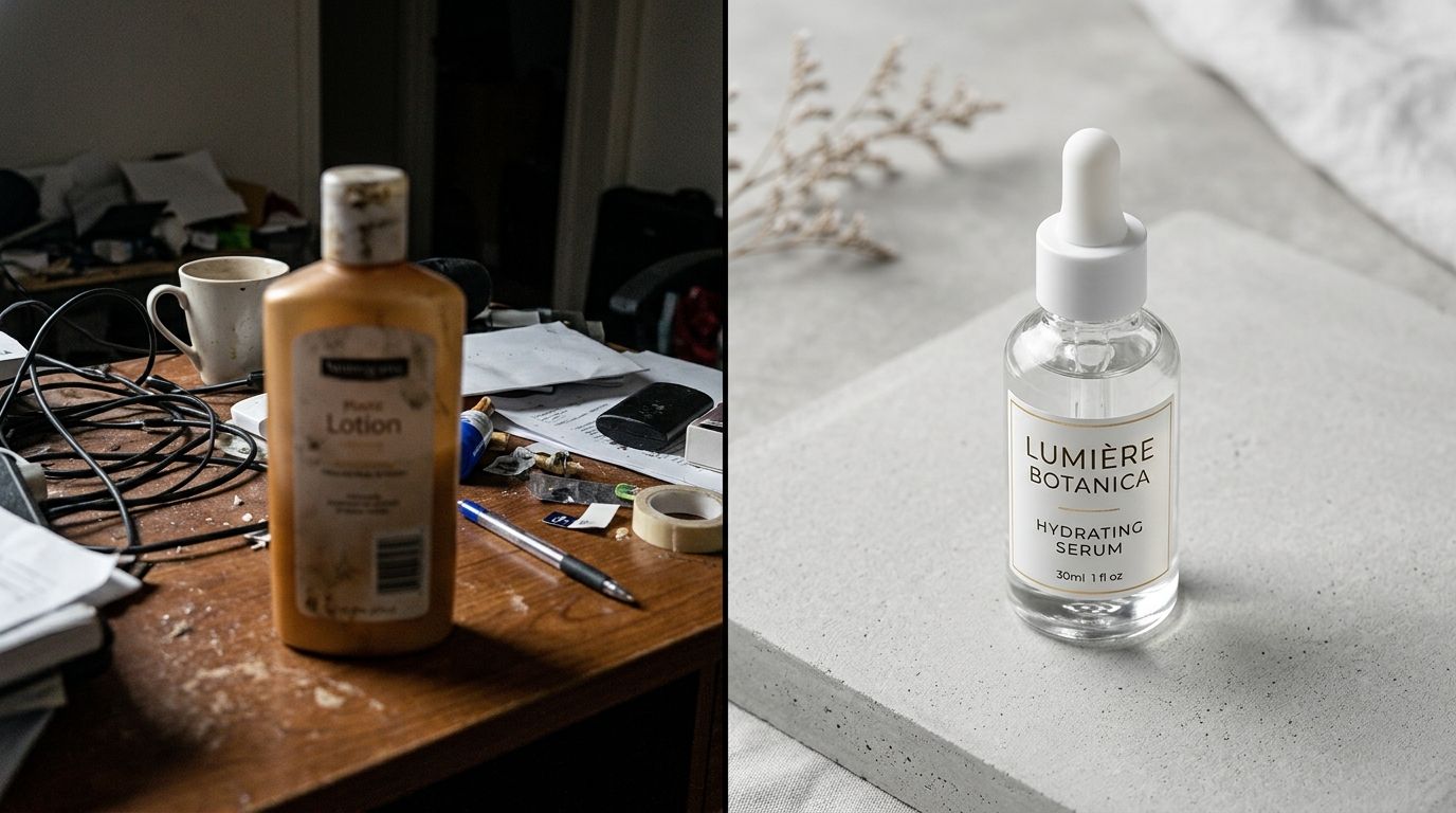
For the hero position, isolation almost always wins. A pure white or very light gray background removes all cognitive load from the viewer. They do not have to process the background scenery. They do not get distracted by a model's outfit or a busy prop table. Their eyes go directly to the product.
This is especially vital for mobile shoppers. On a phone screen, real estate is incredibly limited. If you use a wide lifestyle shot as the hero image, the actual product might only take up fifteen percent of the screen. A tightly cropped isolation shot ensures the product is the absolute center of attention.
When Context Makes Sense
There are exceptions to every rule. If you sell large furniture, a plain white background can actually confuse the sense of scale. A clean, minimalist room setting might perform better as a hero shot because it anchors the product in reality. But even then, the styling must be ruthlessly minimal.
If you are using contextual backgrounds, you still need to master image quality and loading speeds. Large, complex images can slow down your site, which kills conversions faster than a bad photo. Following best practices for optimizing Shopify product page images for conversion ensures that your high-resolution assets load instantaneously when the user arrives.
| Image Style | Primary Purpose | Ideal Carousel Placement |
|---|---|---|
| White Background | Removes distractions and highlights pure product details | Slot 1 (Hero Position) |
| Lifestyle Context | Demonstrates scale, use case, and aspirational value | Slots 2-4 (Supporting Context) |
| Minimalist Room Setting | Anchors large items like furniture in reality | Hero Position (Exceptions Only) |
The Bottleneck of Professional Studio Production
Knowing what makes a great hero image is easy. Actually producing them for a catalog of five hundred SKUs is a nightmare. Traditional studio shoots are notorious for destroying profit margins. You are paying for studio space, a photographer, a lighting assistant, an art director, and days of post-production retouching.
By the time the invoice arrives, founders realize they just spent two hundred dollars per image. When you need a hero shot, three alternate angles, and a lifestyle image for every single colorway of a new product line, the math becomes unmanageable. Brands respond to this financial pressure by cutting corners. They shoot fewer angles. They reuse old backgrounds. They settle for a first image that is just "good enough."
Modern Image Generation Workflows
This is exactly why relying on legacy production methods holds ecommerce brands back. AI product photography changes the baseline of what is possible. Instead of waiting three weeks for a freelance photographer to deliver retouched files, you can upload a basic product image, select a visual mode, and generate campaign-ready photos in minutes.
CherryShot AI was built specifically to solve this exact logistical nightmare. You choose a mode like Minimalist or Classic, and you get high-resolution, perfectly lit hero images that are ready to go live on your store today. The cost drops to less than five dollars an image. The friction of launching a new product completely disappears.
This approach requires a level of honesty about your product. AI product photography is not a magic fix if your actual product design is flawed. It just makes the visual presentation flawless. If the physical item is badly designed, a great hero image will secure the initial sale, but the customer will still return it when it arrives.
Auditing Your Current Storefront
Open your website on your phone right now. Click on your top-selling product. Look at the very first image that loads. Does it look premium? Does it accurately reflect the price tag you are asking the customer to pay?
If your product costs eighty dollars but the hero image looks like it was taken in a dark warehouse on a smartphone, you are losing sales every single hour. Your conversion rate is suffering not because your traffic is bad, but because your visual handshake is weak. The easiest way to learn what makes a product photo convert is to look critically at the sites where you personally choose to spend your own money. They all prioritize the first impression.
Frequently Asked Questions
What should a product page hero image show?
A product page hero image must display the complete item clearly and in sharp focus. This initial visual asset instantly communicates what the item actually is, its primary structural shape, and its exact colorway to the visiting shopper. Frame the shot intentionally to avoid cutting off critical outer edges or obscuring the central physical product with heavy, unnecessary styling props.
How does the hero image affect ecommerce conversion rate?
The hero image acts as the absolute gatekeeper to your add to cart button. If this initial photograph appears low quality, poorly lit, or visually confusing, arriving visitors will bounce before reading a single line of your sales copy. Invest in a professional primary image to build immediate shopper trust and encourage users to scroll through the rest of the carousel.
What are the most common hero image mistakes on product pages?
The most frequent mistake is prioritizing an artistic visual vibe over pure product clarity on the primary shot. These typical errors also include relying on image files that are far too small, causing them to appear highly pixelated on modern high-resolution display screens. Remove unnecessary styling props from the main frame and ensure the chosen angle clearly reveals the true physical depth and dimensions.
Should my hero image be white background or lifestyle?
A clean white or very subtle gray background generally performs best for the primary ecommerce hero image. This isolated visual approach completely removes background distractions and keeps the shopper focus entirely locked onto the physical product. Move your highly effective lifestyle images into the second or third slot of your visual carousel to provide necessary context after establishing that initial clear impression.
Key Takeaways
- The hero image dictates whether a user stays on the page or bounces immediately.
- A clean, isolated background generally performs better than a busy lifestyle shot for the first image.
- Proper scale and slight angles help the customer understand the product dimensions.
- AI generation tools eliminate the high cost and weeks of waiting associated with traditional studios.
Your product page hero image is the most important real estate on your entire website. If you are tired of losing margin to slow, expensive studio shoots just to get a clean first image, it is time to upgrade your workflow. Check out CherryShot AI to see how fast you can turn basic product shots into campaign-ready assets that actually drive revenue.
Audit your product page images before your next campaign
Take out your phone right now and open your top-selling product page to see what your mobile shoppers experience. If that initial photograph fails to clearly communicate the item's value, you need to replace it. Generate high-resolution, perfectly lit hero images in minutes using CherryShot AI without booking an expensive studio.
Try CherryShot AI