How to Improve Ecommerce Conversion Rate: Visuals Ranked
How to improve ecommerce conversion rate? Start with the visual data your customer uses to trust you. You can tweak button colors or restructure your checkout flow, but if a buyer cannot see the texture of your fabric or the scale of your hardware, they will not click add to cart.
Definition
Visual merchandising in ecommerce refers to the strategic arrangement and presentation of product photography to build buyer trust. It encompasses hero images, detailed crops, and contextual lifestyle shots that answer visual questions before a customer abandons their cart. Effective visual merchandising directly increases the percentage of visitors who complete a purchase.
(There is one exception here. If your site takes ten seconds to load, fix your server speed before you touch a single image.)
Most operators treat product page visual changes as an afterthought once the hero shoot is finished. This is a massive mistake. A high conversion rate is built entirely on removing doubt. Product images do all the heavy lifting there. If you want to increase ecommerce conversion without burning more money on ads, you have to fix your visual merchandising. Better imagery will not save a fundamentally flawed product, but it will ensure that a great product is not dragged down by a poor presentation.
I have ranked these eight product page improvements based on the actual revenue impact I have seen them drive for direct-to-consumer brands. Start at number one. Do not move to number two until the first is done.
An optimized product page uses multiple visual modes to answer customer questions before they are asked.
The Hierarchy of Visual Conversion
1. The contextual hero image optimization
Your primary hero image is a digital handshake. It dictates whether the customer scrolls down to read your copy or hits the back button immediately. Most brands stick to a sterile white background because it is safe and easy. This is a missed opportunity to establish brand value.
| Image Style | Primary Function | Best Use Case |
|---|---|---|
| Pure White Background | Provides zero distraction, focuses purely on the item silhouette. | Amazon listings and technical catalog grids. |
| Subtle Contextual Environment | Establishes brand identity and implies premium quality. | Primary hero images on direct-to-consumer storefronts. |
| Full Lifestyle Composition | Demonstrates the product in realistic, everyday use. | Secondary gallery images driving emotional connection. |
A subtle contextual background lifts engagement immediately. White backgrounds belong on Amazon. If you run your own storefront, your lead image must establish your brand aesthetic the second the page loads. You can easily A/B test product photos to prove this. Run your standard white background against a subtle environment generated in CherryShot AI using the Minimalist or Magazine modes. The contextual image will win the majority of the time because it feels premium.
2. Specific variant imagery
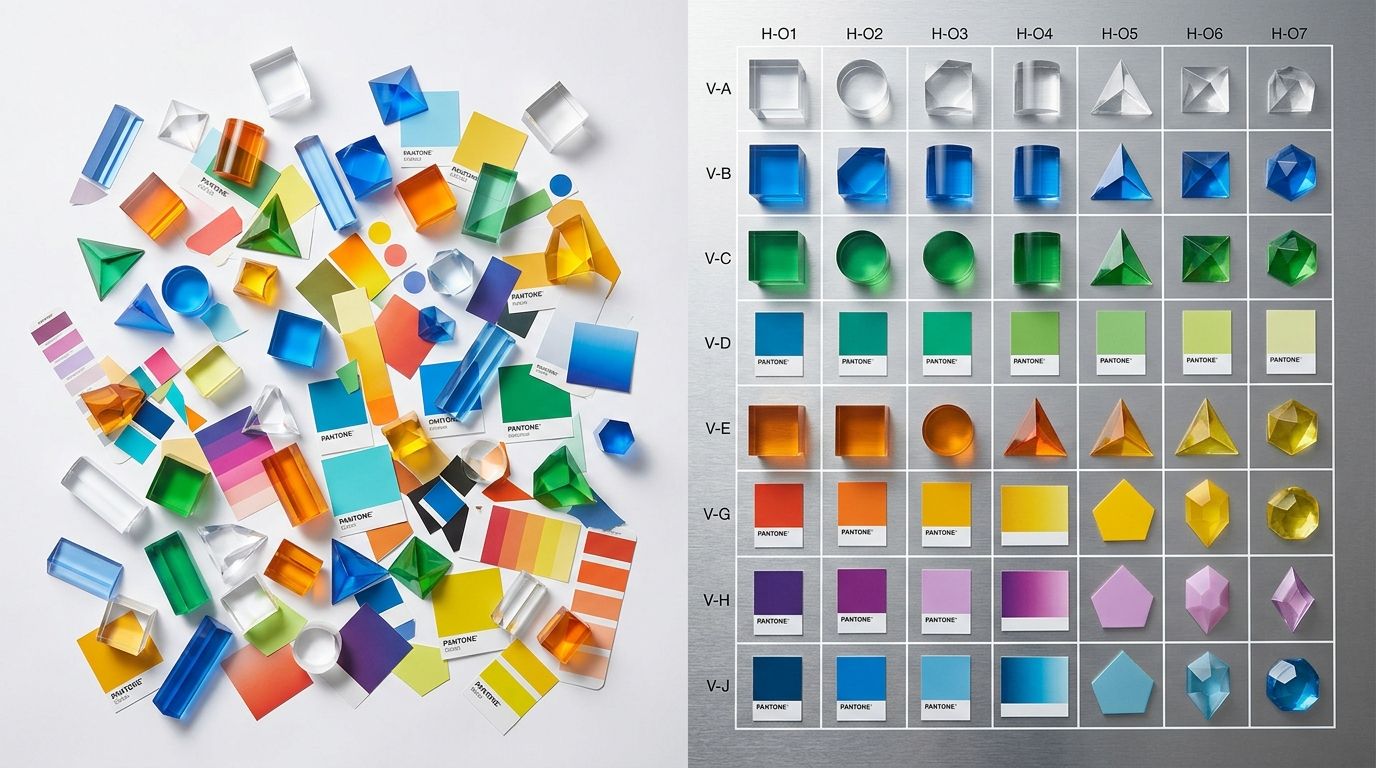
Clicking a red color swatch and looking at a blue product is unacceptable. It breaks trust instantly. Every single SKU needs its own complete gallery. Customers will not buy a variant if they have to guess what it actually looks like under standard lighting.
In the past, photographing twelve colorways of a single shirt was a logistical nightmare. Today, it is just a matter of processing the assets. Never leave a variant without visual representation.
3. Lifestyle photography conversion impact
Seeing a product in use helps the buyer picture it in their own life. This emotional connection is the core driver of impulse purchases. Traditional lifestyle shoots make this incredibly expensive.
Any brand still running a full studio shoot for standard catalog images in 2026 is paying for logistics instead of quality. Upload a basic flat lay, select the Lifestyle mode in CherryShot AI, and you get campaign-ready lifestyle imagery in minutes. Pricing starts at just $10 for 50 images. When the cost of production drops that low, there is absolutely no excuse for launching a product without environmental context.
4. Increasing product image quantity
Customers compensate for the inability to touch an item by looking at it from every conceivable angle. More images mean fewer unanswered questions. If you only show the front of a handbag, the buyer immediately assumes the back has a flaw.
We have documented exactly how a shallow gallery kills consumer trust. Expanding your carousel is a proven tactic when you want to learn exactly how many product images convert a hesitant browser into a paying customer. Do not stop at three images if you have eight distinct details worth highlighting.
5. Detail and texture crops
Show the stitching on the leather. Show the grain of the wood. Show the brushed finish on the hardware. A macro shot does the job of physical touch in an online environment.
This is where visual merchandising ecommerce strategies truly shine. Zooming in close proves your claims of quality. If your product description boasts about premium materials, your photography must provide the visual evidence. A tight crop on a high-quality seam removes the lingering fear of cheap manufacturing.
6. Adding scale reference photography
A table lamp photographed on a plain background could be six inches tall or three feet tall. Buyers are terrible at translating dimensions written in a text description into physical reality.
Show the product next to a recognizable object. Place a phone next to the wallet. Put the lamp on a desk next to a standard laptop. Scale confusion is a leading driver of preventable returns. Fix it by providing immediate visual context.
7. Consistent aspect ratios across the grid
A broken image carousel looks cheap. When your primary image is a vertical rectangle, the second is a perfect square, and the third is a wide horizontal shot, it signals a lack of professional operational standards. It also breaks the mobile viewing experience.
Pick one aspect ratio for your product pages and enforce it ruthlessly. Most modern direct-to-consumer brands default to a four-by-five vertical crop because it takes up maximum real estate on a smartphone screen.
8. Removing visual clutter from the gallery
Do not confuse environmental context with absolute chaos. If you use props in your photos, they must never compete with the product for attention. If a customer has to spend three seconds figuring out which item in the photo is actually for sale, you have lost the conversion.
Keep your styling intentional. This is a critical factor when analyzing what makes ecommerce product photos convert reliably. The product must remain the absolute focal point of the composition, regardless of how stylized the background becomes.
Frequently Asked Questions
What is the fastest way to improve ecommerce conversion rate?
Upgrading your primary hero image from a plain white background to a contextual environment drives the fastest lift in conversion rates. This initial visual handshake dictates whether a browser stops to read product details or bounces from the site immediately. Testing a minimalist background against a sterile catalog shot consistently establishes higher brand authority and secures more cart additions within days.
Which product page changes have the biggest impact on conversion?
Providing specific visual angles that replace the physical experience of touching an item creates the most significant revenue impact. Online shoppers cannot feel fabric weight or gauge hardware size, so you must fill these sensory gaps with targeted photography. Adding dedicated macro texture crops and recognizable scale reference shots eliminates the primary doubts that cause cart abandonment.
Should I fix product images or checkout first?
Prioritize upgrading your visual merchandising because it sits at the absolute top of the product page funnel. The most frictionless payment processing system in the world generates zero revenue if a customer never initiates the purchase sequence. Unless your cart throws active error codes, abandoned sessions almost always stem from unconvincing photography that failed to build adequate trust.
How long does it take to see conversion rate improvement?
Replacing subpar gallery assets alters consumer purchasing behavior the moment the updated pages go live on your storefront. Unlike structural search engine optimization that requires extended indexing periods, visual updates influence the very next visitor who clicks an ad. Running an active split test on a high-traffic listing yields statistically valid performance data within forty-eight hours of launch.
What is a realistic conversion rate improvement target?
Stores currently converting below one percent should expect to double that baseline within thirty days of overhauling their imagery. Sites already holding a stable three percent conversion standard face diminishing returns and require more precise split testing protocols. Target incremental quarterly lifts of zero point two percent by continually testing dedicated lifestyle environments against your proven top sellers.
Key Takeaways
- Replace plain white hero images with subtle, contextual backgrounds to establish immediate brand value.
- Provide specific imagery for every single variant so customers never have to guess a colorway.
- Use macro texture shots and scale references to replace the physical experience of touching the product.
- Leverage AI tools to generate lifestyle imagery rapidly without paying for expensive studio logistics.
Visual changes are not simply an aesthetic upgrade. They are a direct mechanism for revenue growth. Every time you remove a visual friction point, you make it easier for the customer to hand you their money. Build your gallery correctly using CherryShot AI, and the conversion rate will follow.
Audit your product page images before your next campaign
Review your top three best-selling items right now to ensure they include detail crops, scale references, and lifestyle context. If your gallery feels sterile, generate a few contextual backgrounds using your existing catalog assets.
Try CherryShot AI