Mobile Ecommerce Conversion Rate: The Image Fix
Most ecommerce brands have a traffic mix that looks like 2026 but a conversion breakdown that looks like 2016. You pull up your analytics platform and see that mobile devices drive sixty-five percent of your total store traffic. Then you look at the revenue. Your desktop conversion rate is sitting comfortably at 3.5 percent. Your mobile ecommerce conversion rate is struggling to hit 1.2 percent. The gap is massive, and it is entirely preventable.
Definition
A mobile ecommerce conversion rate measures the percentage of smartphone users who successfully complete a purchase after browsing a digital storefront. This metric serves as a direct indicator of how well a brand adapts its visual presentation and site architecture for a vertical, touch-based environment.
Founders see this metric and instantly blame the checkout flow. They assume the mobile user is getting frustrated by form fields. They install new one-click payment options. They completely rebuild the cart drawer. They obsess over button colors and trust badges. After a month of engineering work, the mobile conversion rate barely twitches.
The uncomfortable truth is that the checkout is not the problem. The user is abandoning the product page long before they even consider adding the item to their cart. The real issue is your product imagery. You shot your entire catalog for a fifteen-inch landscape monitor and you are squeezing those exact same assets onto a six-inch vertical screen. The user cannot see what they are buying.
Why Mobile Product Pages Convert Worse Than Desktop
A desktop monitor forgives a lot of visual mistakes. If you place a small product in the center of a wide landscape studio shot, a desktop user can still make out the texture. They can see the precise stitching on a leather bag or the subtle hardware details on a jacket. The screen size does the heavy lifting for your photography.
When that exact same landscape image scales down to fit a smartphone screen, the product becomes a tiny speck surrounded by empty background. The details vanish. The texture is completely lost. You are forcing the user to pinch and zoom just to figure out what they are looking at. Every extra friction point on a mobile device kills buying intent.
This visual failure directly impacts your metrics. If you want to increase ecommerce conversion rate across your store, you have to stop treating mobile users like desktop users with smaller monitors. Mobile requires a fundamentally different visual language.
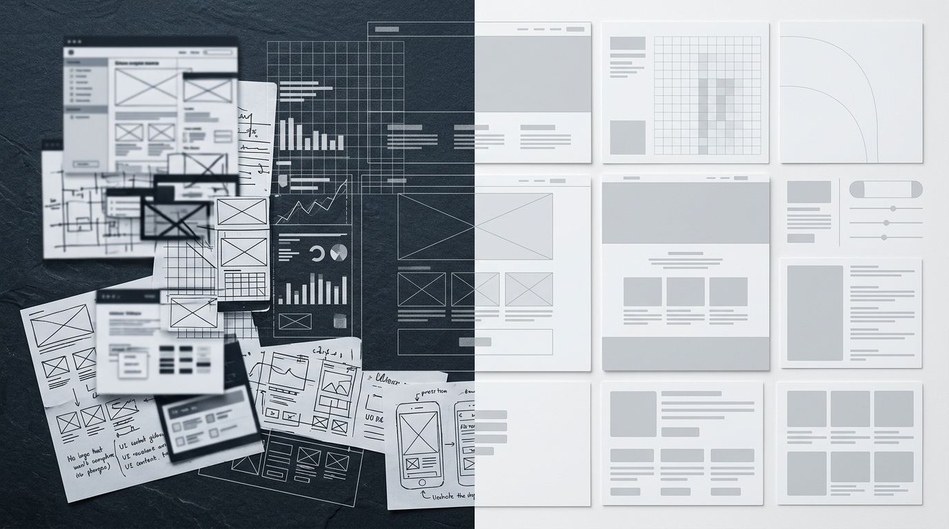
| Visual Requirement | Desktop Strategy | Mobile Strategy |
|---|---|---|
| Aspect Ratio | Landscape (16:9) | Square (1:1) or Vertical (4:5) |
| Product Framing | Centered with wide negative space | Fills at least 80% of the frame |
| Information Delivery | Supported by adjacent descriptive text | Relies entirely on visual context and scale |
A standard landscape studio shot scaled down for mobile forces the user to zoom in. A dedicated vertical crop keeps the product front and center.
The Pinch and Zoom Penalty
Mobile users do not read product descriptions unless they are already sold on the visual. The image carousel is the entire sales pitch. When a user has to double-tap to zoom in on a mobile screen, the image often becomes blurry because the original file resolution was optimized for a smaller container size. They swipe back, lose their place on the page, and ultimately leave.
(It is worth acknowledging that a portion of this conversion gap is behavioral. Users often browse on the subway and complete the purchase on their laptop later that evening. But behavior alone does not account for a massive 3x difference in conversion rates. A gap that wide is a usability failure masquerading as user preference.)
The Image Fix for Ecommerce Mobile CRO
Fixing the mobile conversion rate ecommerce problem requires auditing every visual asset in your primary carousel. You cannot just rely on CSS to resize your images. You need specific image structures designed for vertical swiping.
The Mobile Hero Image Requires Tight Framing
The first image in your mobile product carousel is the most important asset on the page. On desktop, a clean white background shot with plenty of negative space works perfectly. It looks editorial and premium. On mobile, that same white background often bleeds into the surrounding white space of the site UI. The product looks ungrounded and insignificant.
For mobile, the hero image needs tight framing. The product should fill at least eighty percent of the available frame. If you are selling a skincare serum, the bottle needs to dominate the screen. The user should be able to read the label text clearly without any zooming action required.
Aspect Ratios That Respect the Vertical Screen
Horizontal images are a waste of valuable screen real estate on mobile devices. Every pixel matters. You should be using square (1:1) or vertical (4:5) aspect ratios for your mobile product pages. A vertical image takes up more physical space on the phone screen. It pushes distractions further down the page and forces the user to focus entirely on your product.
If you are struggling to optimize product page images for conversion, auditing your aspect ratios is the fastest way to see improvement. A landscape image on a mobile screen leaves massive gaps of empty space above and below the product. It makes the page feel empty and poorly designed.
Breaking the Production Bottleneck
Understanding what makes a good mobile product image is easy. Actually producing those images is where the logistics usually break down.
If you have one thousand SKUs in your catalog, shooting a completely separate batch of mobile-first ecommerce images sounds like a nightmare. Traditional studio shoots are incredibly rigid. You pay for the studio rental, the photographer sets up the lighting, and you get the standard catalog shots you requested in the brief. Going back to ask for tightly cropped, mobile-specific aspect ratios and varied lifestyle backgrounds means booking another entire shoot day. The invoice doubles. The timeline stretches by another three weeks.
A good photographer still makes sense for your primary seasonal campaign hero banner. We are not arguing against high-end art direction for your brand identity. But for standard catalog volume and localized mobile variants, the math of traditional photography simply does not work anymore.
This is exactly why we built CherryShot AI. You do not need to reshoot your entire catalog to fix your mobile product page UX. You simply upload your standard desktop product image, select a visual mode like Lifestyle or Minimalist, and generate campaign-ready photos perfectly sized for mobile screens in minutes. The per-image cost drops to under $5. You stop paying for slow logistics and start paying for actual visual output. When you can generate imagery for a new mobile layout in twenty minutes instead of booking another shoot day, you can actually test what converts best.
Load Speed and Mobile Usability
Visual optimization goes beyond framing and cropping. The technical delivery of the image is just as crucial for your mobile conversion rate. High-resolution images look fantastic, but they are incredibly heavy. A four-megabyte file might load instantly on a desktop fiber connection. On a cellular connection with spotty coverage, that same image takes four seconds to load.
Four seconds on mobile is an eternity. The user will not wait. They will assume your site is broken and leave before the hero image ever renders.
Serving the Right Format
Finding the correct image size for load speed and conversions is a balancing act between visual clarity and technical performance. You cannot serve massive JPEG files to mobile users. You need to leverage modern formats like WebP, which provide the same visual fidelity at a fraction of the file size. Every kilobyte you shave off your mobile hero image translates directly into faster perceived load times and higher retention rates.
Contextual Lifestyle Shots Replace Detailed Copy
Mobile shoppers rely entirely on visual context. On a desktop layout, you have room for bullet points detailing the dimensions, weight, and material of the product right next to the image. On a mobile layout, those details get pushed far below the fold. The user has to scroll past the carousel, past the price, and past the add to cart button just to find out how big the item actually is.
Your mobile product images have to communicate that information visually. You need macro lifestyle shots that show texture. You need contextual shots that show scale. If you are selling a backpack, show it being worn by a person. If you are selling a coffee mug, show it next to a keyboard. Do not force the user to hunt for basic physical information in a hidden accordion menu.
Key Takeaways
- The mobile conversion gap is rarely a checkout problem.
- Landscape images scaled down for mobile destroy product visibility.
- Mobile hero images require tight cropping and vertical aspect ratios.
- CherryShot AI allows you to generate mobile-specific variants instantly without booking a new shoot.
Frequently Asked Questions
What is the average mobile ecommerce conversion rate?
The average mobile ecommerce conversion rate typically sits between 1.5 percent and 2.0 percent across most retail sectors. This baseline performance heavily underperforms desktop traffic, which reliably converts at nearly double that rate hovering around 3.5 percent to 4.0 percent. Brands looking to bridge this performance gap must overhaul their visual layouts to account for how users actually evaluate products on smaller, vertical screens.
Why do mobile visitors convert less than desktop visitors?
Mobile visitors abandon carts more frequently because cramped screens severely restrict their ability to evaluate product details clearly. Retailers often recycle wide landscape photography intended for desktop monitors, forcing mobile users to endure tedious pinching and zooming to inspect the item. Supplying tightly framed vertical imagery eliminates this visual friction and gives the buyer enough confidence to proceed through the checkout sequence.
How do product images affect mobile conversion rate?
Product images dictate mobile conversion rates because shoppers completely ignore long descriptive text blocks on compact screens. Visual assets represent the entire sales pitch, meaning any ambiguity around texture, scale, or quality instantly destroys buyer trust and halts the transaction. Delivering precisely cropped photography that fills the vertical frame ensures the customer fully understands the product value without needing to read a single word.
What image format is best for mobile product pages?
WebP serves as the optimal image format for mobile product pages across modern ecommerce storefronts. This format maintains exceptional visual fidelity while compressing file sizes down to a fraction of the weight required by traditional JPEG or PNG assets. Implementing WebP delivery guarantees that high-resolution product carousels load instantly over weak cellular networks, preventing frustrated shoppers from abandoning a sluggish page.
How do I close the mobile vs desktop conversion gap?
You close the conversion gap by implementing a visual hierarchy specifically engineered for narrow mobile screens. Transitioning away from wide landscape photography in favor of strict square or vertical aspect ratios keeps the focal point front and center. Formatting the hero image so the primary item fills at least eighty percent of the frame immediately removes friction and encourages faster purchasing decisions.
The brands that win on mobile are the ones that design exclusively for the thumb. They use tight crops. They use vertical formatting. They do not force the user to hunt for visual information. The checkout flow only matters if you can keep the user engaged long enough to actually use it.
Stop losing mobile revenue to bad image cropping. Head over to cherryshot.ai and start generating mobile-optimized product imagery for your catalog today.
Audit your mobile product carousel right now
Pull out your smartphone and navigate to your top-selling product page. If you have to zoom in to clearly evaluate the texture or read the label, you are actively losing sales. Upload those same standard images to CherryShot AI and instantly generate tightly cropped, mobile-ready vertical layouts.
Try CherryShot AI