Mobile Ecommerce Conversion Rate: Why Mobile Traffic Converts at Half the Rate of Desktop
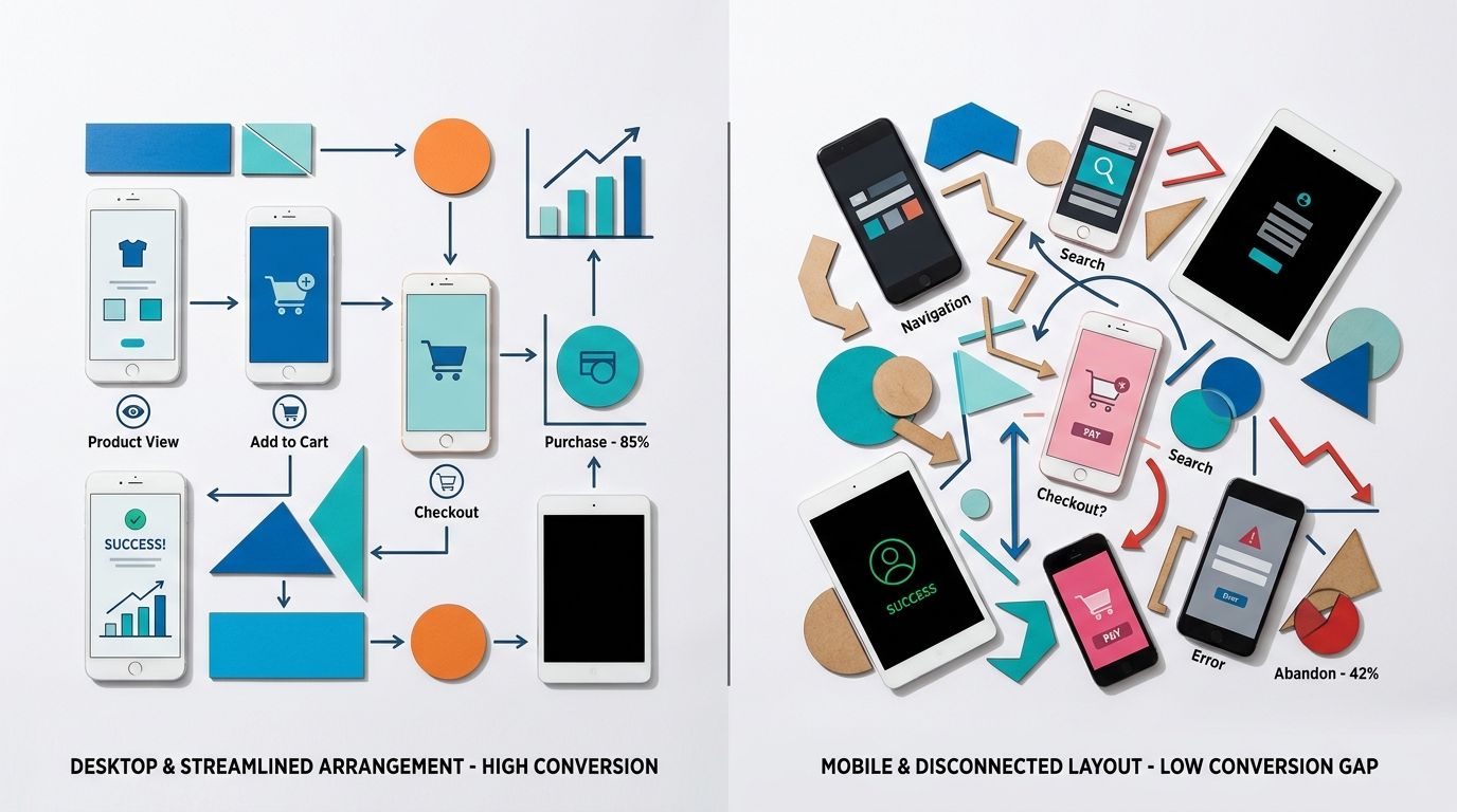
Look at your analytics dashboard right now. Your mobile traffic is likely sitting at seventy percent or higher. Your mobile revenue is probably sitting at forty percent. The reason mobile ecommerce conversion rate lags behind desktop is not a mystery. It is a real estate problem. You are trying to cram a sprawling desktop shopping experience into a six inch screen. The fastest way to fix it is optimizing your visual communication for split second scrolling.
Definition
Mobile ecommerce conversion rate is the percentage of smartphone and tablet visitors who successfully complete a purchase on your online store. It is calculated by dividing total mobile transactions by total mobile sessions and multiplying by one hundred.
Most founders blame their product pricing or their ad copy when their mobile numbers look weak. They ignore the brutal reality of the mobile user experience. If a potential buyer has to pinch and zoom to see the fabric texture of your product, they will just leave. If your images take three seconds to load over a cellular connection, you have already lost the sale.
Making your site hyper fast for mobile means sacrificing some of those high resolution lifestyle videos your creative director loves. That is a trade off you have to make if you want revenue instead of just a pretty storefront. You cannot buy inventory with compliments on your web design.
(Worth noting: you will never get mobile conversion to match desktop entirely. Desktop users are usually sitting down with their credit card ready. Mobile users are often killing time in a waiting room. Acknowledging that context changes how you design for them, but it does not excuse a massive performance gap.)
A poorly cropped desktop lifestyle image becomes entirely unreadable on a smartphone screen.
The brutal math of mobile vs desktop ecommerce conversion
The gap between mobile vs desktop ecommerce conversion comes down to a fundamental difference in user behavior. Desktop shoppers browse with intent. They have multiple tabs open. They are comparing prices. They are reading your shipping policy. They are actively trying to make a purchasing decision.
Mobile shoppers are different. Your smartphone ecommerce conversion rate suffers because these users arrive via a disruptive channel. They clicked an Instagram ad while riding a train. They tapped a TikTok link while waiting for a coffee. Their attention span is measured in fractions of a second. If your website does not instantly validate their click, they hit the back button.
| Shopping Context | Desktop Experience | Mobile Experience |
|---|---|---|
| User Environment | Seated with a credit card nearby | Commuting, waiting, or distracted |
| Purchase Intent | Active research and price comparison | Impulsive clicks from disruptive channels |
| Visual Needs | Can interpret wide lifestyle scenes | Requires tight crops and instant clarity |
| Attention Span | Multiple tabs and longer sessions | Measured in fractions of a second |
Above the fold mobile real estate
The first viewport on a mobile screen dictates your success. Above the fold mobile design is ruthless. You have about six vertical inches to present the product, the price, the social proof, and the add to cart button.
When a web developer takes a desktop layout and simply makes it responsive, the resulting mobile page is usually a disaster. A wide landscape image that looks cinematic on a laptop pushes all the crucial buying information below the fold on a smartphone. By the time the user scrolls down to find the price, they have lost the impulse that brought them to the site in the first place. You have to design the mobile product page as a standalone environment, completely divorced from how the desktop site operates.
How your hero image mobile strategy is killing sales
Your hero image is the single most important asset on your mobile product page. On desktop, you can get away with a wide angle shot showing a model walking down a street holding your product. The screen is big enough that the viewer can still see the details. On mobile, that same image renders your product as a tiny smudge.
The necessity of tight cropping
Mobile users need to understand exactly what you are selling within one second. Your hero image mobile strategy must prioritize tight cropping. The product needs to fill the entire square. If you are selling a leather bag, the mobile hero image needs to show the grain of the leather and the hardware up close. Understanding what makes product photos convert means recognizing that clarity always beats atmosphere on a small screen.
I have watched brands spend twenty thousand dollars on a location shoot in Joshua Tree, only to see their conversion rate plummet because the mobile shopper could not figure out what the actual product looked like against the busy desert background. A clean, tightly cropped studio shot will outperform a beautiful but distant lifestyle shot on mobile every single time.
Image loading speed and page speed mobile
The second way brands destroy their mobile conversion rate ecommerce 2026 numbers is through massive file sizes. A traditional photographer delivers high resolution files that look incredible on a 4K monitor. When you upload those straight to your Shopify store, you are creating a massive bottleneck.
Image loading speed is the silent killer of mobile revenue. A user clicking a link from a social media app is often doing so on a cellular connection. If your product image takes three seconds to render, they will abandon the session. Your page speed mobile metrics dictate your bounce rate. You must compress every single image to its absolute minimum viable file size without introducing visual artifacts.
Fixing the mobile UX with visual clarity
Once you have solved the hero image crop and the loading speed, you need to address how the user interacts with the rest of the visual stack. Mobile UX is deeply tactile. Users do not click tiny arrows. They swipe.
Creating a touch friendly gallery
A touch friendly image gallery is non negotiable. The user expects to swipe left and right to see different angles. If the gesture feels clunky, or if swiping accidentally scrolls the page down, you create friction.
More importantly, the sequence of images matters. The swipe sequence is your sales pitch. The first image grabs attention. The second image shows the back or alternative angle. The third image provides scale. The fourth highlights a specific detail. If you want to dive deeper into this sequencing, you need to optimise product page images for conversion by treating the gallery as a visual funnel. Do not just throw random shots into the carousel. Each swipe needs to answer a specific objection the buyer might have.
The role of AI product photography in mobile testing
Historically, optimizing mobile imagery was expensive. If you realized your hero images were too wide for smartphone screens, you had to book another studio day. You had to pay a photographer hundreds of dollars per image just to get tighter angles. That math prevents most brands from ever testing their visuals properly.
This is exactly where AI product photography changes the workflow. You no longer need to accept poor mobile conversion just because a reshoot is too expensive. You take a basic product photo, upload it to CherryShot AI, and select a visual mode that fits your brand. Our Minimalist mode is incredibly effective for mobile hero images because it removes background clutter and forces the user to focus purely on the product.
Because CherryShot AI pricing starts at just $10 for 50 images, you can afford to generate entirely different sets of images for your mobile and desktop experiences. You can generate campaign ready photos in minutes, crop them tightly for the smartphone layout, and immediately push them live to see the impact on your conversion rate. The barrier to visual optimization is completely gone.
The checkout friction problem
Getting the user to tap the add to cart button is only half the battle. The final hurdle in improving your mobile ecommerce conversion rate is the checkout process itself.
Mobile keyboards are clumsy. Inputting shipping addresses and credit card numbers on a glass screen is annoying. Any moment of hesitation during this process leads to cart abandonment. This is why expressing visual reassurance during the checkout flow is vital.
Reassuring the buyer visually
When a user opens their mobile cart, they should see a clear, high quality thumbnail of the exact variant they selected. If they picked the red colorway, the thumbnail must show the red product. If the cart defaults to a generic parent image, the user will second guess themselves and abandon the cart to go check if they selected the right item. They rarely come back.
You can significantly reduce checkout abandonment with product photography by ensuring your cart thumbnails are large enough to be legible and accurate to the user's choices. Everything on the mobile screen needs to confirm that the user is making the right decision.
Key Takeaways
- Mobile conversion rate will always lag desktop due to user intent differences.
- Tight cropping on your mobile hero image is mandatory for small screens.
- Image file sizes dictate mobile page speed and directly influence your bounce rate.
- AI product photography allows you to test mobile specific layouts without traditional studio costs.
Frequently Asked Questions
What is the average mobile ecommerce conversion rate?
The global average mobile ecommerce conversion rate is approximately two percent, with top performers achieving closer to three percent. This baseline fluctuates significantly because high consideration purchases like furniture naturally encounter more friction on small screens compared to impulse buys. Cosmetics and other similar low consideration products routinely perform well above this global baseline due to the speed of the purchasing decision.
Why is mobile ecommerce conversion rate lower than desktop?
Mobile conversion rates consistently underperform desktop figures due to a combination of lower purchase intent and higher interface friction. Shoppers browsing on smartphones are frequently commuting or easily distracted, which contrasts sharply with desktop users who are seated and focused with a credit card nearby. The physical limitations of a smaller screen make the entire checkout and navigation process inherently more tedious.
How do product images affect mobile conversion rate?
Product images function as the absolute primary source of decision-making information for all mobile shoppers. Smartphone users rarely scroll down to read lengthy text descriptions, relying almost entirely on your image gallery to verify product scale, material texture, and fine details. Shoppers will immediately bounce from your page if the mobile hero image is too wide or completely lacks visual clarity.
What is the fastest way to improve mobile ecommerce conversion?
The fastest method to increase mobile conversions is optimizing the visual elements displayed above the fold. You must ensure your hero image is tightly cropped while keeping your primary call to action permanently visible without any scrolling. Combining this visual clarity with image loading speeds under two seconds will immediately remove the most common friction points for your shoppers.
Closing the gap between your mobile and desktop conversion rates requires ruthless attention to the visual details. You cannot paste a desktop layout onto a phone and expect the same revenue. By optimizing your image clarity, reducing file sizes, and utilizing tools like CherryShot AI to generate mobile specific assets quickly, you can stop bleeding traffic and start capturing the revenue your brand deserves. Try generating your first mobile optimized batch at cherryshot.ai today.
Test your mobile hero images on a smartphone right now
Open your top selling product page on your own phone and evaluate the first visual impression. If you cannot clearly see the material details without zooming, use CherryShot AI to generate a tightly cropped, mobile-specific hero image in minutes.
Try CherryShot AI