How to Create a Product Photography Style Guide: The Template That Keeps Your Catalog Consistent
If you open your category page right now and the backgrounds shift from stark white to pale gray as you scroll down, your brand is bleeding credibility. A product photography style guide stops this. It takes visual decisions away from whoever happens to be holding the camera and enforces a rigid standard. Writing one is tedious, but living without one is expensive.
Definition
A product photography style guide is a centralized manual that mandates the technical and aesthetic parameters of your imagery. It acts as a single source of truth for photographers, stylists, and editors to ensure every product image adheres to the same lighting, angle, and framing standards.
Every growing ecommerce brand hits a breaking point where they cannot hire the same photographer for every launch. You bring in someone new. They have their own preferences for lighting and scale. Suddenly, the shadows point in different directions and your new fall collection looks completely disconnected from your core products. The only way to prevent this fragmentation is to document exactly what your images must look like before a single shutter clicks.
A strict product photography style guide solves this problem entirely. It treats visual choices like mathematical rules. You define the hex codes, the angles, and the margin ratios. You hand this document to any studio or any retoucher and you get predictable results back.
Worth noting: a rigid style guide does inherently stifle creative experimentation. If you want wildly artistic, rule-breaking hero shots, a rigid template will fight you. For catalog volume, however, consistency matters far more than creativity.
When scale and lighting shift from one row to the next, the perceived value of your entire inventory drops.
Why your catalog looks like a patchwork quilt right now
Inconsistency rarely happens on purpose. It happens because brands scale faster than their documentation. You start with a few great shots from your founder days. You hire an agency for your next big launch. Then you hire a local freelancer to quickly shoot three new SKUs because the agency was booked.
Each person brings their default lighting setup and their favorite lens. One prefers a bright, airy aesthetic with soft shadows. Another likes high contrast with crisp edges. Neither approach is wrong in isolation. Put them next to each other on a Shopify grid and the customer immediately notices the disconnect. It makes the store look like a marketplace of different vendors rather than a single, premium brand.
The hidden cost of switching photographers
The invoice from the studio is never the final cost of an unstructured shoot. When the images come back and look wrong next to your legacy products, you end up paying for rescue work. You hire a retoucher to try and lighten the backgrounds. You spend hours in Photoshop trying to manually scale the products so the shoes from the spring shoot do not look massive compared to the shoes from the fall shoot.
Establishing visual brand identity early prevents this tax entirely. When you have a template, you never pay a retoucher to fix something that should have been captured correctly on set. A firm document is the strongest protection you have when managing external vendors. If the work delivered does not match the rules you provided, you hold the studio accountable for the reshoot.
What actually belongs in a product photography style guide
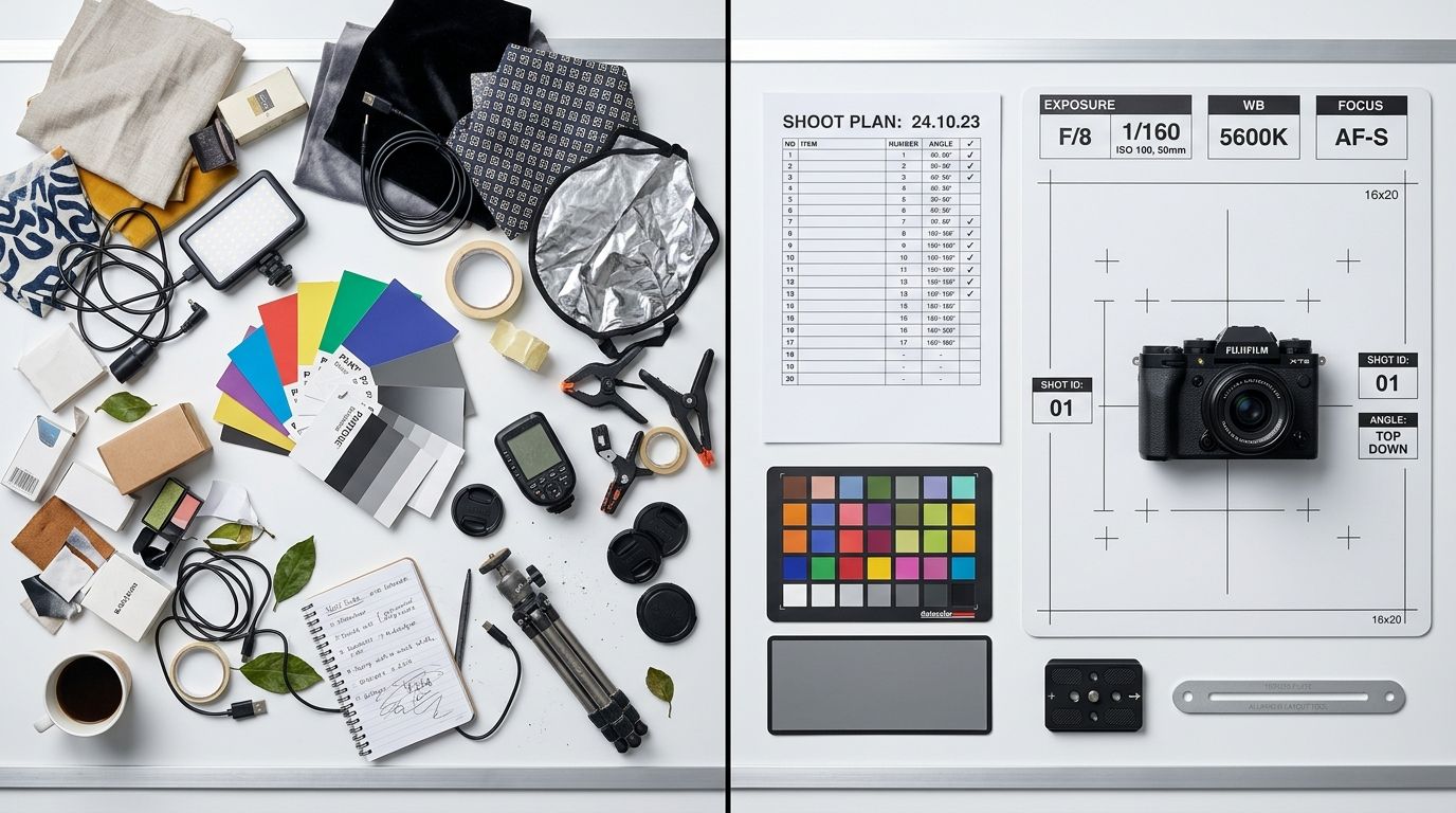
A vague mood board is not a style guide. Tacking five pictures you like to a Pinterest board tells a photographer almost nothing about how to physically execute your catalog. A real photography style guide is a technical manual. It leaves nothing to interpretation.
You must define the exact physical parameters required to replicate your brand look. This document needs to be clear enough that a photographer who has never seen your website can read it and deliver perfect files.
Lighting and shadow rules
Lighting dictates mood. You have to document whether you use hard light or soft light. Does your brand require crisp, defined shadows that look like direct sunlight? Or do you require soft, diffuse lighting with barely visible drop shadows?
You must specify the direction of the light source. If half your catalog has shadows falling to the left and the other half has shadows falling to the right, your category pages will look chaotic. Document the angle of the key light. State exactly how dense the shadows should be in post-production.
Camera angles and focal lengths
Focal length completely changes the geometry of a product. If you photograph a water bottle with a 35mm lens close to the subject, the top will bulge and distort. Photograph that exact same bottle with an 85mm lens backed away from the subject, and the lines will look straight and natural.
Your guide must state the required lens length. It must also define the exact camera angles. A shoe shot at zero degrees looks very different from a shoe shot at a fifteen-degree downward angle. Define the hero angle that every single SKU must be captured in for the main product image.
Prop limits and styling constraints
If your visual identity relies on lifestyle elements, define the boundaries. What materials are allowed in the frame? Are you styling with organic elements like stone and wood, or synthetic materials like acrylic and metal?
A common mistake is letting the stylist bring whatever they think looks good that day. This guarantees your next shoot will not match your last one. Document exactly what is allowed near the product. If your brand relies on a minimalist aesthetic, state clearly that no more than two styling props can appear in any lifestyle shot.
Building your template
You do not need to hire a design agency to format this. A simple, well-organized text document with reference images is all you need. Start by analyzing your current catalog. Find the images that convert the best and look the most professional. These become your baseline.
Reverse engineer why those images work. Pull the metadata to find the focal length. Use a color picker to find the exact hex code of the background. Write these facts down.
Core elements to document immediately
Start your document with a checklist that must accompany every final delivery. Require your vendors to match these specific points before sending you an invoice.
First, establish crop ratios and margins. How much negative space must exist between the top of the product and the edge of the frame? A product that fills 90 percent of the frame next to a product that fills 50 percent of the frame is the fastest way to ruin a grid layout. Define your alignment rules clearly.
Second, dictate the background requirements. If you shoot on white, you need to state what kind of white. Absolute pure white is #FFFFFF. Many brands actually prefer off-white like #F4F4F4 because it feels softer. Whatever you choose, lock it in. If you are paying for consistent photo retouching, give your editors the exact hex code they must match across all deep-etched files.
Third, mandate file naming conventions. If a studio delivers files named IMG_8472.jpg, you will waste hours organizing them. Dictate a format like SKU_Color_Angle.jpg. It sounds minor until you are managing thousands of assets.
The old way vs the automated way
Writing and enforcing a style guide requires constant vigilance. Every time you get a new batch of photos, you have to audit them against your document. You have to push back when the studio misses a detail. This administrative overhead is a heavy burden, especially when trying to maintain consistent photography at scale while launching new collections rapidly.
Automated generation fundamentally changes how brands maintain visual consistency. AI does not need to read a PDF to understand your lighting rules.
| Focus Area | Traditional Photography | AI Photography |
|---|---|---|
| Lighting Setup | Manual light placement | Automated light logic |
| Consistency | High risk of human error | Built-in mathematical accuracy |
| Scaling Speed | Slow and resource intensive | Immediate and scalable |
When you use CherryShot AI, the style guide is baked directly into the software. You upload a raw product photo, select a visual mode like Minimalist or Classic, and the tool outputs campaign-ready photos that perfectly match the rest of your catalog. The shadows always fall correctly. The scale is always right. You remove the entire category of human error that causes inconsistent catalogs in the first place.
Frequently Asked Questions
What is a product photography style guide?
A product photography style guide is a technical document that defines the exact visual standards for your brand imagery. These rules dictate camera angles, focal lengths, lighting setups, background hex codes, shadow placement, and cropping ratios. Establishing this baseline ensures every image matches the rest of your catalog regardless of who shoots it.
How do I create a photography style guide?
You create a photography style guide by documenting the technical specifications of your most successful hero image and turning those specs into strict rules. Start by defining your background color, camera focal length, specific angles for your primary and secondary product shots, and exactly how much negative space must surround the product in the final crop. Documenting these specific constraints turns your visual identity into a repeatable process.
What should a product photography style guide include?
A comprehensive guide must include camera settings, lighting diagrams, shadow density expectations, and exact hex codes for backgrounds. You should also define prop guidelines, file naming conventions, and strict rules for margins and alignment in post-production. Each element acts as a safeguard against visual drift, ensuring that every asset delivered by a vendor or studio aligns with your established brand standards.
How does a style guide prevent catalog inconsistency?
It removes creative interpretation from the production process entirely. When freelancers or new studio hires read a tight style guide, they know exactly what the finished image must look like without making assumptions. They do not guess whether the shadow should point left or right. This clear direction enforces a unified visual standard across different shoots and seasons, keeping your store layout looking professional.
Can AI photography maintain a consistent visual style automatically?
Yes. AI product photography enforces consistency by design during the generation process. Instead of relying on a human to interpret a complex PDF document, tools like CherryShot AI use a selected visual mode to apply the exact same lighting logic, shadow placement, and scale to every uploaded product image automatically. This replaces manual auditing with software-defined precision.
Key Takeaways
- A style guide replaces creative interpretation with strict mathematical rules for production.
- You must document physical technicalities like focal length and lighting angles, not just mood boards.
- Cropping ratios and exact background hex codes are critical for grid alignment.
- Automated tools bypass manual enforcement by locking your visual standards into the generation process.
Audit your product page images before your next campaign
Check your mobile layout on your phone right now to spot inconsistencies in shadow and scale. If your catalog feels disjointed, you can use CherryShot AI to re-process your existing product images into a consistent visual set that reflects your brand guidelines.
Try CherryShot AIBuilding a visual identity that scales requires more than just good taste. It requires discipline. When you formalize your photography standards, you protect your brand from looking cheap and fragmented. For brands looking to skip the manual enforcement entirely, CherryShot AI turns visual consistency from a logistical headache into an automatic guarantee.