Product Image Order for Ecommerce: Sequence Your Gallery for Conversion
Most founders treat their product image gallery like a digital dump. They upload the white background shot first and let the rest fall into whatever order the files were named. This is an expensive mistake. The sequence of your ecommerce gallery dictates exactly how a customer understands your item. Start with a clear hero shot on a clean background. Follow it immediately with an alternate angle. Put your macro detail shot third to prove manufacturing quality. Place your lifestyle image fourth to show scale. End with packaging or technical specifications. This order answers customer questions before they even scroll down to the product description.
Definition
Product image order is the deliberate sequence of photographs displayed on an ecommerce product page. It organizes visual information into a logical hierarchy, guiding a shopper from basic product identification to detailed material verification. A structured gallery answers typical buying questions sequentially to reduce hesitation and increase the likelihood of purchase.
I spent years running operations for direct to consumer brands. We used to sit in pre-production meetings for hours arguing with art directors about which angle looked the most dramatic. The truth is that looking dramatic is not the goal. The goal is removing hesitation. If your gallery order forces a user to swipe four times just to see the back of a garment, they will bounce. You are building an information hierarchy, not an art exhibit. When founders ask me about product page fixes for conversion, I always look at the image sequence before I look at the checkout flow.
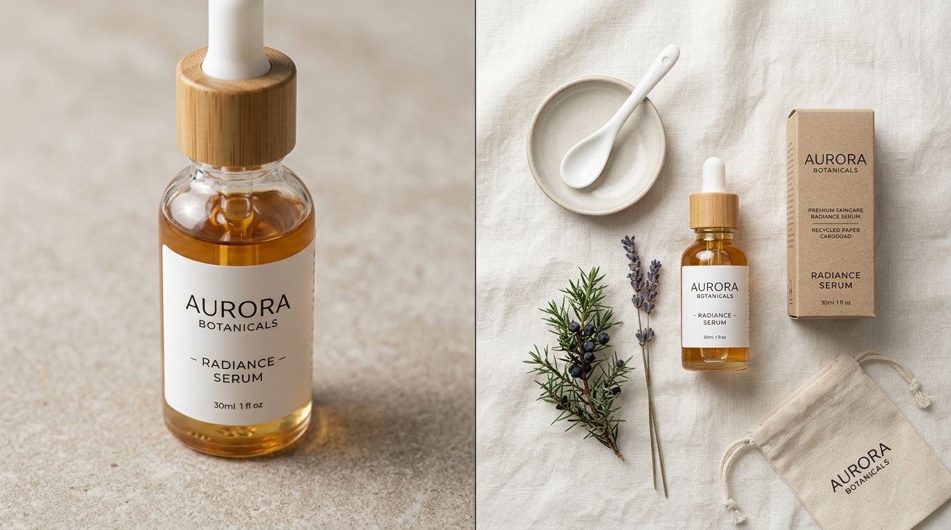
A strong product gallery sequence moves from clear hero shot to detailed texture, answering buyer questions with every swipe.
Why your product gallery order dictates your add to cart rate
When a customer clicks on a product card from a category page, they arrive with a baseline level of intent. They saw a thumbnail they liked. Now they need verification. They use your product gallery to verify that the item matches the promise of the thumbnail. Every single swipe or click must deliver new, relevant information that moves them closer to a purchase decision.
If your sequence is random, the cognitive load on the customer increases. They have to piece together an understanding of the product from disjointed visual clues. If you show a lifestyle shot, then a zoomed-in zipper, then a box, then the full product, the brain has to work too hard to map those images to a single physical object. Friction kills conversion. A logical product image sequence eliminates that friction by mirroring the natural way a human would inspect an item in a physical store.
The cost of a scattered image hierarchy
I have watched hundreds of user session recordings where customers simply swipe back and forth between the first two images, searching for a different angle that never appears. If they cannot see the heel of the shoe, the clasp of the necklace, or the interior pockets of the backpack, they will leave. The bounce rate on product pages with poorly sequenced galleries is consistently higher than those with a strict visual narrative.
| Image Position | Random Gallery Approach | Optimized Gallery Sequence |
|---|---|---|
| First Position | Low-lit lifestyle shot | Clear hero shot on white background |
| Second Position | Redundant front angle | Distinct alternate perspective |
| Third Position | Closed product packaging box | Macro detail of fabric or material |
| Fourth Position | Irrelevant branding prop | Clear scale reference in context |
The optimal product image sequence for ecommerce
There is a formula that works across almost every major category. Whether you are selling a fifty-dollar t-shirt or a five-hundred-dollar coffee machine, this five-step sequence provides the highest baseline conversion rate.
Position 1: The Anchor (Hero Shot)
The first image must be a clear, unobstructed view of the entire product. Use a pure white or light grey background. No props. No dramatic shadows masking the shape. The item should fill at least eighty percent of the frame. The singular goal of this image is to confirm to the buyer that they clicked the correct link. Do not get creative here. Clarity is your only metric.
Position 2: The Confidence Builder (Alternate Angle)
Most brands make the mistake of showing the exact same angle slightly zoomed in for their second image. This wastes prime visual real estate. Your second image must build immediate confidence by showing an entirely different perspective. If you sell a sneaker, the first image is the profile. The second image should be the top-down view or the tread. If you sell a handbag, the second image must show the back or the base. Customers swipe to discover new information. When they swipe and see redundant information, they assume the rest of the gallery is equally useless and they stop swiping.
Position 3: The Physical Touch (Macro Detail)
In a physical store, the third thing a customer does after looking at the front and back of an item is touch it. They feel the fabric, test the zipper, or examine the stitching. Your third image must replace that physical touch. Get incredibly close to the material. Show the grain of the leather, the weave of the cotton, or the brushed finish of the metal. This detail shot is where you justify your pricing.
Position 4: The Reality Check (Scale and Lifestyle)
By the fourth image, the customer understands what the product is and how it is made. Now they need to know how big it is and how it looks in the real world. Place the product next to a recognizable object or put it in the hands of a model. This is where context happens. If you want to know what makes product photos convert reliably, it is answering the scale question visually before the customer has to hunt for the dimensions in a hidden dropdown menu.
If you are missing a lifestyle shot because a location shoot fell through or a model canceled, you do not have to leave this critical slot empty. You can drop your base product photo into CherryShot AI, select the Lifestyle mode, and generate campaign-ready context shots in minutes. The per-image cost drops to under $5, and you maintain your conversion sequence without waiting three weeks for a reshoot.
Position 5: The Technical Objections (Packaging and Specs)
The final core image should handle the logical objections. What comes in the box? Does it include the charging cable? How is it packaged for shipping? A flatlay of all included components or a beautiful shot of the branded box answers these final operational questions and removes the last bit of friction before the customer clicks the buy button.
How to adapt this sequence across different categories
While the core formula holds true, you must flex the sequence slightly based on what you sell. The hierarchy of information changes when you move from a t-shirt to a sofa.
Apparel requires fit context early
If you sell clothing, you cannot wait until the fourth image to show a human being. The first image might be an invisible mannequin shot for clean category pages, but the second image must be a model shot showing the drape and fit. Customers cannot buy clothing without understanding how it hangs on a body.
Cosmetics demand texture and swatch visibility
For beauty brands, the packaging is important, but the product inside the packaging is the actual purchase. The hero image is the closed jar or bottle. The second image must be an open jar with a smear or a swatch on different skin tones. The texture of the cream or the pigmentation of the powder is the alternate angle that matters most.
Homeware relies heavily on the lifestyle placement
A white ceramic vase on a white background looks like every other white ceramic vase on the internet. For homeware, the lifestyle shot often moves up to the second position. The customer needs to see the vase on a wooden table with morning light hitting it to understand its aesthetic value.
The operational reality of filling the gallery
(Worth noting: some luxury brands prefer to break this rule entirely by using highly editorial, abstract imagery for their first three slots. They can afford to do this because their brand equity is already doing the heavy lifting. For ninety-nine percent of ecommerce brands, clarity will always beat cleverness.)
The trade-off of maintaining a strict image sequence is the sheer volume of assets required. It demands relentless discipline in production. You cannot simply tell a freelance photographer to grab some cool shots. Setting up a strict product photography brief for consistency ensures your team actually captures the required angles for every single SKU. If you launch fifty new items a month, you need two hundred and fifty specific images to maintain this sequence.
This is where traditional studio shoots break down. The invoice is not just the photographer. It is studio rental, the stylist's half-day, the art director's back-and-forth, and the weeks between brief and delivery. A general-purpose tool will give you weird artifacts, but a dedicated ecommerce tool changes the math. Generating your alternate angles and lifestyle context with CherryShot AI turns a three-week production bottleneck into an afternoon task.
Key Takeaways
- The first image must provide immediate clarity on a clean, distraction-free background.
- Every subsequent image in your sequence should answer a specific customer question or objection.
- Macro detail shots belong early in the sequence to build trust in product quality and materials.
- Lifestyle images should be placed fourth to provide context and scale after the core product features are understood.
Frequently Asked Questions
What order should I put product images in my ecommerce gallery?
The optimal sequence begins with a full-product hero shot on a white background, followed immediately by a distinct alternate angle. This predictable progression establishes immediate visual comprehension before addressing specific buyer objections. Insert a tight macro detail shot in the third position to verify manufacturing quality, and place a lifestyle image fourth to demonstrate real-world scale before concluding with packaging dimensions.
Does image order affect ecommerce conversion rate?
A strictly structured visual sequence directly increases your baseline add-to-cart metrics by reducing the cognitive load on the buyer. Shoppers demand instant verification that they clicked the correct item, and poorly arranged galleries force them to hunt for basic physical dimensions or textures. Audit your current catalog to ensure every single swipe reveals new, critical data rather than repeating redundant angles that cause frustrated visitors to bounce.
What should the first product image show?
The initial photograph must display the complete, unobstructed item against a pure white or light grey backdrop to guarantee absolute clarity. This isolated presentation confirms the core identity of the merchandise before the shopper decides to analyze any specific manufacturing details. Frame the studio shot so the physical object fills exactly eighty percent of the available canvas, eliminating heavy shadows or distracting props that obscure the natural silhouette.
What is the optimal product gallery sequence for ecommerce?
The highest converting baseline formula pairs a clear hero image, an alternate perspective, a macro texture, a lifestyle context, and a final packaging layout. Different merchandise categories require slight structural modifications to this visual hierarchy based on their primary buying criteria. Move invisible mannequin fit shots to the second position for apparel lines, or elevate interior port diagrams to the third slot for complex technical electronics.
Fixing your product image order is the highest leverage task you can do this week. Stop treating your gallery like a random folder of files and start treating it like a deliberate sales presentation. If you are missing the assets required to build this sequence, upload your existing shots to CherryShot AI and generate the missing angles today.
Audit your product image sequence before launching your next SKU
Open your top-selling product page on a mobile device and count how many swipes it takes to understand the materials and scale. If your sequence creates friction, you are actively losing sales. Drop your existing base photos into CherryShot AI to generate the missing lifestyle contexts and alternate angles you need to complete a high-converting gallery.
Try CherryShot AI